The network for creativity
Join 1.25M professional creatives like you
Connect with clients, get discovered, and run your business 100% commission-free
Creatives on Contra have earned over $150M and we are just getting started
Back to feedPost
The 17 Sustainable Development Goals are essentially the world’s to-do list for 2030. I wanted to build an immersive interface that actually lets countries and governments interact with their progress. It’s built for deep dives where you can compare performance across borders, analyze raw data, and even use a policy sandbox to "dummy try" initiatives to see simulated results before they happen. 🚀
Honestly didn’t think I could cram all of this in, but Figmake helped me pull off features and intuitive experience. I managed to build an AI-driven story mode, conversational inputs, and :a unique custom circular filter.
Started same day, around 200 regenerations, last minute submission; please accept!
#FigmaMake #SDG #GlobalGoals #UIUX #DesignChallenge
Figma Site - https://many-scarf-95159460.figma.site
FigJamAI Agent DesignerAI Agent OrchestratorConversational AI DevelopmentFigma Makefigmamakeathonmarch2026


Really an immersive experience and intuitive too, just a little bit of learning required.
Do you mind give me a feedback about my submission?

contra.com
Revolutionize Typography: Sculpt Fonts with Your Hands Using KINESIS
Connect with next-gen talent and tools to get work underway. Hire more independents. Start more projects. Get more creative.

yeah, I tried the handtracker. It's cool. :)

Thanks, hope this can add value and save effort for decision makers :))
The network for creativity
Join 1.25M professional creatives like you
Connect with clients, get discovered, and run your business 100% commission-free
Creatives on Contra have earned over $150M and we are just getting started



Related posts

Explaining "unlimited development" in 30 seconds is harder than it sounds.
That was the brief from figue.ai: a subscription where startups get a dev team without hiring one. Great product, but abstract. So I skipped the buzzwords and showed what it actually feels like: you ask, it gets built, you ask again.
Every interface in the video is rebuilt from scratch, so the product feels real instead of mocked up.
Really enjoyed this one! If you're launching something that's hard to explain, that's exactly the kind of project I love.


TOP!!

Redesign concept for Carbonate, where I designed a few screens early in my career. The dashboard helps HR teams see the day at a glance and know who to follow up with. It isn't the live product.
What I worked on:
- Dashboard layout: daily metrics, people table, weekly trend and follow-up card
- UX copy that keeps the tone human, like "Let's check in with them"
- Component-based UI in Figma, with one consistent icon set across the screen
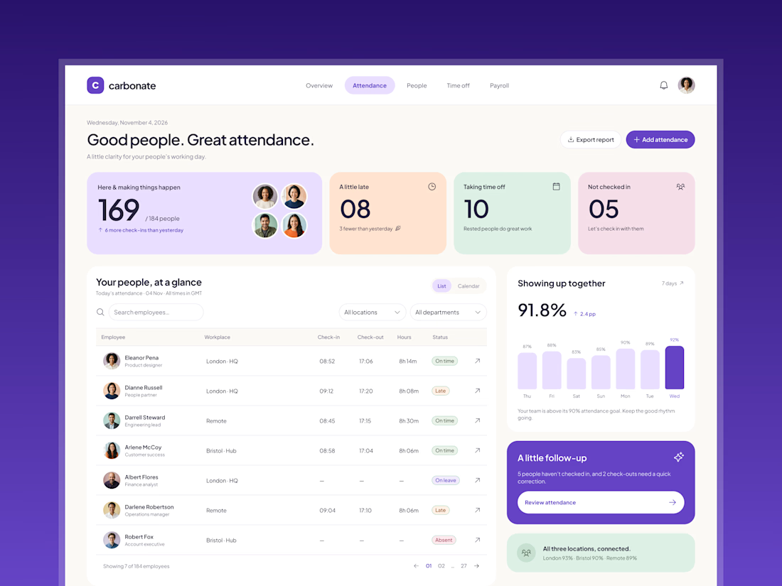

These pastel cards work so well.

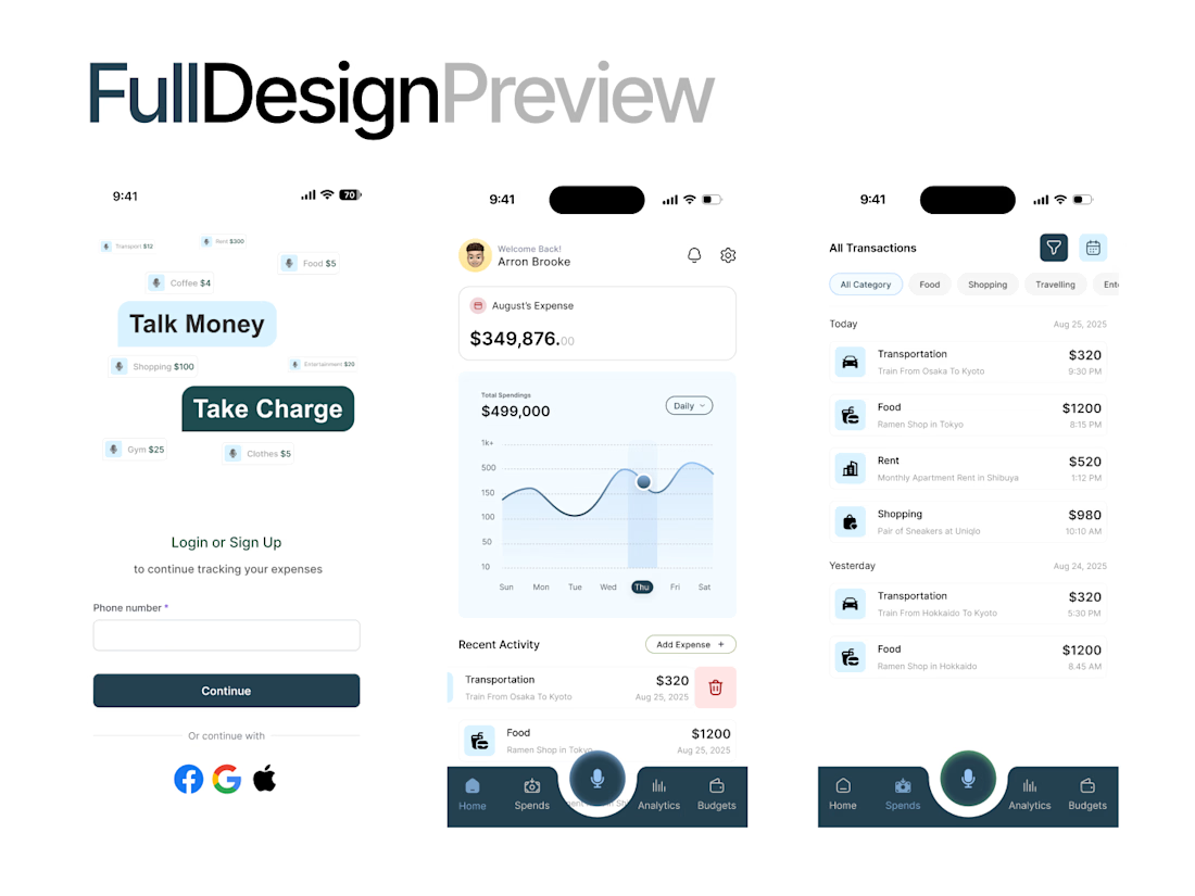
What if your money could actually talk back? 👀💸
Meet Moneytalk AI, a smarter way to explore your finances with AI, clean visuals, and intuitive design.
Let's break down the experience! 🧵
#FintechDesign #AIDesign #UIUX #MobileAppDesign #DesignTwitter
(1/5)
Less financial stress. More clarity. ✨
A clean dashboard, easy-to-read spending charts, and organized transactions make tracking your money feel effortless.
Because good UX should make life easier, not more complicated.
(2/5)