The network for creativity
Join 1.25M professional creatives like you
Connect with clients, get discovered, and run your business 100% commission-free
Creatives on Contra have earned over $150M and we are just getting started
Back to feedPost
Taste Test
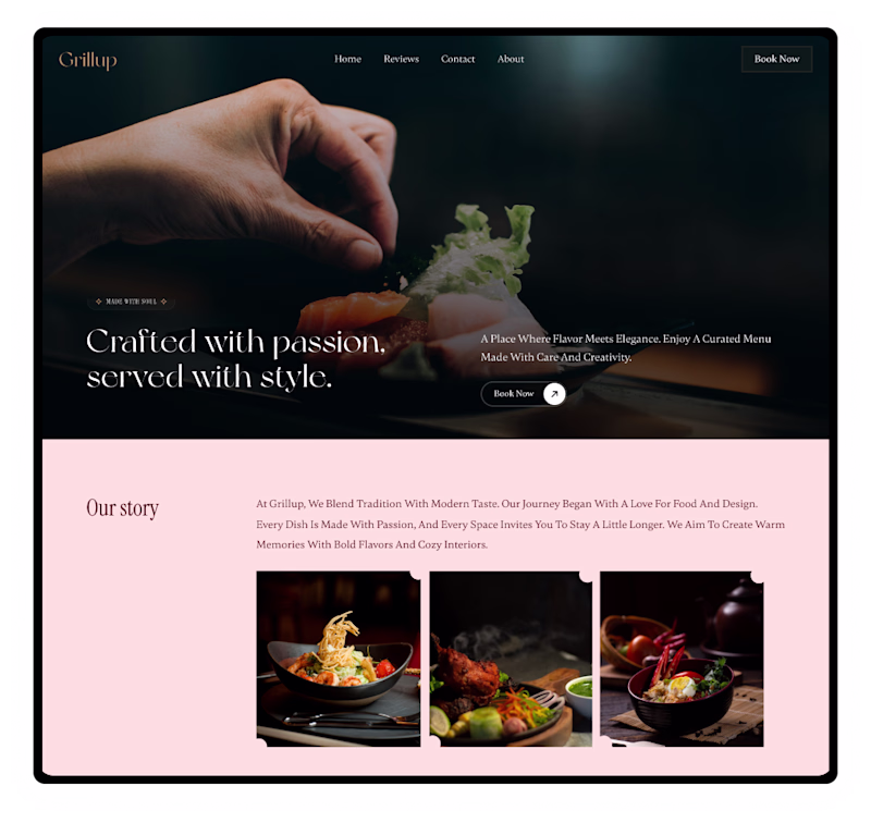
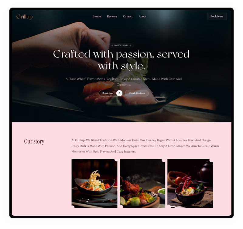
Centre alignment looks better because of the way it guides the attention
Agreed, it makes the design feel more cohesive.
Did you mistake left for right?
Yeah, that’s my mistake. I got it wrong.
I strongly favor the "F" pattern for reading, as it begins on the left side and allows for a more efficient and engaging experience.
Yes, the F pattern is great for scanning long content, while centre alignment works better for short, focused messages where you want attention in one place.
Clean, sophisticated, and highly functional design 🙌
Thank you, Mishaal ❤️
i prefer left due to it's text readability and image showing properly - win win situation.
Exactly. Better readability and a clearer visual focus makes it a win win. Appreciate your vote.
Team Left on this one! The centered text creates a really strong focal point that draws the eye straight to the CTA. Clean work!
Thanks for voting, Love you perspective.
The network for creativity
Join 1.25M professional creatives like you
Connect with clients, get discovered, and run your business 100% commission-free
Creatives on Contra have earned over $150M and we are just getting started
Trending
Claude
Claude has entered the design space. How are you using Claude Design?
Contra University
Learn from expert creatives how to earn more using next-gen AI tools.
creativeaiflow
Creative AI workflows are evolving. What tools do you use, and what are their strengths and weaknesses?
freelancerlife
Freelancer life is wins, pivots, and everything in between. What’s yours right now?