The network for creativity
Join 1.25M professional creatives like you
Connect with clients, get discovered, and run your business 100% commission-free
Creatives on Contra have earned over $150M and we are just getting started
Back to feedPost
Taste Test

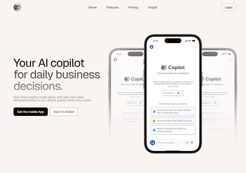
Visually, the centered layout is more appealing (UI), but left-aligned is superior for UX as it avoids unnecessary scrolling
Good point actually.
Left align shows the product pretty well.
Yup totally agree.
Center align is good
For sure.
The left side makes it much easier to appreciate the product content in a simple and clear way.
got it.
love this one
Center Align for sure. It gives the product a more authoritative, hero feel compared to the Left Align, which feels a bit more like a standard SaaS template.
The network for creativity
Join 1.25M professional creatives like you
Connect with clients, get discovered, and run your business 100% commission-free
Creatives on Contra have earned over $150M and we are just getting started
Trending
Claude
Claude has entered the design space. How are you using Claude Design?
Contra University
Learn from expert creatives how to earn more using next-gen AI tools.
creativeaiflow
Creative AI workflows are evolving. What tools do you use, and what are their strengths and weaknesses?
portfolioreview
The best portfolios tell a story, not just show a grid. Share yours for feedback.
freelancerlife
Freelancer life is wins, pivots, and everything in between. What’s yours right now?