The network for creativity
Join 1.25M professional creatives like you
Connect with clients, get discovered, and run your business 100% commission-free
Creatives on Contra have earned over $150M and we are just getting started
Back to feedPost
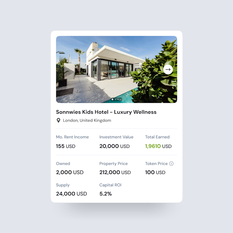
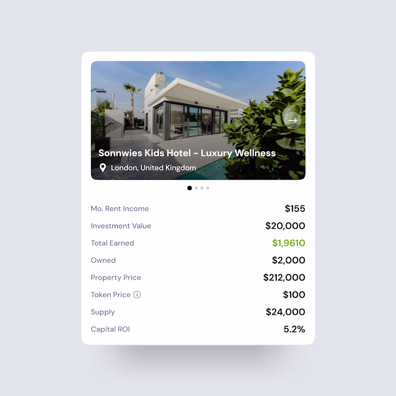
Taste Test
Exploring two ways to present property investment data
Both designs show the same information, but the layout & hierarchy tell very different stories.
One focuses on visual impact, the other on structured clarity.
Which one would you trust more as an investor?
Cast your vote 👇
2 voted
100%
0 voted
0%
2 votes
Closed
Both designs looks awesome Dhruvik 🙌
Visual-First Card shows the data in more structured and engaging way.
Yes! Thanks for sharing your view.
The network for creativity
Join 1.25M professional creatives like you
Connect with clients, get discovered, and run your business 100% commission-free
Creatives on Contra have earned over $150M and we are just getting started
Trending
Claude
Claude has entered the design space. How are you using Claude Design?
Contra University
Learn from expert creatives how to earn more using next-gen AI tools.
fifaworldcup2026
The World Cup is here and the whole world's watching. How are you designing for the world stage?
creativeaiflow
Creative AI workflows are evolving. What tools do you use, and what are their strengths and weaknesses?
freelancerlife
Freelancer life is wins, pivots, and everything in between. What’s yours right now?