The network for creativity
Join 1.25M professional creatives like you
Connect with clients, get discovered, and run your business 100% commission-free
Creatives on Contra have earned over $150M and we are just getting started
Back to feedPost
Taste Test
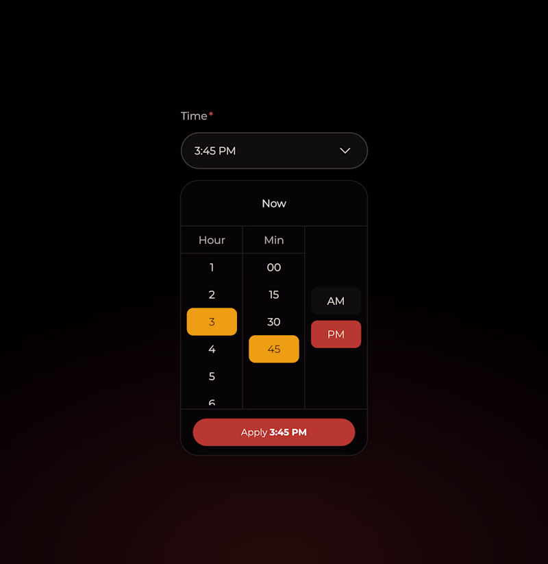
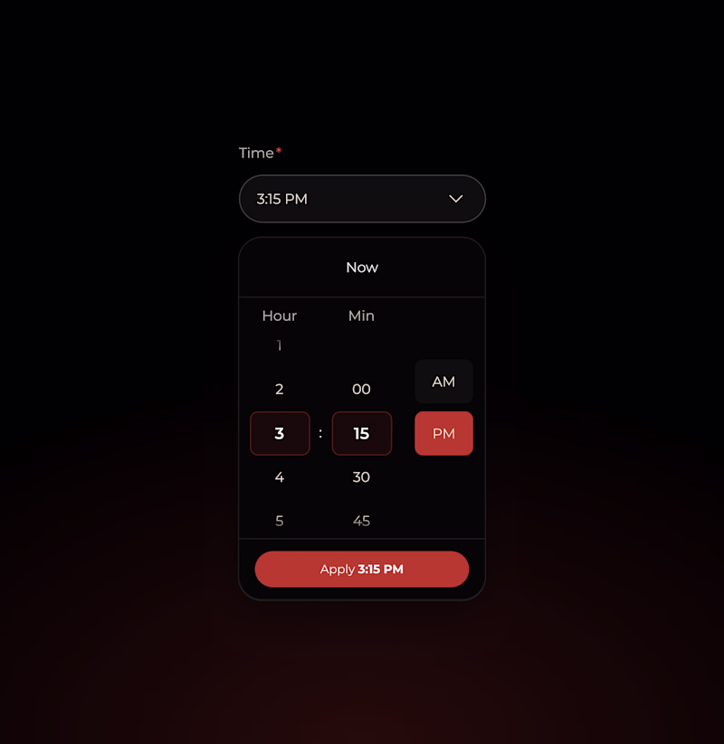
Hi folks! I would love to know your preference on these for a dropdown menu on desktop for a time picker (that scales well to mobile)
A: scroll + click with selected state
B: scroll + click-to-snap rolodex
1 voted
17%
5 voted
83%
6 votes
Closed
I chose option B, but both look good
thank you!
Definitely leaning toward the second option. It subtly highlights the selected hour and minute, which keeps the focus where it matters. Option A feels a bit too distracting. The orange selections are competing for attention
thanks so much for your feedback!
Both design seems awesome Jana 🙌
The Time Picker B looks more eye pleasing 🔥
i'm leaning towards this one as well, thank you!
Yeah 😊
B 😍
Time Picker B is a great choice because it offers a much more tactile and intuitive experience that translates seamlessly from desktop to mobile.
The network for creativity
Join 1.25M professional creatives like you
Connect with clients, get discovered, and run your business 100% commission-free
Creatives on Contra have earned over $150M and we are just getting started
Trending
Claude
Claude has entered the design space. How are you using Claude Design?
Contra University
Learn from expert creatives how to earn more using next-gen AI tools.
MagicPath
The canvas is infinite, and exploration is becoming the workflow. How are you using MagicPath?
creativeaiflow
Creative AI workflows are evolving. What tools do you use, and what are their strengths and weaknesses?
freelancerlife
Freelancer life is wins, pivots, and everything in between. What’s yours right now?