The network for creativity
Join 1.25M professional creatives like you
Connect with clients, get discovered, and run your business 100% commission-free
Creatives on Contra have earned over $150M and we are just getting started
Back to feedPost
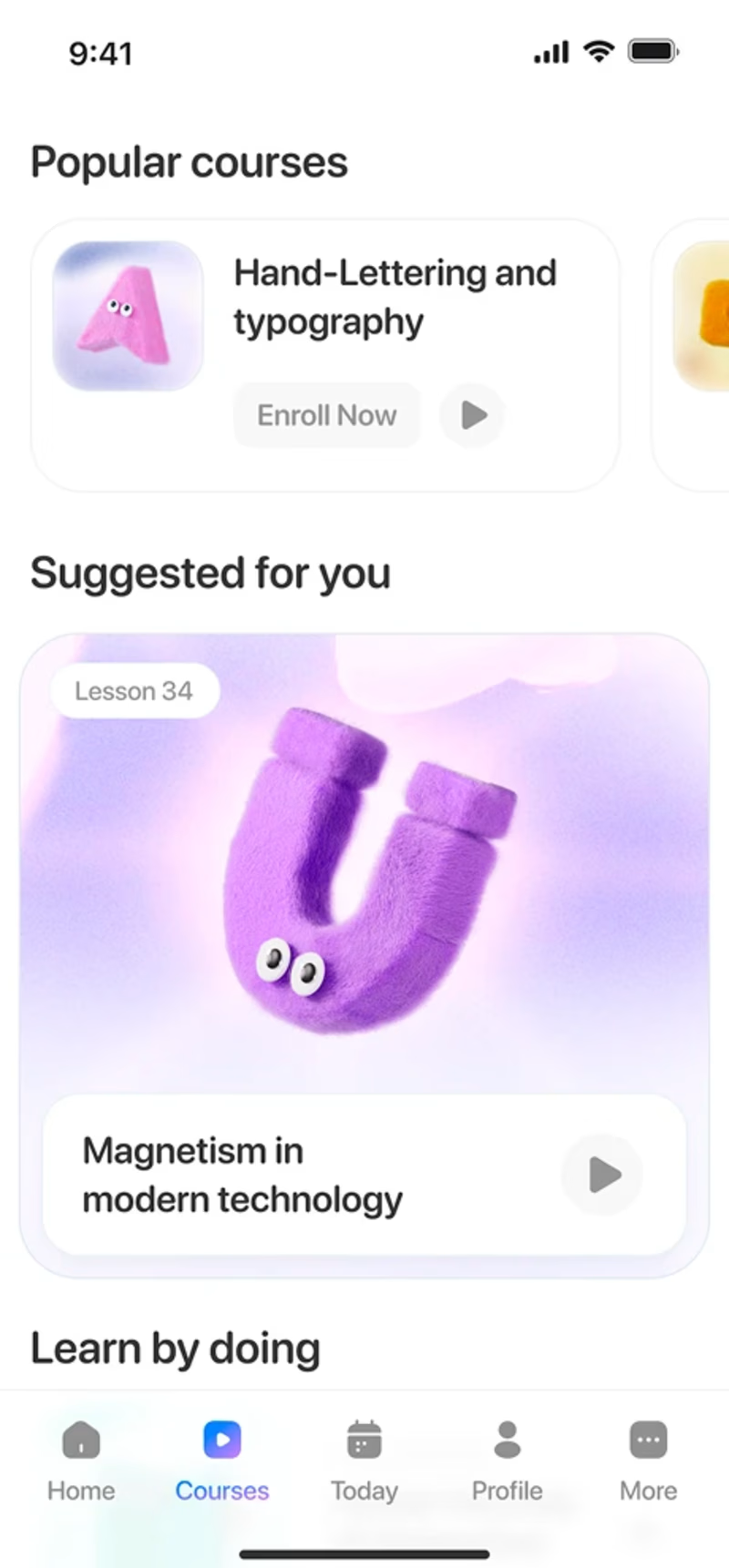
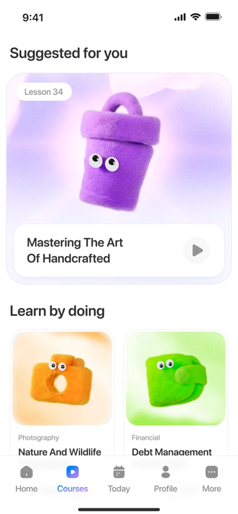
Taste Test
Quick UI vote 👀👇
I’m comparing two UI options for an e-learning app and can’t decide which one works better.
👉 UIA or UI B — which would you pick and why?
Drop your vote (A or B) in the comments, and feel free to share any quick thoughts or feedback. Thanks!
2 voted
100%
0 voted
0%
2 votes
Closed
@Marcos Jova I prefer B because the large, centered feature card for Suggested for you creates a much stronger focal point that immediately engages the user
The network for creativity
Join 1.25M professional creatives like you
Connect with clients, get discovered, and run your business 100% commission-free
Creatives on Contra have earned over $150M and we are just getting started
Trending
Claude
Claude has entered the design space. How are you using Claude Design?
Contra University
Learn from expert creatives how to earn more using next-gen AI tools.
creativeaiflow
Creative AI workflows are evolving. What tools do you use, and what are their strengths and weaknesses?
portfolioreview
The best portfolios tell a story, not just show a grid. Share yours for feedback.
freelancerlife
Freelancer life is wins, pivots, and everything in between. What’s yours right now?