The network for creativity
Join 1.25M professional creatives like you
Connect with clients, get discovered, and run your business 100% commission-free
Creatives on Contra have earned over $150M and we are just getting started
Back to feedPost
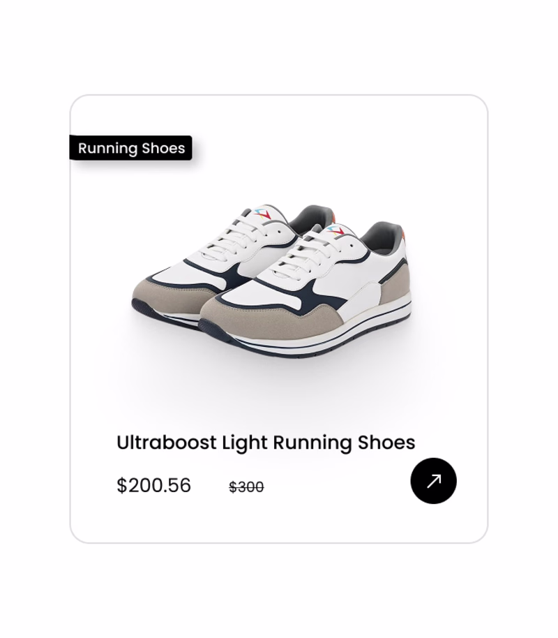
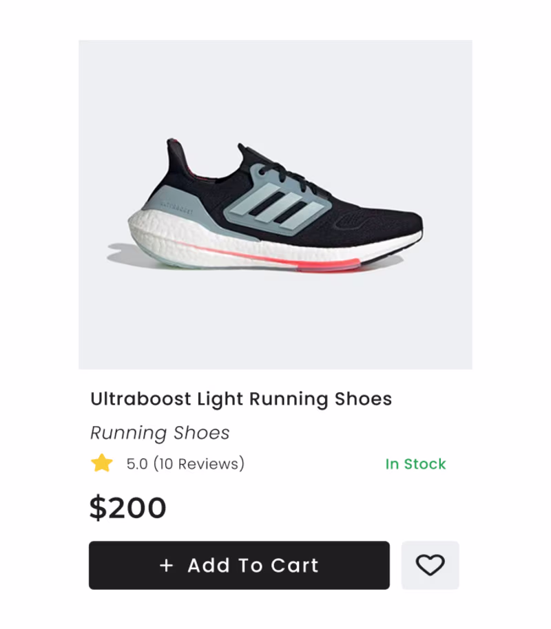
Taste Test
Exploring how UI changes perception
I designed two product cards for a shoe brand —
each follows a different UX logic & visual hierarchy.
Which one feels more usable + premium to you?
⬅️ A or ➡️ B
0 voted
0%
6 voted
100%
6 votes
Closed
I liked Option 2😍
2 feels good.
I prefer Option 2 layout product card because the vertical stacking creates a much more balanced visual hierarchy, making the Add To Cart button and pricing information feel primary and accessible.
By placing the key action items directly below the product name, the design guides...
yes 💯
The network for creativity
Join 1.25M professional creatives like you
Connect with clients, get discovered, and run your business 100% commission-free
Creatives on Contra have earned over $150M and we are just getting started
Trending
Runway
AI video generation is exploding. What are you dreaming up in Runway?
Contra University
Learn from expert creatives how to earn more using next-gen AI tools.
creativeaiflow
Creative AI workflows are evolving. What tools do you use, and what are their strengths and weaknesses?
portfolioreview
The best portfolios tell a story, not just show a grid. Share yours for feedback.
freelancerlife
Freelancer life is wins, pivots, and everything in between. What’s yours right now?