The network for creativity
Join 1.25M professional creatives like you
Connect with clients, get discovered, and run your business 100% commission-free
Creatives on Contra have earned over $150M and we are just getting started
Back to feedPost
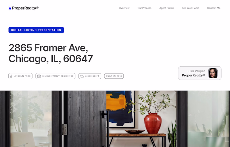
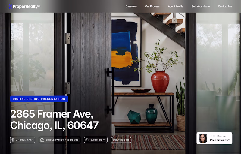
Taste Test
Hero section exploration underway for my upcoming Framer real estate template 👀
Which layout catches your eye?👇
2 voted
33%
4 voted
67%
6 votes
Closed
Thanks for the input, Taha! I'll try that, but I don't want to overdo it with blur, lol.
I currently have a linear gradient fill with 55% opacity. I'll bump it up a bit, which should make the tags stand out more.
Hi Faris, is this Hero section for the vertical apartment page or the homepage of the site?
I would go with the Withe Space/Image for the apartment page and the Full Image for the hypothetical hero of the Homepage.
Nice work
p.s. I don't see any CTA's in the Hero, is it your choice?
Hi Andrea, Thanks for your vote! The hero sections are for the homepage. The idea behind the template is a single-page microsite for the listing – kinda like a pitch deck, but digital.
I felt there was no need for the CTA here, since the user would scroll down, but I might...
The network for creativity
Join 1.25M professional creatives like you
Connect with clients, get discovered, and run your business 100% commission-free
Creatives on Contra have earned over $150M and we are just getting started
Trending
Claude
Claude has entered the design space. How are you using Claude Design?
Contra University
Learn from expert creatives how to earn more using next-gen AI tools.
MagicPath
The canvas is infinite, and exploration is becoming the workflow. How are you using MagicPath?
creativeaiflow
Creative AI workflows are evolving. What tools do you use, and what are their strengths and weaknesses?
freelancerlife
Freelancer life is wins, pivots, and everything in between. What’s yours right now?