The network for creativity
Join 1.25M professional creatives like you
Connect with clients, get discovered, and run your business 100% commission-free
Creatives on Contra have earned over $150M and we are just getting started
Back to feedPost
Taste Test
What version do you think works better here?
30 voted
77%
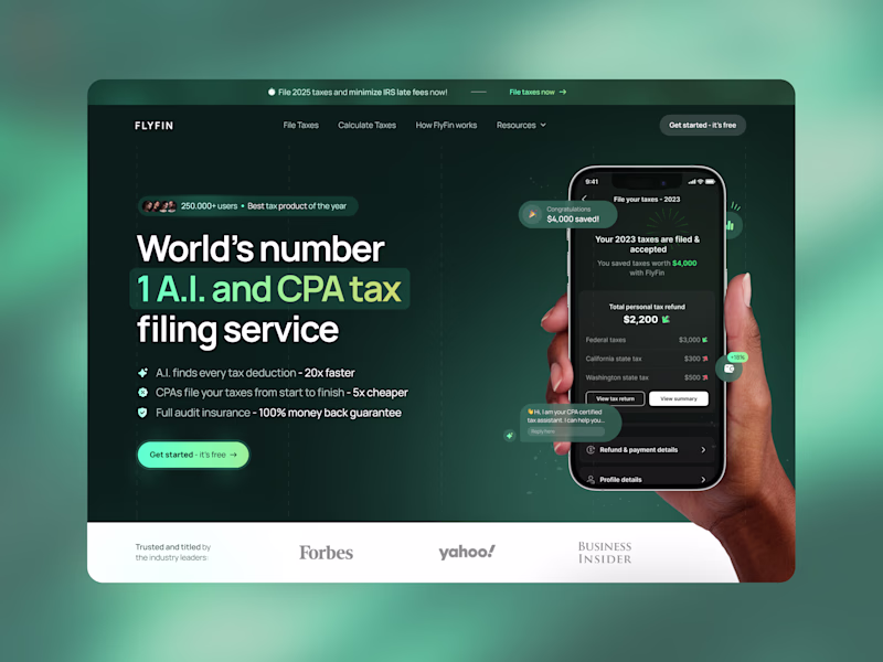
9 voted
23%
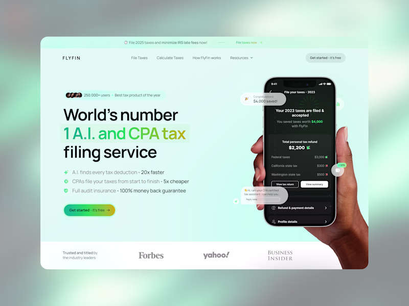
39 votes
Closed
I rarely vote for dark, this is it. Dark it is.
Loved the dark one.
Dark mode makes everything stand out more here!
Dark version, no doubt - much better visual hierarchy
Dark feels more ‘serious money’, light feels more ‘friendly fintech’. For taxes, I’d probably ship dark and test light on marketing pages
Both are good but am voting for dark
Dark is better in terms of visibility and grabbing instant atrraction.
Like both of them. Not a fan of CTA gradient in light. gotta go with dark!
the contrast of the colors and visual hierarchy is better on the dark mode
The dark mode looks way better and more "corporate" than the light one
I prefer the dark mode👍
The network for creativity
Join 1.25M professional creatives like you
Connect with clients, get discovered, and run your business 100% commission-free
Creatives on Contra have earned over $150M and we are just getting started
Trending
Claude
Claude has entered the design space. How are you using Claude Design?
Contra University
Learn from expert creatives how to earn more using next-gen AI tools.
fifaworldcup2026
The World Cup is here and the whole world's watching. How are you designing for the world stage?
creativeaiflow
Creative AI workflows are evolving. What tools do you use, and what are their strengths and weaknesses?
freelancerlife
Freelancer life is wins, pivots, and everything in between. What’s yours right now?