The network for creativity
Join 1.25M professional creatives like you
Connect with clients, get discovered, and run your business 100% commission-free
Creatives on Contra have earned over $150M and we are just getting started
Back to feedPost
Taste Test
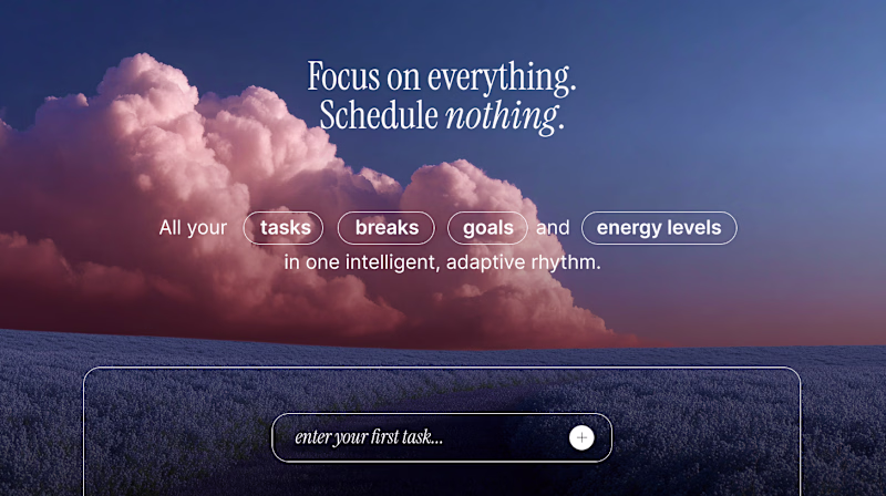
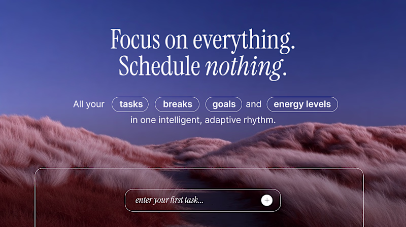
I'd prefer B
I recommend using a gradient background to enhance text contrast and improve overall readability within the design.
great option
Thanks
I would go for A with the background image from B... maybe shifted a little further down so it breathes better
Love the feedback, thank you!
hard to decide
Better guidance on the B one
The background image from A but the sizing layout of B! 👀
Sweet! Love the feedback Julia!
Both are gorgeous, but B feels more focused. The softer foreground keeps the headline readable while still selling that dreamy ‘no scheduling’ vibe
Yes, felt the same way!
to be honest, neither one. i think it feels too busty for how simple it actually is. the idea is simple but there's just too much going on there. what do u think
thanks for the feedback
you're welcome
B but i think there's not enough type hierarchy here. What do you want the users to focus on first? I do like the background of option B.
great feedback, thank you... where did you focus first?
I focused on the first paragraph first but i was distracted by the next set of components
Good feedback, thanks
Thank you
I prefer B 🔥
A is beautiful but B is more clear to the user.
Both are amazing, but I prefer option A because it has more balance and it is more easy to look at.
The network for creativity
Join 1.25M professional creatives like you
Connect with clients, get discovered, and run your business 100% commission-free
Creatives on Contra have earned over $150M and we are just getting started
Trending
Claude
Claude has entered the design space. How are you using Claude Design?
Contra University
Learn from expert creatives how to earn more using next-gen AI tools.
MagicPath
The canvas is infinite, and exploration is becoming the workflow. How are you using MagicPath?
creativeaiflow
Creative AI workflows are evolving. What tools do you use, and what are their strengths and weaknesses?
freelancerlife
Freelancer life is wins, pivots, and everything in between. What’s yours right now?