The network for creativity
Join 1.25M professional creatives like you
Connect with clients, get discovered, and run your business 100% commission-free
Creatives on Contra have earned over $150M and we are just getting started
Back to feedPost
Taste Test
I'm revising my Framer-rejected template. I believe this is the right time to address it.
What are your thoughts on the Hero options?

4 voted
50%
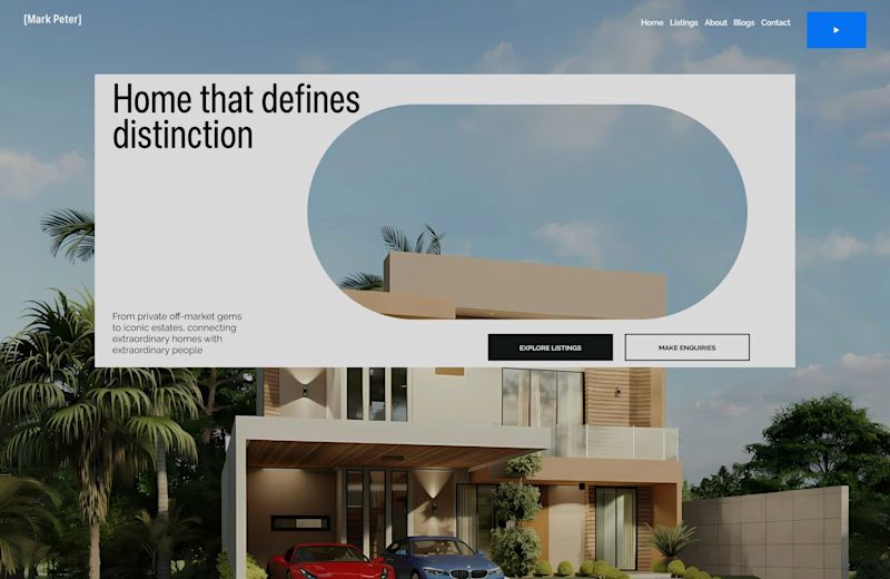
4 voted
50%
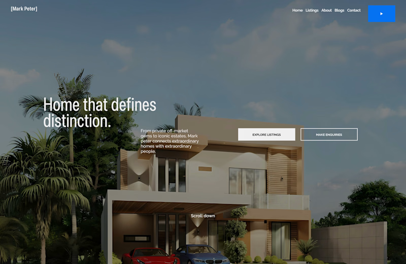
8 votes
Closed

Option A looks pretty nice!

Thank you😊!

Option A looks unique
Thank you😊!

i feel the first option was the color contrast i can barely see the text cause the bg image is taking away the focus from whats important then for option 2 i still feel like the white fill also is taking alot of focus ...we should see design beyond looking pretty but if i was to...
Impressive! Thank you for your feedback
The network for creativity
Join 1.25M professional creatives like you
Connect with clients, get discovered, and run your business 100% commission-free
Creatives on Contra have earned over $150M and we are just getting started





