The network for creativity
Join 1.25M professional creatives like you
Connect with clients, get discovered, and run your business 100% commission-free
Creatives on Contra have earned over $150M and we are just getting started
Back to feedPost
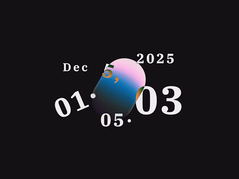
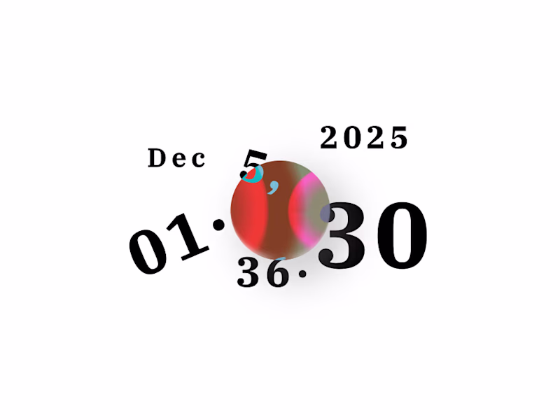
Taste Test
🟨 Submitting this Typographic Clock as a Framer component tomorrow. Would love some advice on the thumbnail; which do you think works best?
34 voted
68%
16 voted
32%
50 votes
Closed
Both look amazing, but light definitely highlights the date better. Either way, love this!!
Thanks Julia. Fan of the light one too. 😊
although i love dark mode everywhere, this time light mode looking amazing actually, nice work
Thanks @Zaoui Ali youcef , I have always been a fan of light theme but I know dark theme is more marketable.
Thanks Kalkidan
looks good
Thanks Jesse 🙂
Good
nice
Thanks arbaz
Thanks karthik
Why not adding dark mode to the white one. Users can always switch between modes.
They can, but this is just for a vote for thumbnail :)
Oh cool
Are you participating in the tempo AI challenge?
good work
Dark mode wins always.
The network for creativity
Join 1.25M professional creatives like you
Connect with clients, get discovered, and run your business 100% commission-free
Creatives on Contra have earned over $150M and we are just getting started
Trending
Claude
Claude has entered the design space. How are you using Claude Design?
Contra University
Learn from expert creatives how to earn more using next-gen AI tools.
creativeaiflow
Creative AI workflows are evolving. What tools do you use, and what are their strengths and weaknesses?
portfolioreview
The best portfolios tell a story, not just show a grid. Share yours for feedback.
freelancerlife
Freelancer life is wins, pivots, and everything in between. What’s yours right now?