The network for creativity
Join 1.25M professional creatives like you
Connect with clients, get discovered, and run your business 100% commission-free
Creatives on Contra have earned over $150M and we are just getting started
Back to feedPost
Taste Test

This is the homescreen for a medical practice management app. Waiting for client to get back to me about the colors but what do you think looks better? Green or Orange?
4 voted
67%
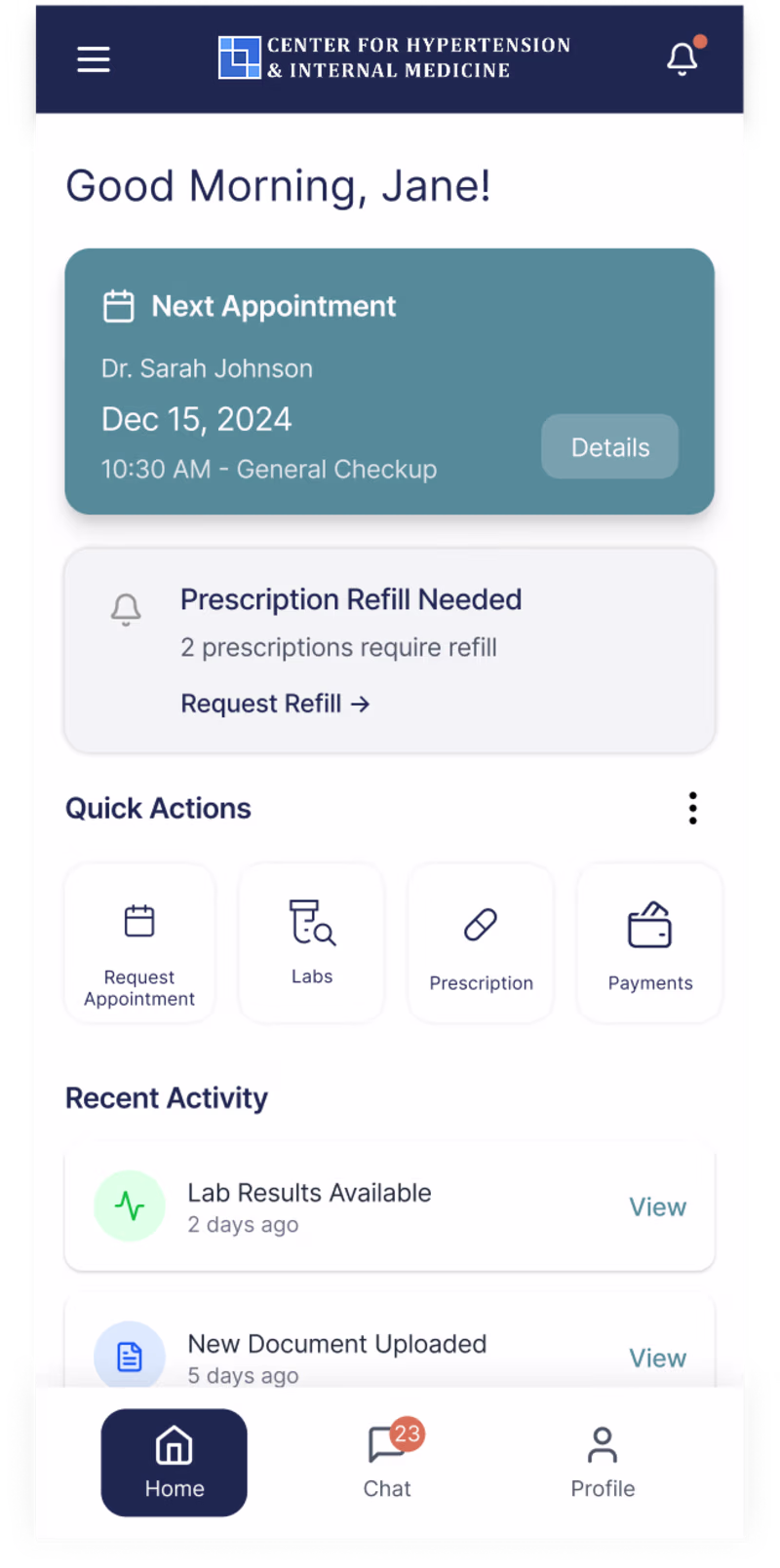
2 voted
33%
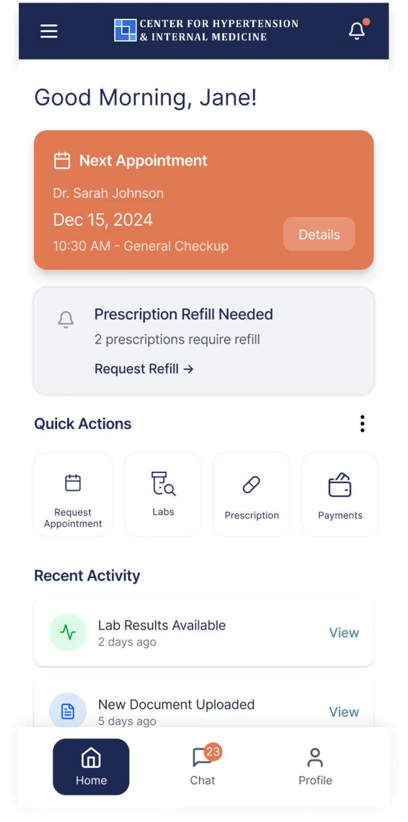
6 votes
Closed

Both options are good👍

Fantastic job!!

Considering current color theories, the orange may cause some confusion or anxious feelings for users, since it's often (but not always!) associated with destructive actions. I think the blue/green is a much more accessible (and pleasant) color.
Thank you! this is helpful!
The network for creativity
Join 1.25M professional creatives like you
Connect with clients, get discovered, and run your business 100% commission-free
Creatives on Contra have earned over $150M and we are just getting started


Trending


FLORA
Reusable workflows are replacing one-off prompts in creative AI. Share what you're building in FLORA.

Contra University
Learn from expert creatives how to earn more using next-gen AI tools.
creativeaiflow
Creative AI workflows are evolving. What tools do you use, and what are their strengths and weaknesses?
portfolioreview
The best portfolios tell a story, not just show a grid. Share yours for feedback.
freelancerlife
Freelancer life is wins, pivots, and everything in between. What’s yours right now?