The network for creativity
Join 1.25M professional creatives like you
Connect with clients, get discovered, and run your business 100% commission-free
Creatives on Contra have earned over $150M and we are just getting started
Back to feedPost
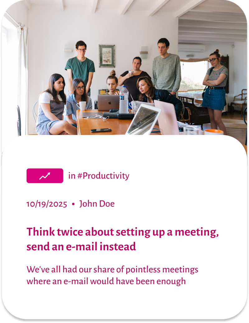
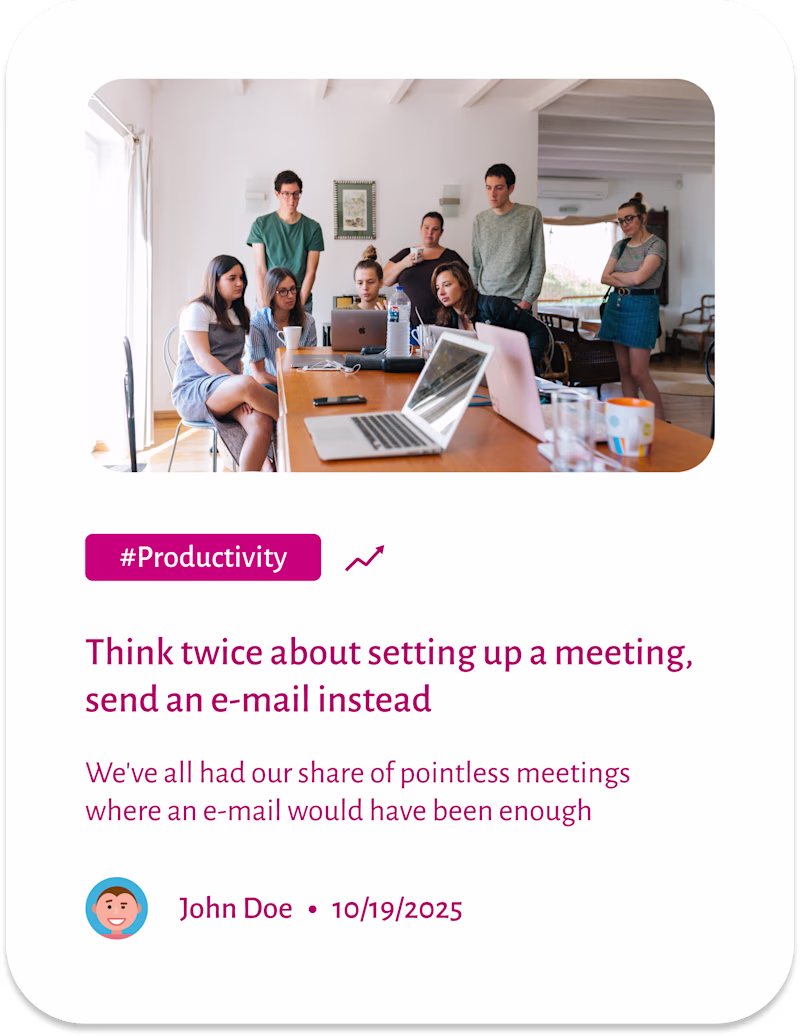
Taste Test
I'm currently designing article cards. Which one is more visually engaging for you?
Feedback is always welcome! 🙏
1 voted
14%
6 voted
86%
7 votes
Closed
I prefer the right one. Maybe try using pink only for the card header, then black for the heading and light gray for the body text. Adding a little padding around the card would also make it feel cleaner.
That's a good suggestion, Fedir. Thank you so much!
Fantastic job!!
Thank you, Nedjar
The network for creativity
Join 1.25M professional creatives like you
Connect with clients, get discovered, and run your business 100% commission-free
Creatives on Contra have earned over $150M and we are just getting started
Trending
Claude
Claude has entered the design space. How are you using Claude Design?
Contra University
Learn from expert creatives how to earn more using next-gen AI tools.
fifaworldcup2026
The World Cup is here and the whole world's watching. How are you designing for the world stage?
creativeaiflow
Creative AI workflows are evolving. What tools do you use, and what are their strengths and weaknesses?
freelancerlife
Freelancer life is wins, pivots, and everything in between. What’s yours right now?