The network for creativity
Join 1.25M professional creatives like you
Connect with clients, get discovered, and run your business 100% commission-free
Creatives on Contra have earned over $150M and we are just getting started
Back to feedPost
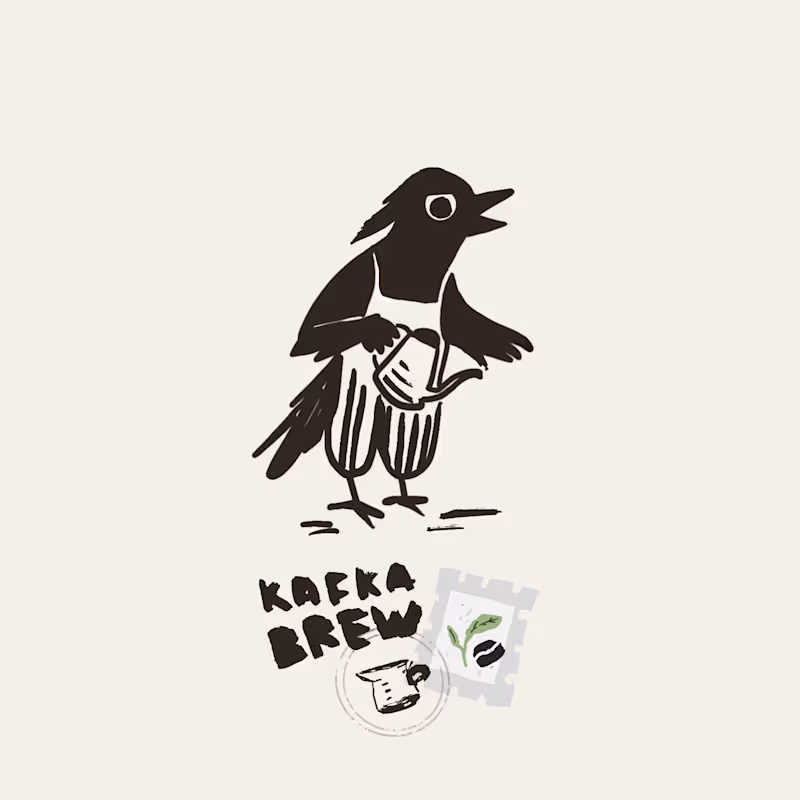
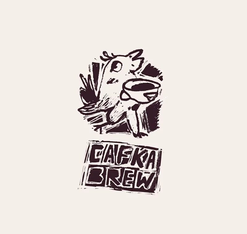
Taste Test
Which creative direction is more promising?
Cafka Brew is an alternative coffee roastery with a degustation cafe. The brand centers on Cafka, a Polish raven (“kruk”), that always hunting for exceptional beans.
Archetype: Trickster-Guide ( smart, playful and non traditional)
124 voted
67%
62 voted
33%
186 votes
Closed

Both are brilliant, but Kafka 1 takes the cake for me. Kafka 2 has that very ‘now’ feel with a nod to 90s zine aesthetics, but Kafka 1 feels timeless. Like it’s creating its own lane outside of trends.

Both are great ! leaning towards option 2

I love both! But I find Kafka 1 easier to read, while still maintaining the 'handcrafted' look, if that makes sense 😊 Anyway, great work!

Thank you, it make sense 🙌

The first one has a stronger branding 👍
yep, thanks!

Option 1 is easier to read and understand, it’s calmer. Option 2 gives me more of the “alternative” vibe, more punk. It’s already had 4 coffees by 10am and is on it’s way to it’s 5th :)
Yes, true, the second one feels more alternative and closer to the brief, so it’s actually hard to choose 🫠
@Helen Statsevich I feel you! I really like both.
Do you know what the design of the space looks like? Might be helpful if you have some real life reference, so you can chose the one that feels more cohesive with the rest of the branding. Otherwise, I see nothing wrong with proposing the 2 options to the client and see what they say :)
@Helen Statsevich Something I just noticed: one is spelled "Cafka", the other "Kafka". Not sure if that's part of the brand identity you're working on

like kafka 1. kafka 2 is not clear enough
Yep, thank you!

Amazing work
Thank you! 😊

I'm jealous girl

thanks, got it 🙌

I will go with option 2. In the end, what matters the most is client satisfaction.
haha, thanks, it`s still exploration phase

Nice work! Love the style, personally I like where option 2 is going, but option 1 is much easier to read
Yep, totally agree, maybe will revise opt. 2 for more readability


Love the second bird
Thanks 🙌 ❤️

There could be a lot of fun to be had with Kafka Brew if you wanted to lean into the Metamorphosis.

Nice work! Love your illustrative style. I selected left, but might suggest a larger name to balance it off and letting go of the stamps. You'll get a more readable logo that works at almost any size :) You could save the stamp elements as secondary branding graphics.
Thank you, yes! Staps and naming on the lest variant is actualy not a logo, just elements explorations, confused everyone, haha
oh no worries :) its great work - look forward to seeing the final branding!
Love Option 1😍

Love the vibes of Kafka 2

#1 is far easier to read and will be more immediately recognizable. It'll look better on t-shirts and mugs and the character is more malleable (I could see it in other poses). #2 takes effort to decipher.
(As someone mentioned below, is Kafka in #1 supposed to be Cafka?)
Oh, and great work btw! 🔥 😊
yep, thanks, but seems opt. 1 is like too "safe" for the archetypy? It's still not under review will it be Cafka or Kafka, Cafka is more about cafe, but Kafka is more about polish version of "Kawa"
I think Cafka is pretty clever. :)
Option 1 is certainly safer, but the flat line on top of the eye is great at conveying a hint of mischief. As a longtime punk I like the aesthetic of #2, but I feel it leans more into death metal logo territory with regard to legibility. :)


I love them both. You are doing a great work 💪🏼
thank you ! ❤️
You are welcome Helen.
I would like to connect with you

loved the personal touch also 2nd option is what i loved the most

Kafka 1 has more clarity and I prefer it but both look very good! 😍
Thank you! 🙏

1 is easier to understand and so cute
thank you! ❤️

The first image (kafka 1)stands out to me — its simplicity makes it more visually inviting than the other.

Good work

Kafka 2 = fun but too commercial
Kafka 1 = artisan but too plain
Outcome = evolve Kafka 1 with Kafka 2’s personality

Awesome work 👍

The network for creativity
Join 1.25M professional creatives like you
Connect with clients, get discovered, and run your business 100% commission-free
Creatives on Contra have earned over $150M and we are just getting started


Trending
aivideo
AI video tools are moving at warp speed. Which ones are you experimenting with?
illustration
Handcrafted illustration is bubbling up across the web. What are you drawing lately?
aidesignflow
AI tools are redefining design work. What's your current workflow?
returntonature
Spring is a reset for creativity. What’s inspiring you outside the screen right now?
freelancerlife
Freelancer life is wins, pivots, and everything in between. What’s yours right now?