The network for creativity
Join 1.25M professional creatives like you
Connect with clients, get discovered, and run your business 100% commission-free
Creatives on Contra have earned over $150M and we are just getting started
Back to feedPost
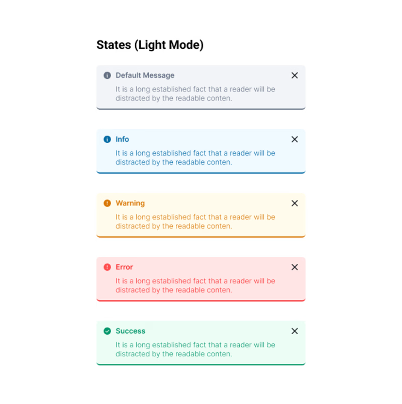
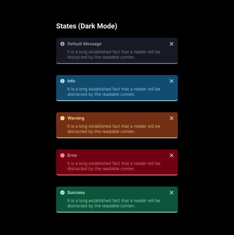
Taste Test


Hellooo everyone! I just finished standardizing the UI Alert stats for a product design project. What do you think? And which mode do you prefer?
My personal favorite is always Light mode. 😄
29 voted
63%
17 voted
37%
46 votes
Closed

I didn’t choose because both of them are great.👍

Hehe Ty 💯

For this one, light mode is better 👍
Dark mode stands out much more when it’s shown in a real UI context with the surrounding elements, trust me 😄
Dark, always choose dark mode.
Light or Dark mode, the eternal debate with a million different opinions 🧠

I love them both
Thank you, I’m really glad you like it!

Thank you!
Both looks Awesome! You got a GOAT!
Thank you very much!
Dark mode🔥
Ty 🔥

Your light mode looks nice, but I love what you did with the dark mode.
Thanks mate
Nice design bro.

I think dark mode feels more substantial - the bottom border on the light mode is throwing everything off, its too heavy in comparison to the surface.
Curious - do these all pass contrast checks? Some feel very difficult to read myself and I don't have low vision. Plus it might...
Sam, thanks a lot for this comment! I’m really glad you like the dark version. Regarding the border, I wouldn’t fully agree, the border is there for a reason, to create a certain balance in the overall design, especially since these “messages” are used frequently.
About the...
Thank you Nimra!

Looks great! Always a light mode lover
Ty 😊

Impressive design
Thanks

Thank you so much, and I completely agree with you. I just had to create a palette where the developer only needs to invert the colors when switching themes, instead of dealing with a thousand variations, that was one of the goals. So the dark theme suffers a bit compared to the light theme :D

I always prefer light mood, but this time I love both of them.
The network for creativity
Join 1.25M professional creatives like you
Connect with clients, get discovered, and run your business 100% commission-free
Creatives on Contra have earned over $150M and we are just getting started


Trending
aivideo
AI video tools are moving at warp speed. Which ones are you experimenting with?
returntonature
Spring is a reset for creativity. What’s inspiring you outside the screen right now?
aidesignflow
AI tools are redefining design work. What's your current workflow?
freelancerlife
Freelancer life is wins, pivots, and everything in between. What’s yours right now?
allthingsmetal
Metal is having a design moment – from chrome to gates and grates. What designs are you forging?