The network for creativity
Join 1.25M professional creatives like you
Connect with clients, get discovered, and run your business 100% commission-free
Creatives on Contra have earned over $150M and we are just getting started
Back to feedPost
Taste Test

What waitlist screen do you like the most?
140 voted
50%
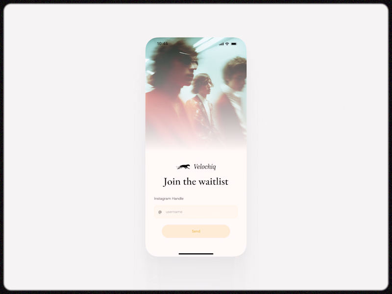
140 voted
50%
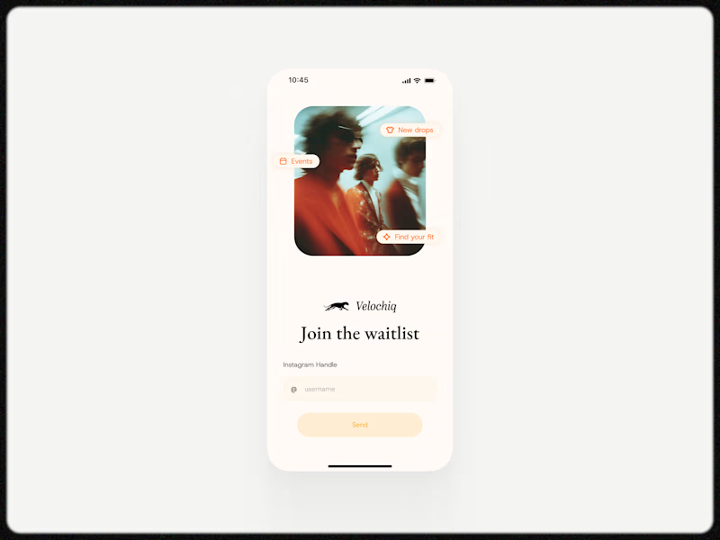
280 votes
Closed

Option 2 seems the right one to me 🔥

I didn’t choose because both of them are great.

Ill go with Option 2

Why?

More white, probably.

They both look good, but I prefer the first one

Option 2 looks great.

I will go with option 2 because it gives me more context for the waitlist

I am all for full imagery whether on mobile or print. It's just my personal opinion. not fan of the gradient. It really doesn't do anything. It distracts from the the great image!
Now let me in to join :)

Option 2 looks nice

Love both of them, but the option 1 feels more like an experience

Option 2 has an increased opacity which makes it look sharper. Well done.

Option 2 just look better

Definitely option 2. It's much cleaner and if I assume right, brand composition shown on the image looks sharp. In opposite, Option 1 and opacity mask you used feels dirty and out of brand (if any)

I voted for Option 2- it clearly highlights the waitlist for notifications about Find Your Fit, events, and new drops, which makes it a lot more engaging. Option 1 feels more like a usual subscription list. 👍😊

The 2nd one looks attractive and the simple


I went with option 2. I felt that option 1 might lead to people getting distracted and not returning to join the waitlist, which would defeat the purpose of the screen. Adding the additional options, such as events, after they’ve submitted their details might be a better way to...

Option 2

With the gradient is so better, but I would make it even smoother. I can see that rough edge… but it looks better anyway! Nice work!

No. 1

I love the simplicity of option 2

1 feels more dreamy

Yes
The network for creativity
Join 1.25M professional creatives like you
Connect with clients, get discovered, and run your business 100% commission-free
Creatives on Contra have earned over $150M and we are just getting started


Trending
maxearnings
The next frontier of payments is live on Contra. How are you maximizing revenue?
freelancerlife
Freelancer life is wins, pivots, and everything in between. What’s yours right now?
aidesignflow
AI tools are redefining how designer work. What does your workflow look like?
micrographics
Micrographics started as utility - barcodes, packaging, instruction labels. How would you use them?
aivideo
AI video tools are moving at warp speed. What tools are you using?