The network for creativity
Join 1.25M professional creatives like you
Connect with clients, get discovered, and run your business 100% commission-free
Creatives on Contra have earned over $150M and we are just getting started
Back to feedPost
Taste Test
Online education platform UXUI Design.
Which version you prefer?
1 voted
25%
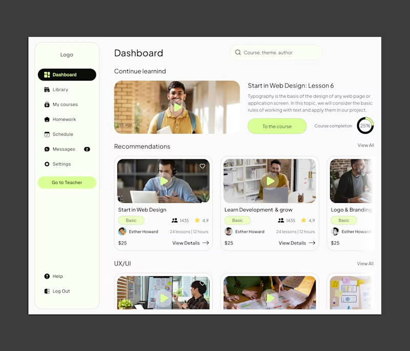
3 voted
75%
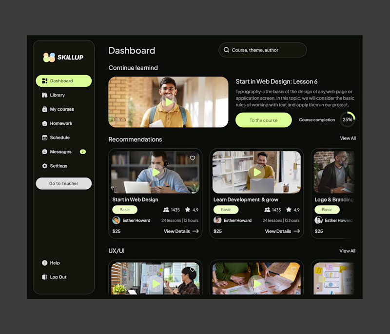
4 votes
Closed

I’d ship the light version as default, cleaner hierarchy, easier on the eyes for long study sessions, and better for mixed lighting environments and then offer the dark theme as a toggle

Thank you for your opinion mate. I also think lighter version works better. But some of my team member voted for dark one. Waiting for client's feedback😊

Thank you

Glad to see you Nizam, Black would be good option. ♥️
Thank you MATE.
The network for creativity
Join 1.25M professional creatives like you
Connect with clients, get discovered, and run your business 100% commission-free
Creatives on Contra have earned over $150M and we are just getting started





