The network for creativity
Join 1.25M professional creatives like you
Connect with clients, get discovered, and run your business 100% commission-free
Creatives on Contra have earned over $150M and we are just getting started
Back to feedPost
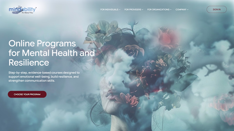
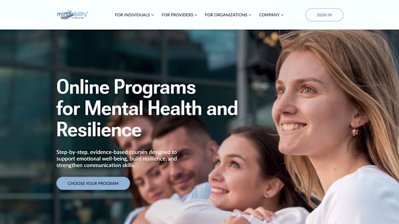
Taste Test


We’re redesigning a full website for a client in the mental-health & resilience space - and we started by exploring two very different concepts.
Option 1 - Airy, uplifting, unconventional
Option 2 - Classic, professional, grounded
Which direction feels more aligned to you?
75 voted
40%
114 voted
60%
189 votes
Closed


I voted option 2, it’s clean and clear, aligned with the brand style (based on their vertical and logo), and what I would expect from a mental health service.
What was in the brief? What is their audience and ideal client?
Option 2 feels like a rebranding, have they mentioned...

If I'm looking for mental health help, I want something that looks grounding, not what looks like someone's brain exploding.


funny man 👍

It depends on the target but for me mental health is more structured and need grounding, even is the unconventional is astonishing !
lovely

Option 2 - keep it human and relatable.

I’m leaning toward Option 2 — the classic, professional, and grounded direction. It feels more centered on the users themselves, conveys a stronger sense of trust, and aligns well with the supportive, people-focused nature of mental-health and resilience work.

i will go with option 1

The message in option 2 is bold and clear, which is essential for attention-grabbing and can yield result

Perfect visualization, great work!


Great work

the first option doesnt look clear like option b


I think the first one is more inviting and relaxed than the second

I like both, but option one feels more youthful and creative. I actually think a lot of people would be looking for that these days with mental health. Less conventional seems like they would be able to understand you more.

Both look great

Option 2 is better

Option 2 is a better option. It's welcoming and soothing cos of the imagery. Option 1 looks chaotic and also imaginative

option 2 for me it's more readable and catches my eye more


Option 1 is much better

Option 1 is too dramatic. Option 2 is really positive and sends a message of hope. More human.


I voted for #2!
From a personal or a user perspective, I'd most likely be feeling vulnerable and looking for ressources.
Familiarity with the usual designs from this type of service would make me feel safer and more confident in my actions.
Subconsciously, this confidence...

Its looks so good

Option 2 speaks best to non-designer. option 1 is arty and speaks more to Contra's audience without context. No surprise why Option 2 is the most efficient for the target

Option 2 has not enough contrast on the paragraph part.

Option 2 is much more relaxing in my opinion, portrays serenity more
The network for creativity
Join 1.25M professional creatives like you
Connect with clients, get discovered, and run your business 100% commission-free
Creatives on Contra have earned over $150M and we are just getting started
Trending
maxearnings
The next frontier of payments is live on Contra. How are you maximizing revenue?
freelancerlife
Freelancer life is wins, pivots, and everything in between. What’s yours right now?
aidesignflow
AI tools are redefining how designer work. What does your workflow look like?
micrographics
Micrographics started as utility - barcodes, packaging, instruction labels. How would you use them?
aivideo
AI video tools are moving at warp speed. What tools are you using?