The network for creativity
Join 1.25M professional creatives like you
Connect with clients, get discovered, and run your business 100% commission-free
Creatives on Contra have earned over $150M and we are just getting started
Back to feedPost
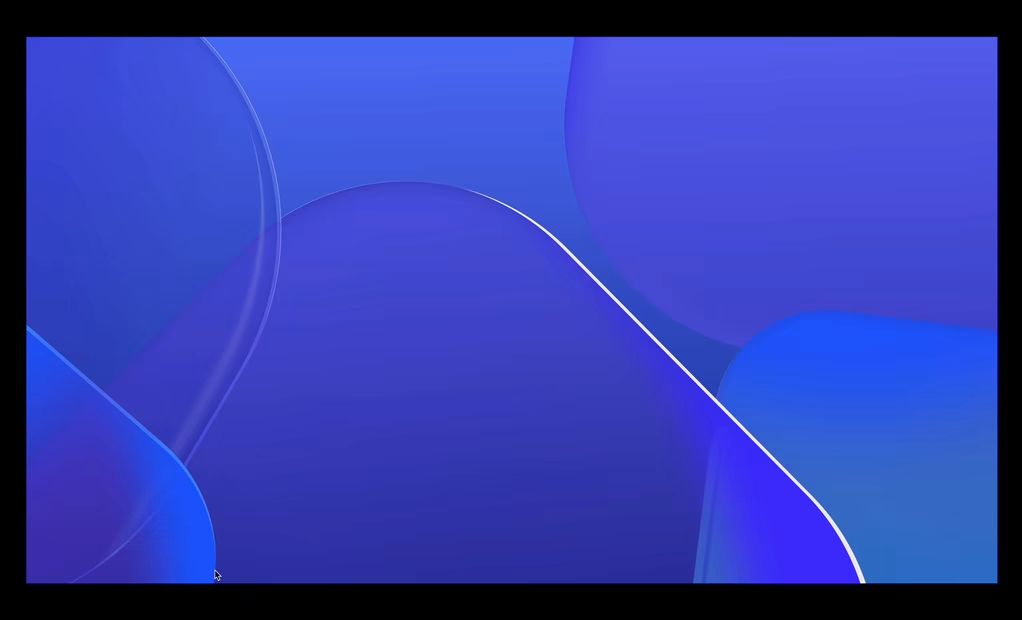
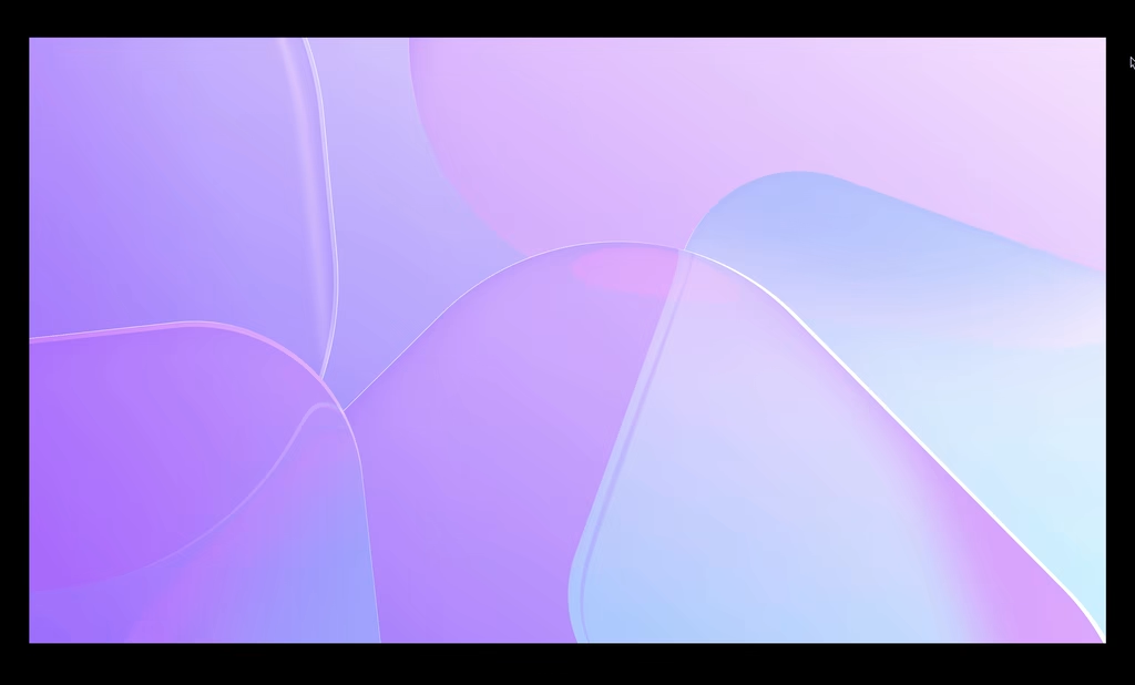
Taste Test
Running this quick visual test 👀
Same pitch deck, different Figma glass-effect animation.
You know the drill, which one do you prefer, drop your vote 👇
2 voted
22%
7 voted
78%
9 votes
Closed
great work
This is a critical visual test; the glass effect sets the entire mood for the pitch deck's professionalism.
Which version do you feel is more effective at directing attention to the main header/title of the slide?
That's the great debate, right... Although the elements might be the same, one might be more in link with the rest of the content than the other...
The network for creativity
Join 1.25M professional creatives like you
Connect with clients, get discovered, and run your business 100% commission-free
Creatives on Contra have earned over $150M and we are just getting started
Challenges
View allTrending
Claude
Claude has entered the design space. How are you using Claude Design?
Contra University
Learn from expert creatives how to earn more using next-gen AI tools.
fifaworldcup2026
The World Cup is here and the whole world's watching. How are you designing for the world stage?
creativeaiflow
Creative AI workflows are evolving. What tools do you use, and what are their strengths and weaknesses?
freelancerlife
Freelancer life is wins, pivots, and everything in between. What’s yours right now?