The network for creativity
Join 1.25M professional creatives like you
Connect with clients, get discovered, and run your business 100% commission-free
Creatives on Contra have earned over $150M and we are just getting started
Back to feedPost
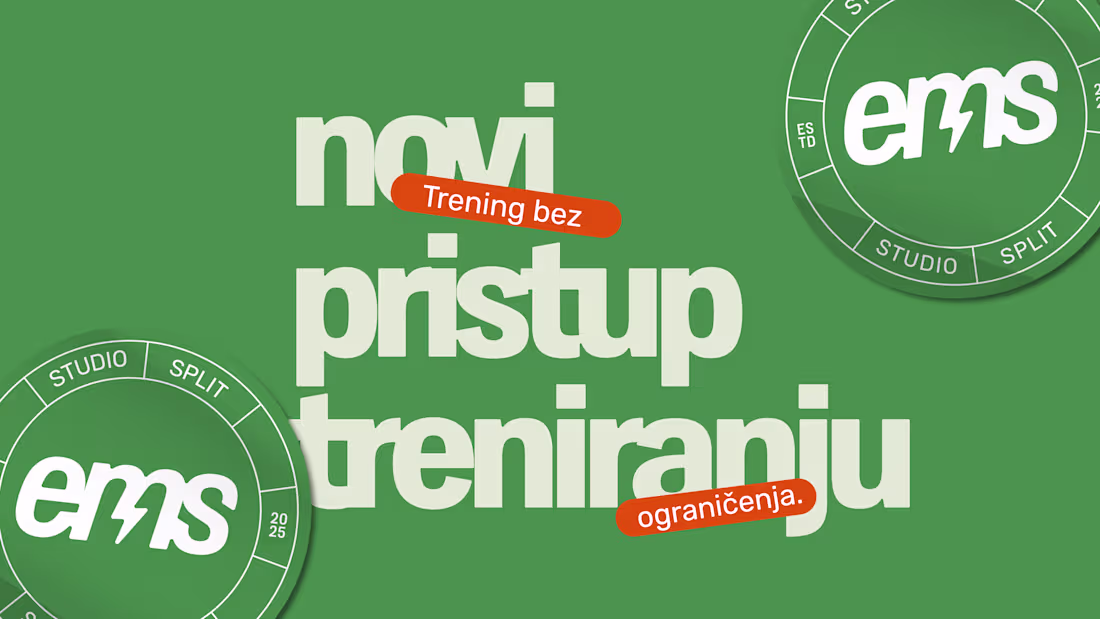
I swear, every time I see it this green, it pumps me with energy, like a visual shot of espresso.
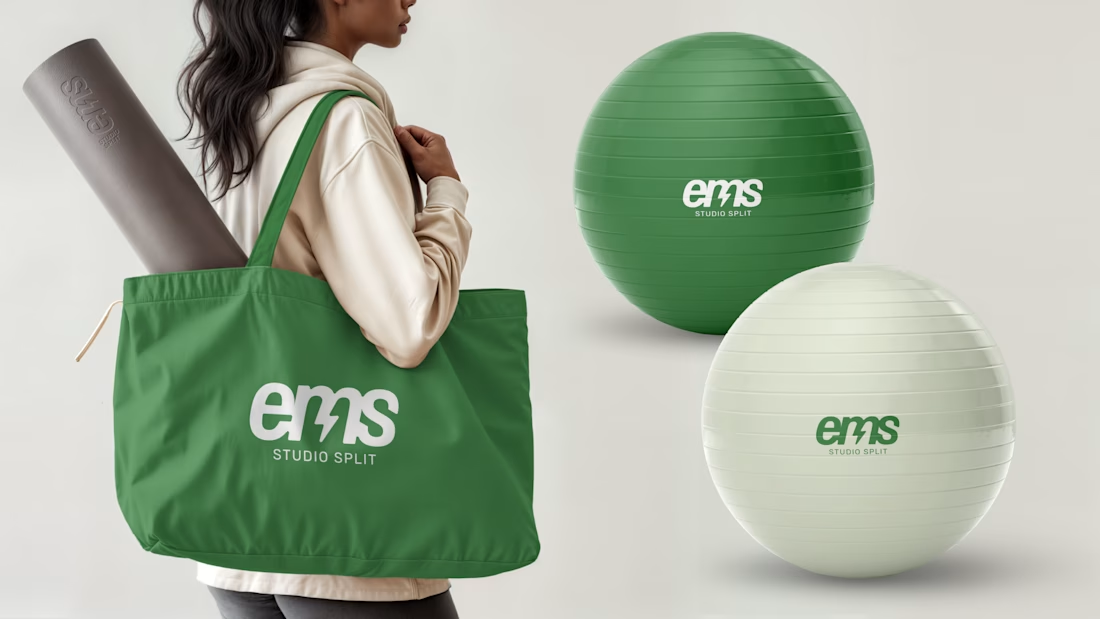
EMS Studio Split is all about energy, confidence, and connection, and that’s exactly what I wanted the visual identity to radiate. A simple yet powerful logo that moves like the training itself: dynamic, clear, and effective.
The lightning symbol woven into the typography adds a pulse, a little spark that mirrors the electric energy of EMS technology. And the lowercase letters? They keep things friendly, approachable, and human, because strength doesn’t always have to shout.
This is a brand that makes people feel seen, supported, and strong in their own bodies.


I surely will train at this studio for sure !

hahah I guess I did my job right 😂
Yess you did !!! 🙌🏽
Thank you so much :D

Amazing design and brand mission 💯
Thank you for being so supportive! 😊
The network for creativity
Join 1.25M professional creatives like you
Connect with clients, get discovered, and run your business 100% commission-free
Creatives on Contra have earned over $150M and we are just getting started


Trending
aivideo
AI video tools are moving at warp speed. Which ones are you experimenting with?
illustration
Handcrafted illustration is bubbling up across the web. What are you drawing lately?
aidesignflow
AI tools are redefining design work. What's your current workflow?
returntonature
Spring is a reset for creativity. What’s inspiring you outside the screen right now?
freelancerlife
Freelancer life is wins, pivots, and everything in between. What’s yours right now?