The network for creativity
Join 1.25M professional creatives like you
Connect with clients, get discovered, and run your business 100% commission-free
Creatives on Contra have earned over $150M and we are just getting started
Back to feedPost

3 details I love about the Blackton Grange build (Figma)
Blackton Grange is a wedding venue and holiday home in the North Pennines. I designed their website in Figma with a romantic, countryside feel and big photography.
• Desktop layouts at 1440px with a consistent type scale, colours and components
• Clear page hierarchy and calls to action on every section
• The Farm House and communal spaces
Small decisions like these are what make a site feel premium a year after launch.
Tools: Figma (design, components, auto layout and prototyping)
Design systems for small sites: worth it, or overkill?
Planning a project like this? Message me with your goals and timeline.


The romantic countryside feel really comes through, especially that warm parchment tone in the presentation. Calls to action on every section is the detail most venue sites forget, and it is usually the one that actually fills the booking calendar. On your design systems...
Thanks Timothy, fully agree on the components, they pay for themselves the first time someone asks for one more page. On builds like this I set the system up as my own safety net first, and it ends up being what keeps later edits quick and consistent.
The network for creativity
Join 1.25M professional creatives like you
Connect with clients, get discovered, and run your business 100% commission-free
Creatives on Contra have earned over $150M and we are just getting started









Related posts


Gorgeous 😍

Which colour palette would you choose for the banner design for a domain business? 🔥 Fiery or 🧊 Frosty?
20 voted
36%
35 voted
64%
55 votes
Closed

Frosty seems really cool for me!!


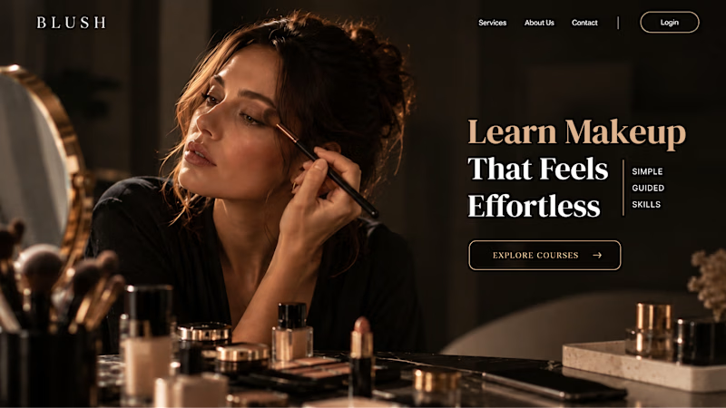
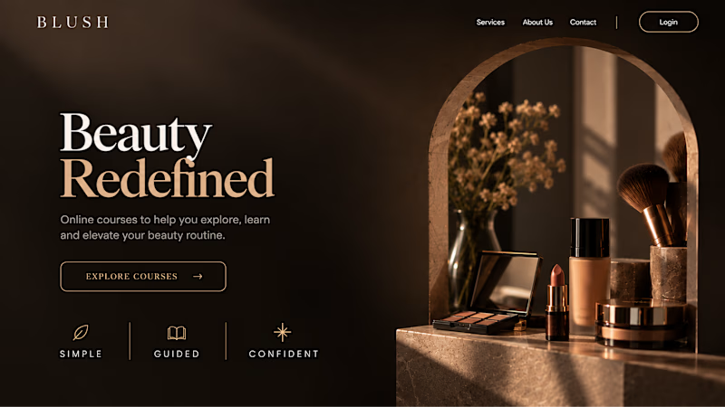
Your Hero Section Has One Job: Be Clear.
You don’t need huge headlines or long explanations. You need the right image + short headline + clear offer.
For the first version, we worked on the branding, the image and the copy together, so at first glance it’s clear: this is a makeup course, and here’s what you’ll get.
The second version is still beautiful and still feels like beauty. But what are you actually getting? A makeup course? Products? A store? That’s the problem with a Hero that looks good but isn’t thought through.
Your first screen doesn’t need to say everything. It just needs to say the right thing.

22 voted
61%
14 voted
39%
36 votes
Closed
