The network for creativity
Join 1.25M professional creatives like you
Connect with clients, get discovered, and run your business 100% commission-free
Creatives on Contra have earned over $150M and we are just getting started
Back to feedPost

Hi everyone, just wanted to share this Daffodil Pattern Design work here, full project is on, https://www.behance.net/gallery/252779687/Daffodil-Botanical-Surface-Pattern


The network for creativity
Join 1.25M professional creatives like you
Connect with clients, get discovered, and run your business 100% commission-free
Creatives on Contra have earned over $150M and we are just getting started



Related posts

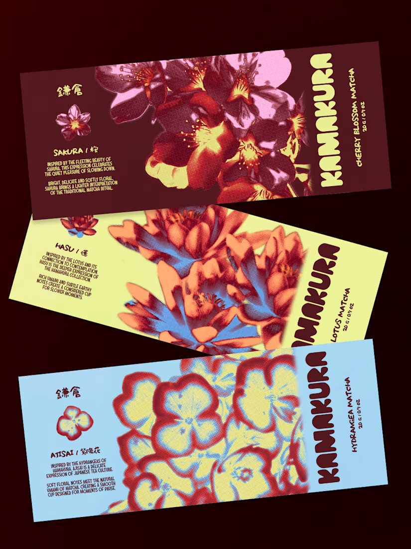
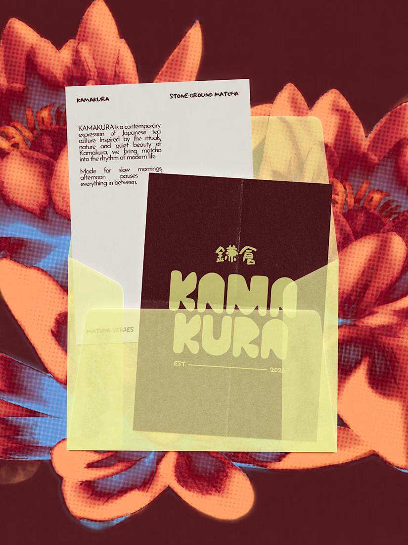
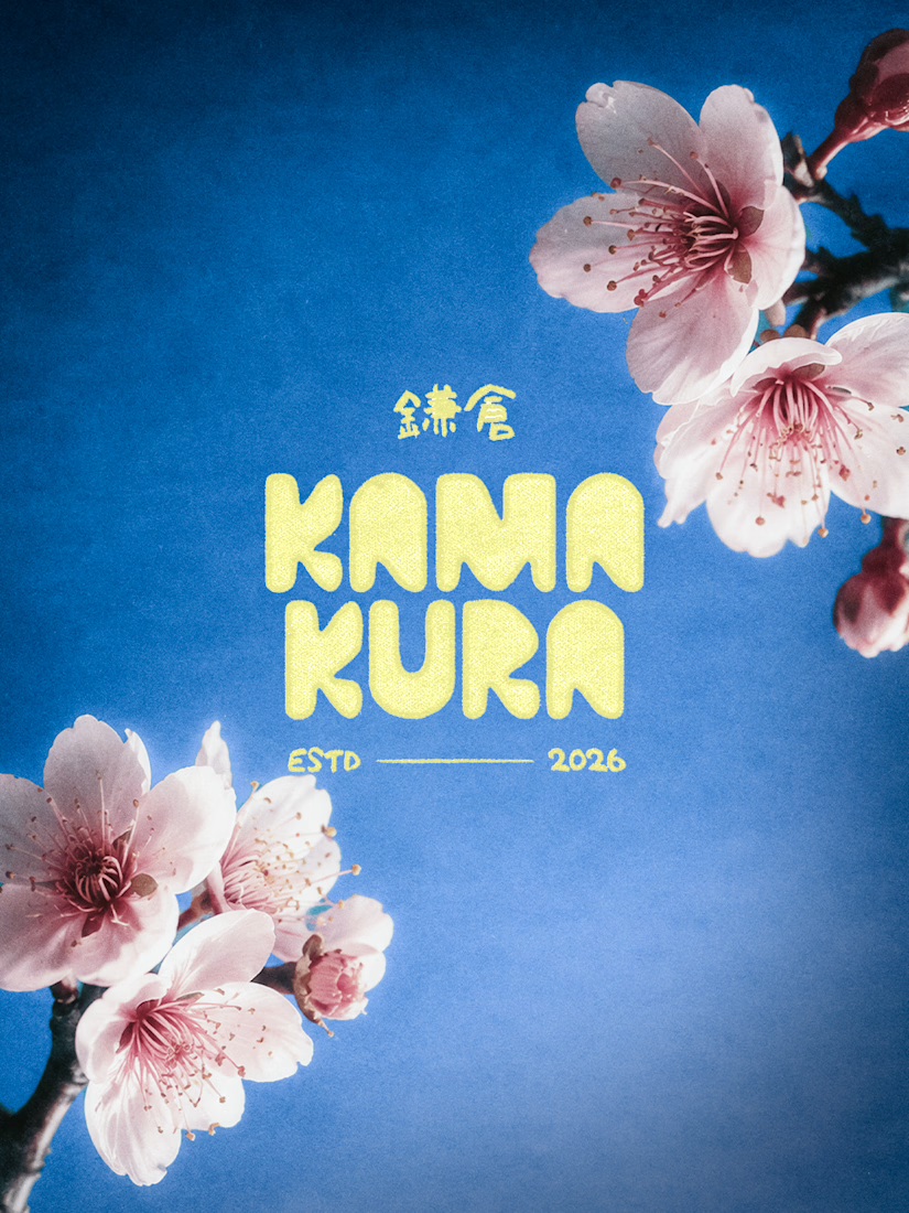
KAMAKURA is a Japanese matcha brand I designed to bring traditional matcha into everyday life. There are three flavours, each inspired by a flower: Ajisai (Hydrangea), Sakura (Cherry Blossom) and Hasu (Lotus).
I didn’t want the flowers to just sit there as decoration. So I started the whole identity from them. Their shapes and colours shaped the graphics and gave each flavour its own personality.
Then I added gradients. Petals are never one flat colour, so I wanted the design to shift the same way. It gave the brand some depth and made it feel a bit more artistic.
The final look is floral forms, soft gradients and bold type. Nothing like the green tins you usually see.
This was a collaborative project with my designer friend, Safna.
What do you guys think of the whole identity

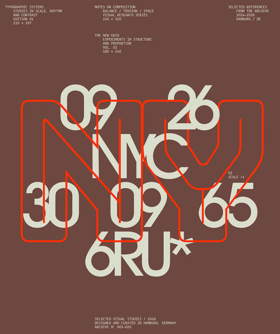
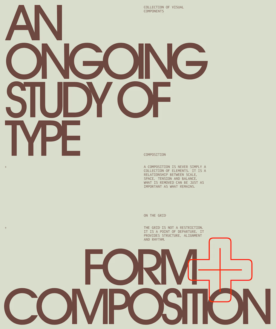
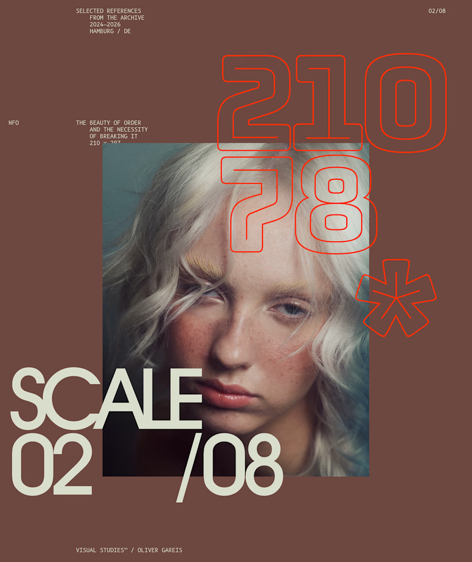
I designed these typographic layouts as part of my ongoing visual series on scale, grid and rhythm
↳ Master typography & layout - The foundation of timeless web design. Join 350+ designers inside my 13-hour online course https://typomonday.com/course


Beautiful wo

Just added a new project to my portfolio.
This project focused on creating a professional appointment booking landing page using Kajabi, designed to guide visitors from their first interaction with the brand to taking the next step.
The goal was to bring the company's introduction, video content, testimonials, and appointment-booking experience together in one clear, engaging layout.
I focused on creating a clean visual structure, making the information easy to navigate, and giving visitors a straightforward path to schedule an interview.
It's always interesting to see how thoughtful design and the right structure can make a digital experience more effective.
Built with Kajabi.
I would love to hear your thoughts, What stands out to you about this design?
#Kajabi #LandingPageDesign #WebDesign #KajabiExpert #AppointmentBooking
Check it out