The network for creativity
Join 1.25M professional creatives like you
Connect with clients, get discovered, and run your business 100% commission-free
Creatives on Contra have earned over $150M and we are just getting started
Back to feedPost

Meet Nordstar🌟 my first template on Framer 3.0.
A premium website template for consulting firms, advisors, and service providers.
Preview : https://www.framer.com/community/marketplace/templates/nordstar/
The network for creativity
Join 1.25M professional creatives like you
Connect with clients, get discovered, and run your business 100% commission-free
Creatives on Contra have earned over $150M and we are just getting started



Related posts

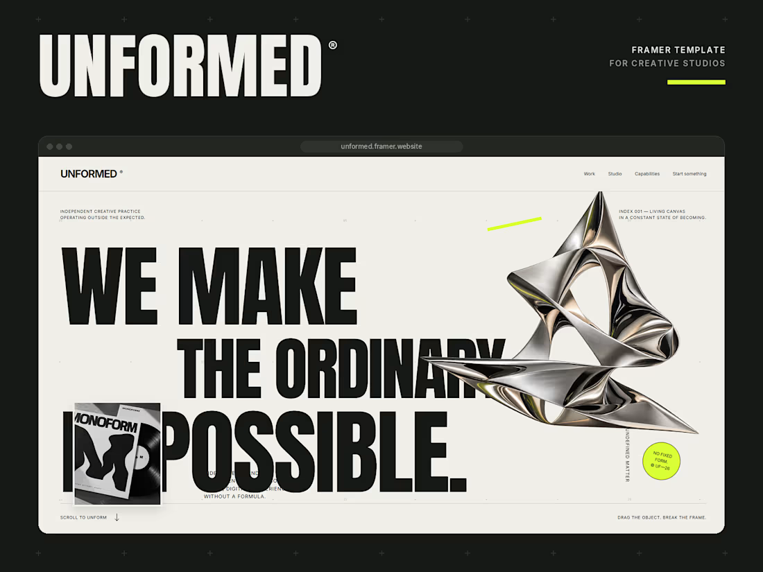
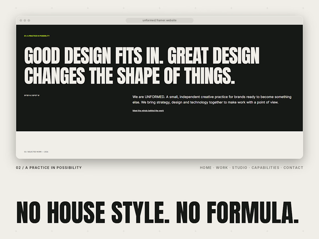
Meet UNFORMED, my new Framer template for independent creative studios and agencies. 🖤💚
I wanted to build something that doesn’t play it safe. Most studio sites look the same, so this one leans into huge condensed type, a warm off-white and black palette, and one loud lime accent.
A few things I’m proud of:
A draggable chrome object in the hero. Grab it and break the frame.
A type experiment where visitors drag the words to make their own composition, and it works by keyboard too.
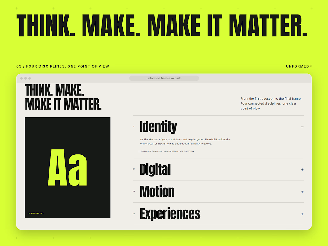
CMS case studies, an accordion services section and a live local clock.
Fully responsive, with clean text and colour styles and a template guide to help you set it up.
Pages: Home, Work, Project, Studio, Capabilities, Contact and a Template guide.
Built for studios that want their site to have a point of view. Would love to hear what you think.



when i started working on NODDO template, i first thought about what kind of brand an AI workflow orchestration platform should feel like.
the audience here is AI startups, automation platforms, and teams building products around AI agents and complex workflows.
they don't just need a good-looking website, they need to explain a technical product in a way people can actually understand.
so i built it around a few clear ideas: clarity, control, connection, and efficiency.
the positioning was to make it feel like a technical product built for people who work with systems, without making it feel too complicated or intimidating.
for the visual identity, i went with bold blue to create a strong, confident presence, paired with clean typography, sharp layouts, thin borders, monospace labels.
- the idea was to make the interface feel structured and precise, just like the product itself.
i also kept the messaging direct and focused on what the product helps people do, rather than filling the page with generic AI claims.

Made a free Framer template for AI consultancies ☀️
The hero has soft window light drifting across the page, like a slow morning in the studio.
CMS case studies, team page, subtle motion. Free to use.