The network for creativity
Join 1.25M professional creatives like you
Connect with clients, get discovered, and run your business 100% commission-free
Creatives on Contra have earned over $150M and we are just getting started
Back to feedPost

The Kitchen Trend That Actually Matters —
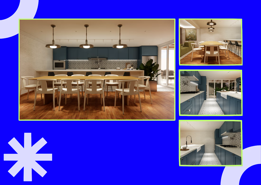
The defining kitchen trend of 2026 is not a color; it is functionality. Houzz found that 38% of renovating homeowners were motivated by deterioration or poor function, while 52% changed their kitchen layout and 76% added built-in features.
In this project, space planning organizes cooking, dining, storage, and circulation as one connected system. FF&E selection and 3D visualization test how appliances, finishes, furniture, and lighting work together at a human scale.
For families, this means a kitchen that supports multiple routines without feeling chaotic. For design studios, it means clearer specifications and fewer gaps between presentation and execution.


The network for creativity
Join 1.25M professional creatives like you
Connect with clients, get discovered, and run your business 100% commission-free
Creatives on Contra have earned over $150M and we are just getting started





Related posts

I went back to some AI-generated packaging images I created one year ago and tried to recreate them using newer AI models.
The difference is honestly wild. The materials, lighting, shadows, reflections, proportions… everything feels significantly more realistic now.
It made me wonder what we'll be recreating with these tools another year from now.
2025 or 2026: which one looks more convincing?

3 voted
11%

25 voted
89%

28 votes
Closed

"October 2026" looks better. It has better lighting, shadow, material design and it looks more realistic.

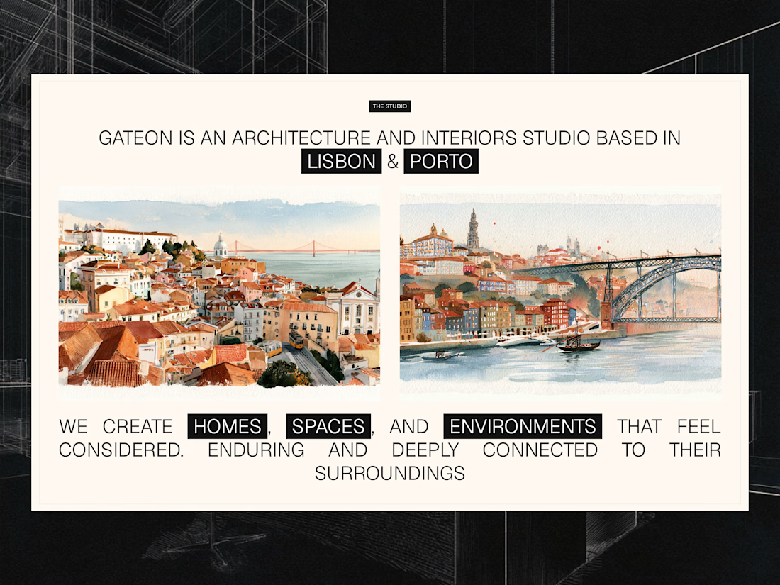
Studio section for Gateon, a interior design and architecture studio with bases in Lisbon and Porto



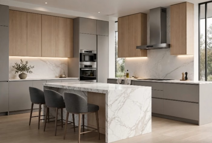
Luxury modern kitchen design with central island in white marble.
What I did:
Complete 3D realistic rendering
Custom furniture planning (MDF + wood)
LED lighting design
Material list and exact measurements
Delivery in 3 days
Software: SketchUp + V-Ray + Photoshop
Client: Private residence in Luanda, Angola (Talatona)
This project shows my ability to create premium, minimalist and functional kitchens.



Great balancing. As an interior designer, stabilizing amoung floor, ceiling, & furniture is always been a pin-point👍