The network for creativity
Join 1.25M professional creatives like you
Connect with clients, get discovered, and run your business 100% commission-free
Creatives on Contra have earned over $150M and we are just getting started
Back to feedPost

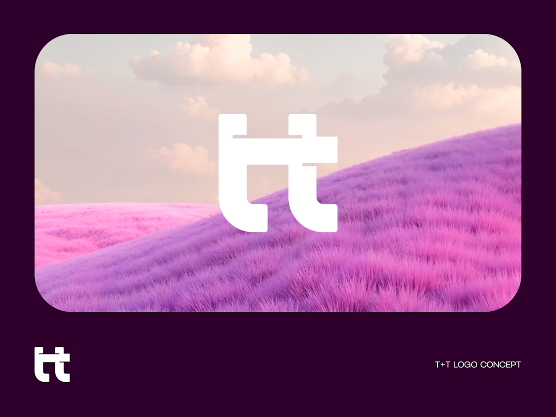
Two letters. One bold identity.
A T+T monogram logo concept built around simplicity, balance, and connection.
By merging two T’s into one distinctive symbol, the mark creates a clean and memorable visual identity. Minimal form.
Maximum recognition. What do you see first—two T’s or one symbol?
The network for creativity
Join 1.25M professional creatives like you
Connect with clients, get discovered, and run your business 100% commission-free
Creatives on Contra have earned over $150M and we are just getting started
Related posts


Which Logo is your favorite for a Registered Dietitian called Nourish Colorfully?
22 voted
39%
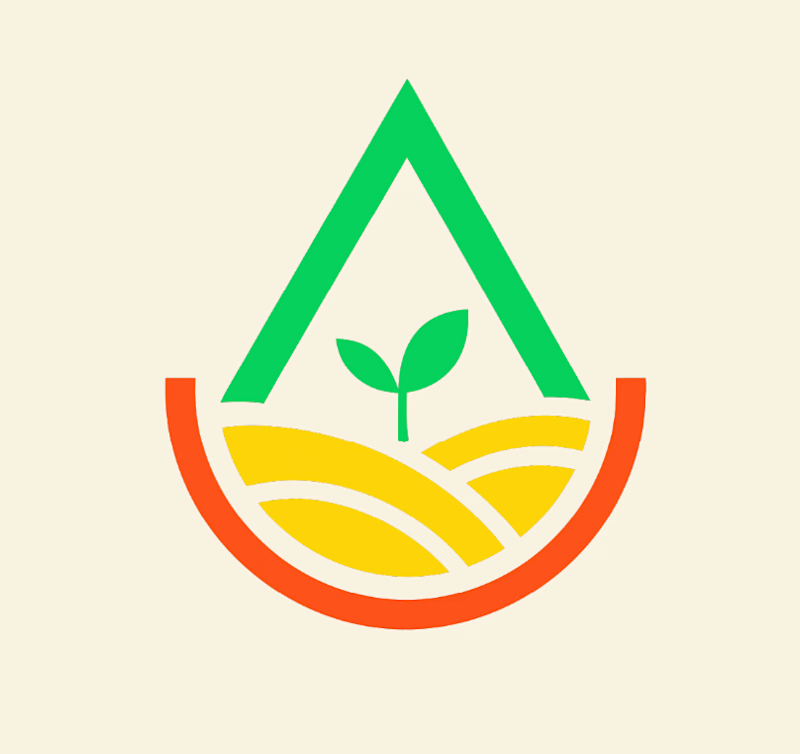
35 voted
61%
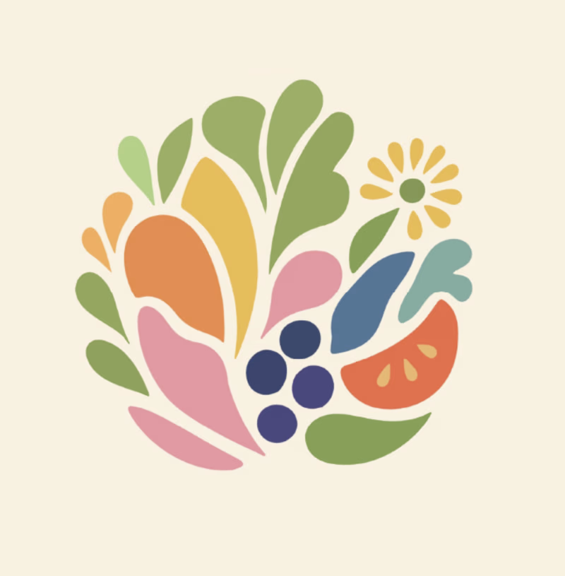
57 votes
Closed

Ummmm, option A gives the feeling actually

dither branding iterations for ai startup, which one would you choose?
15 voted
75%
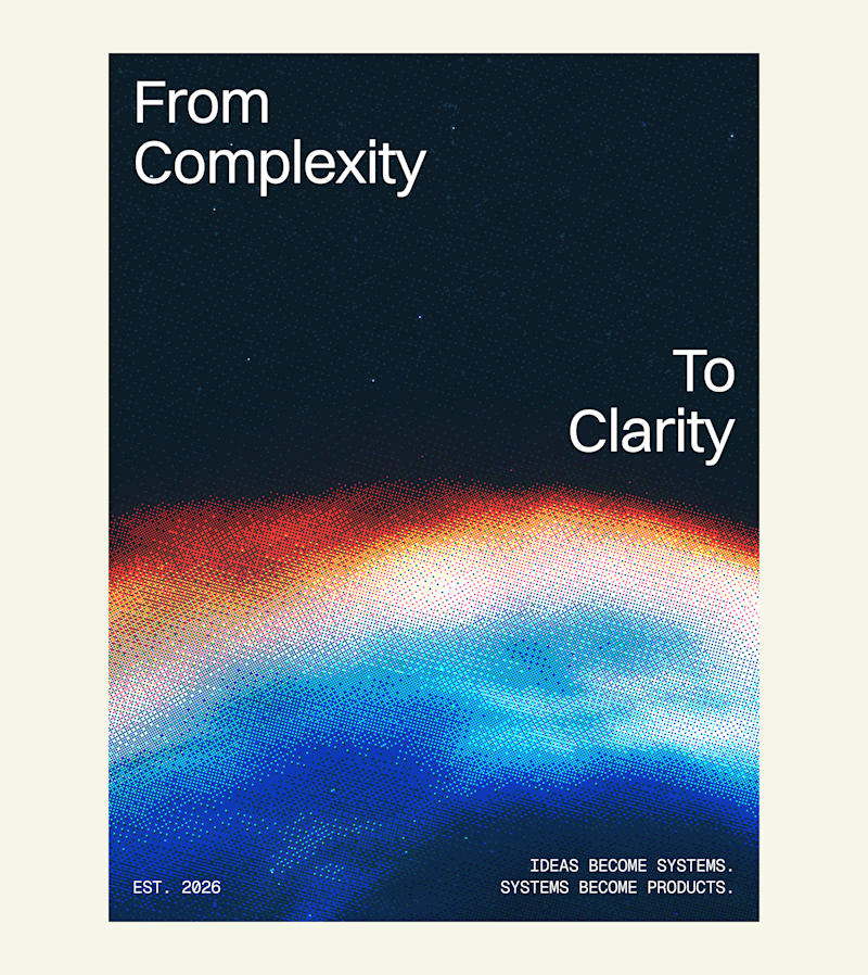
5 voted
25%
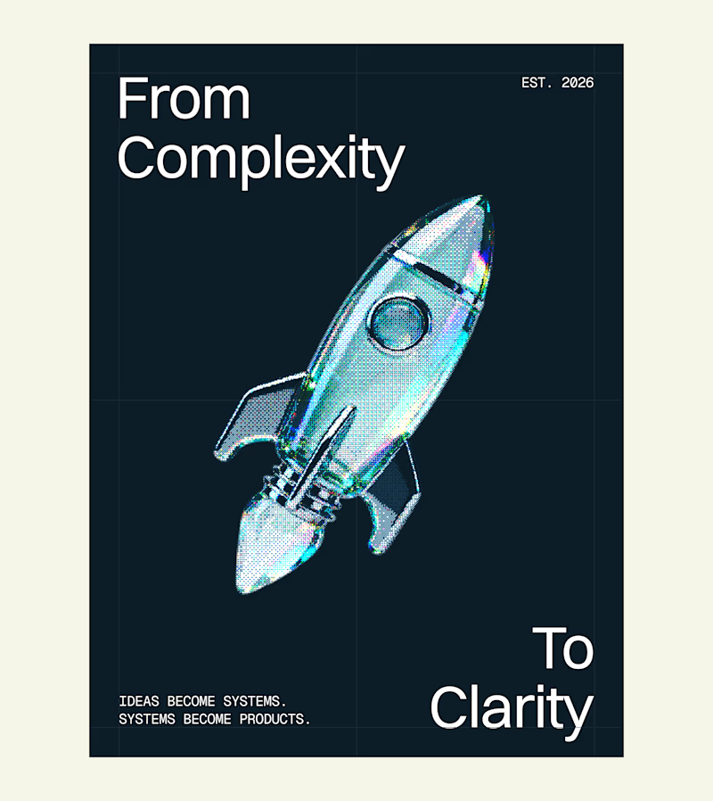
20 votes
Closed

I'm not a brand designer, but seeing this CapCut AI challenge made me want to give it a try... and honestly, it was so much fun. ✨🎨
Life is already hard enough to take everything seriously, so here's me adding a little whimsy to my day. 🌼💫
Sometimes the best creative moments come from trying something that's completely outside your lane. 🤍

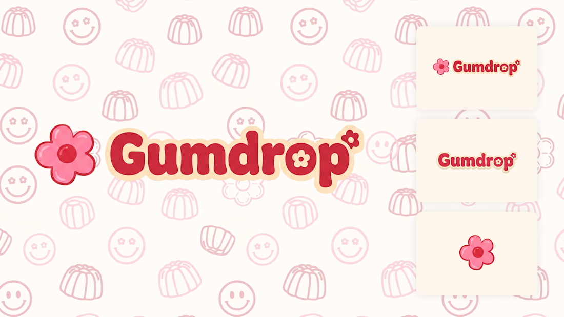
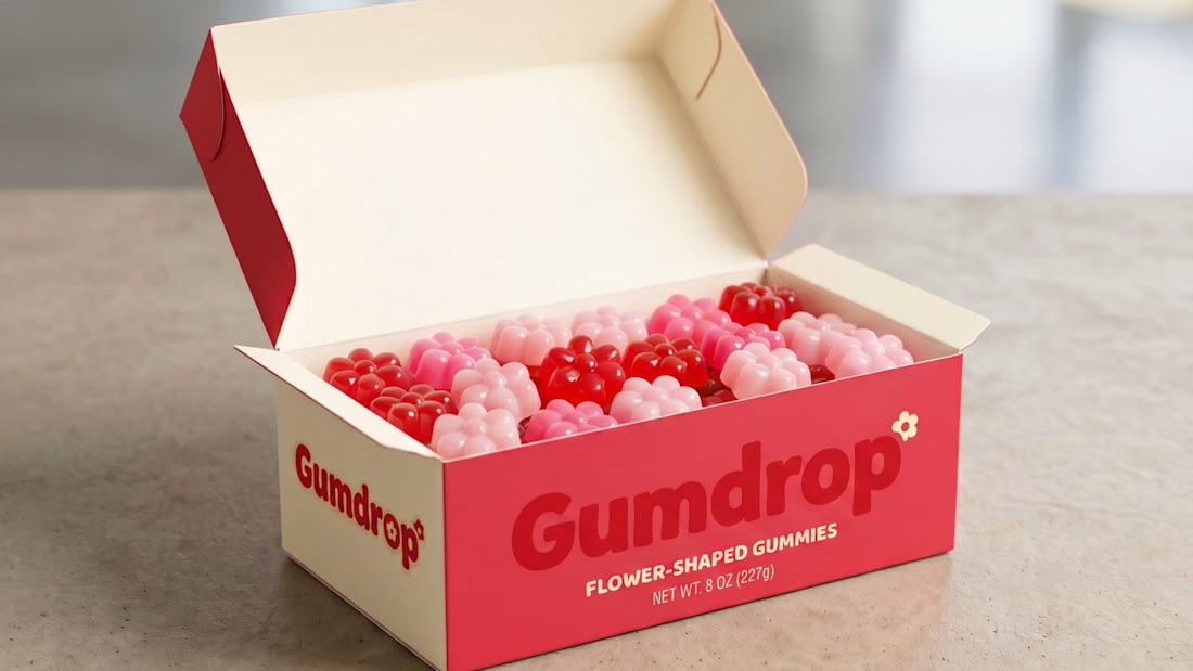
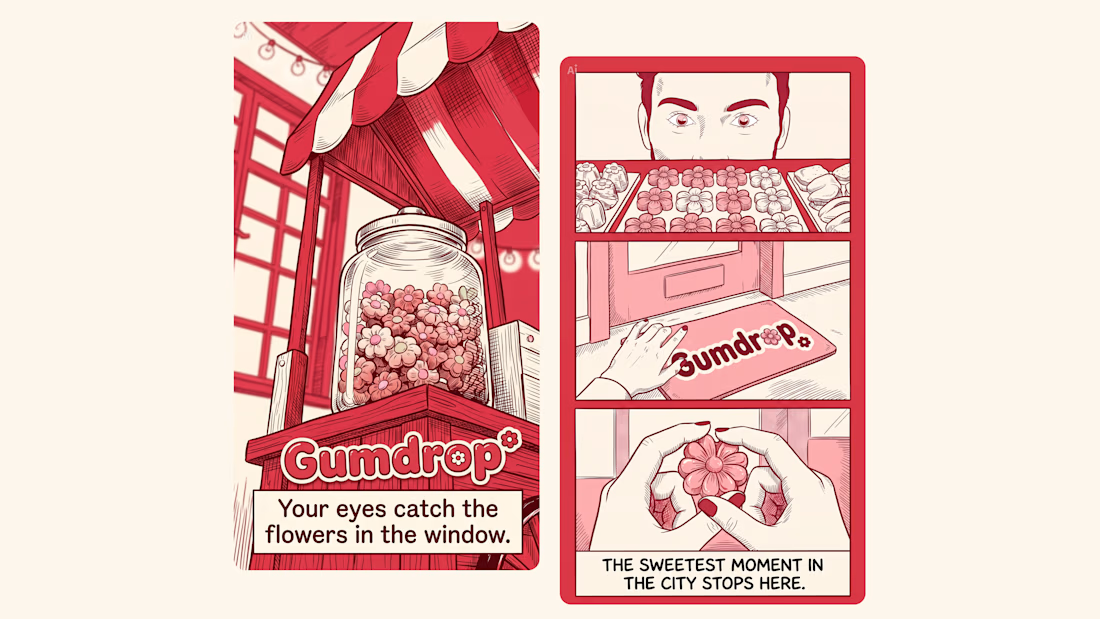
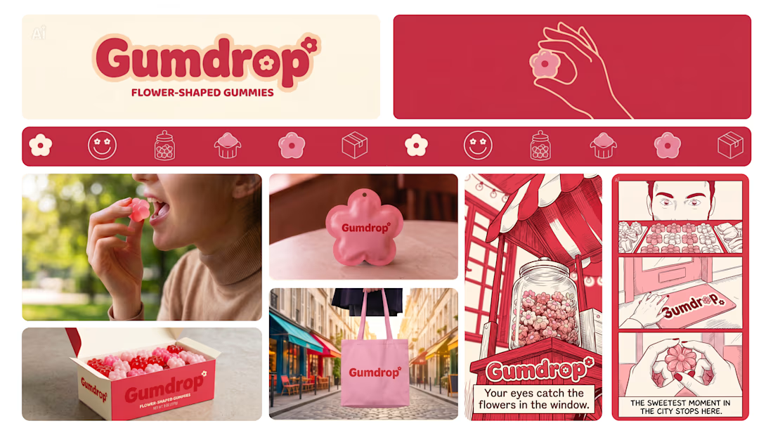

Thats a great and cute design. I both feel the clean side of the design and the tasty & cute side too!












Trending

Claude
Claude has entered the design space. How are you using Claude Design?

Contra University
Learn from expert creatives how to earn more using next-gen AI tools.
creativeaiflow
Creative AI workflows are evolving. What tools do you use, and what are their strengths and weaknesses?
freelancerlife
Freelancer life is wins, pivots, and everything in between. What’s yours right now?