The network for creativity
Join 1.25M professional creatives like you
Connect with clients, get discovered, and run your business 100% commission-free
Creatives on Contra have earned over $150M and we are just getting started
Back to feedPost
Designing a dashboard that turns complex workforce data into clear, actionable insights.
Focused on making attendance, shifts, working hours, and key metrics easier to understand at a glance.
#ProductDesign #UXDesign #DashboardDesign #UIUX #SaaS #Figma
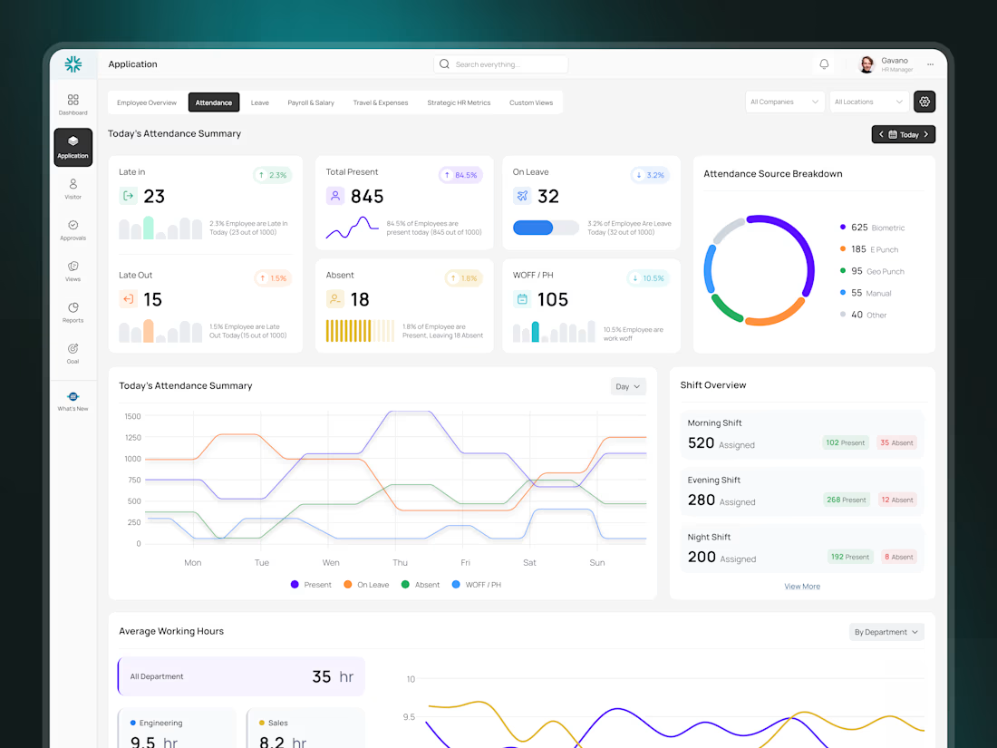

Really like how you’ve made complex workforce data feel simple and easy to scan. Great hierarchy! 👏

The multi-line shift chart earns its space by showing morning/evening/night as separate trends instead of one blended attendance number — that's the difference between "who's late today" and "which shift is actually understaffed." The KPI row above stays honest by not trying to say the same thing twice.

Exactly! The goal was to turn attendance data into something teams can actually act on, especially when looking at shift-level staffing gaps.
The network for creativity
Join 1.25M professional creatives like you
Connect with clients, get discovered, and run your business 100% commission-free
Creatives on Contra have earned over $150M and we are just getting started





Related posts


Definitely the new one. Seems more fluid and easier to interact with

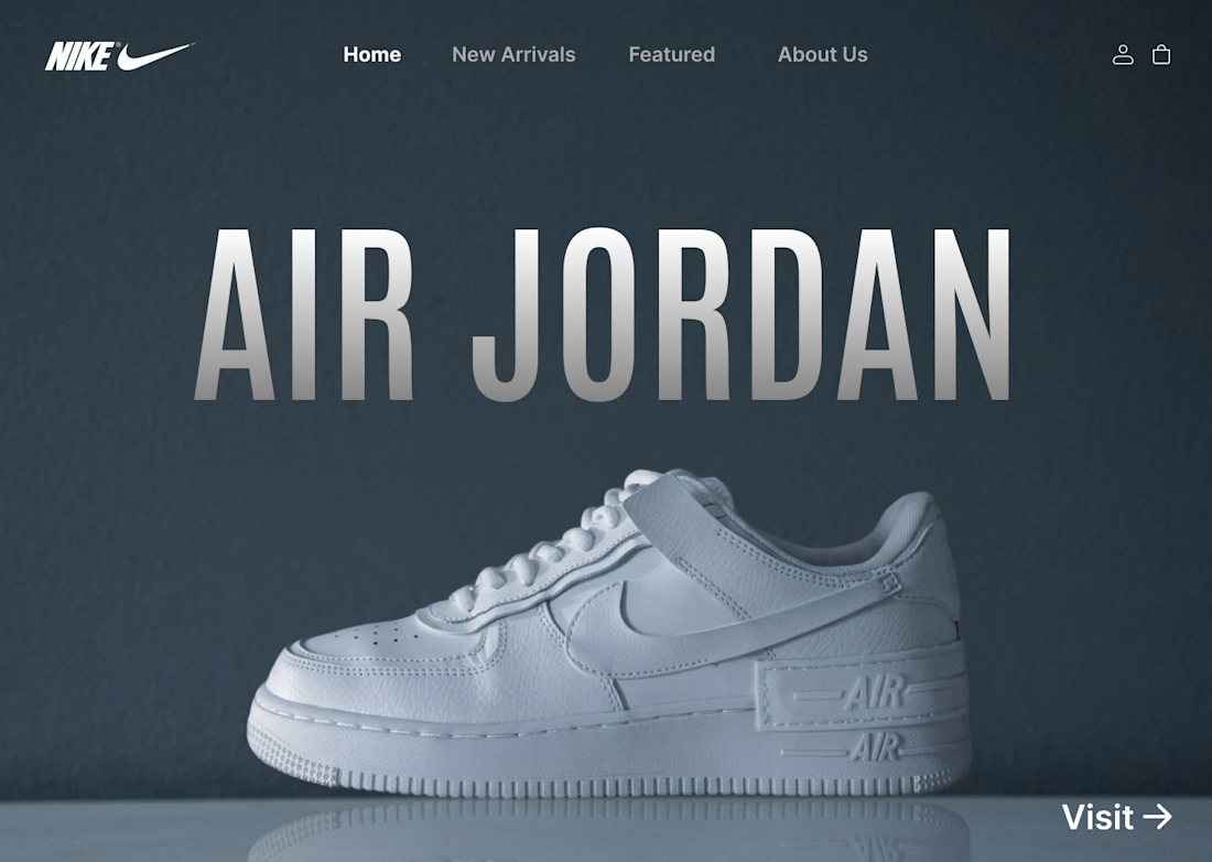
I designed a clean, minimalist e-commerce concept for Nike centered around the iconic Air Jordan series. The goal was to create a bold, modern hero section that instantly grabs attention while keeping the navigation effortless for shoppers.
Key Highlights:
Hero Visual: Featured high-resolution shoe imagery paired with bold display typography.
Minimal Layout: Dark, muted color scheme that makes the product pop without visual noise.
Streamlined UI: Essential navigation tabs paired with a direct CTA for seamless user flow.
#UIDesign #UXDesign #Figma #WebDesign #NikeConcept #LandingPage #DesignShowcase #UXUI #ECommerceDesign


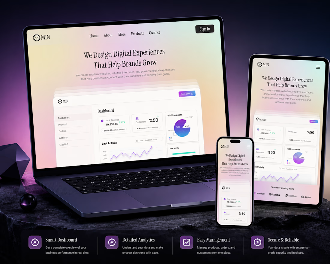
A clean and modern landing page concept designed for a SaaS platform. The goal was to create a visually engaging hero section with a strong focus on product presentation, clear hierarchy, and a premium user experience.
Designed with simplicity, usability, and scalability in mind.
Services: • UI/UX Design • SaaS Dashboard • Landing Page • Web Design

Amazing work