The network for creativity
Join 1.25M professional creatives like you
Connect with clients, get discovered, and run your business 100% commission-free
Creatives on Contra have earned over $150M and we are just getting started
Back to feedPost

My take on oaten!
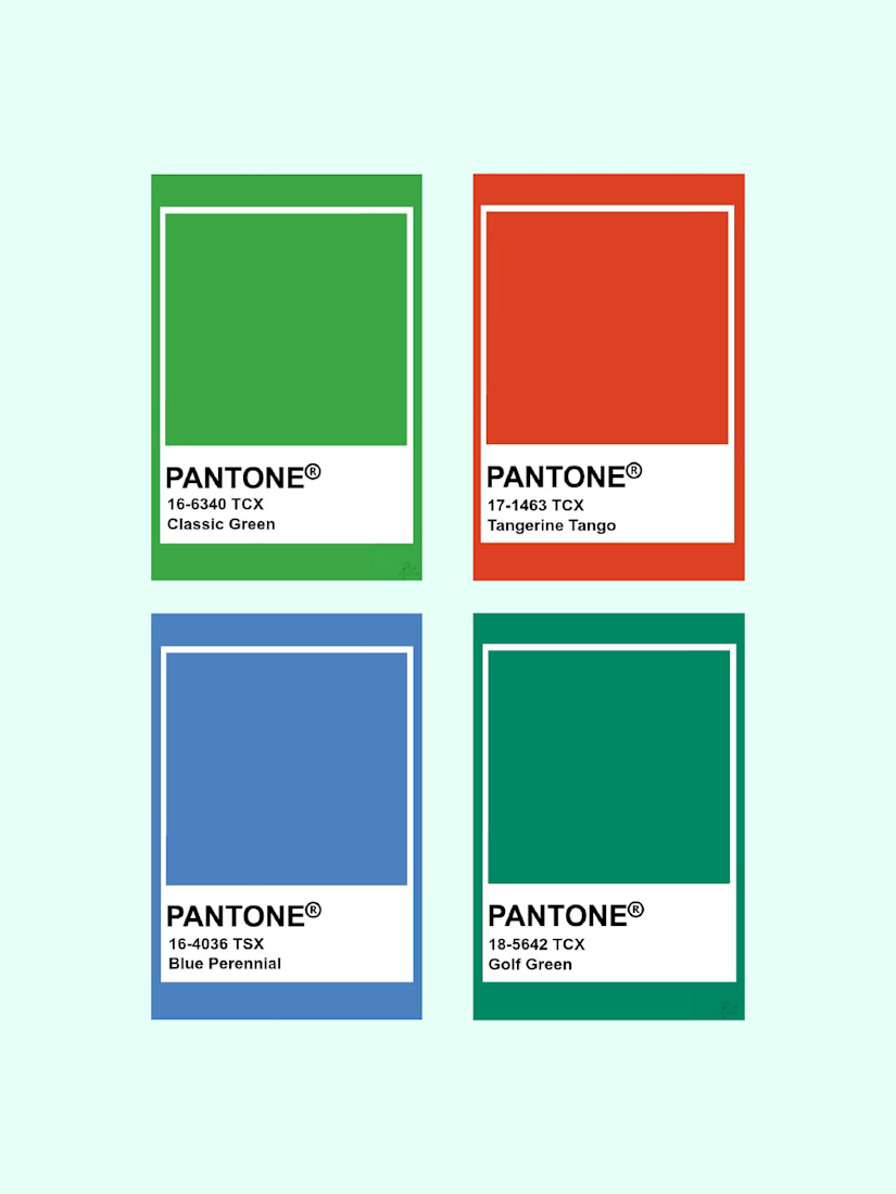
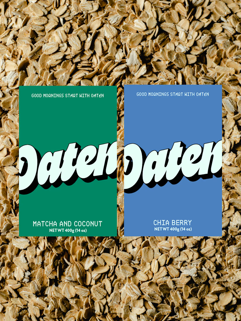
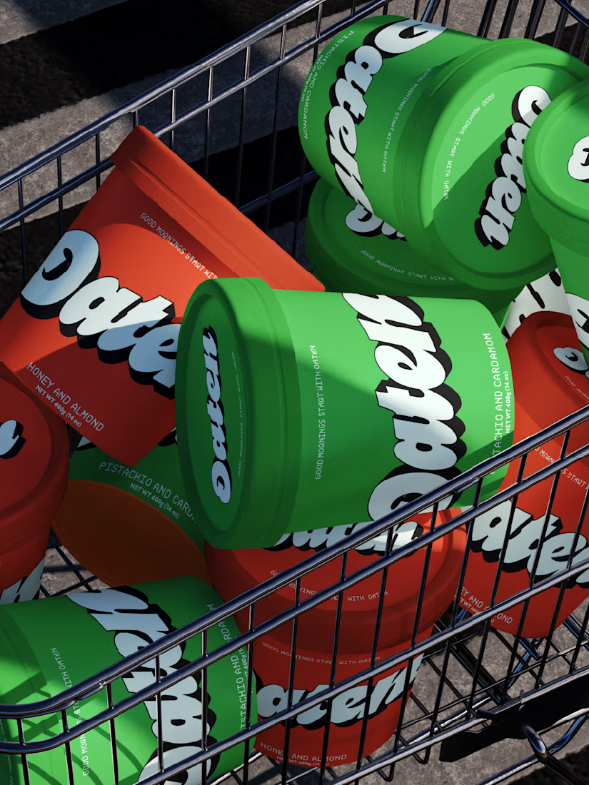
Curated this really cool retro color palette for this project, as I wanted to aim it toward Gen Z and increase unboxing videos.
I wanted this brand to be distinct from all the oat brands, which are generic and use the same color palette. For this reason, I curated an eye-catching color palette and designed the logo and packaging that a customer would immediately want to pick up.
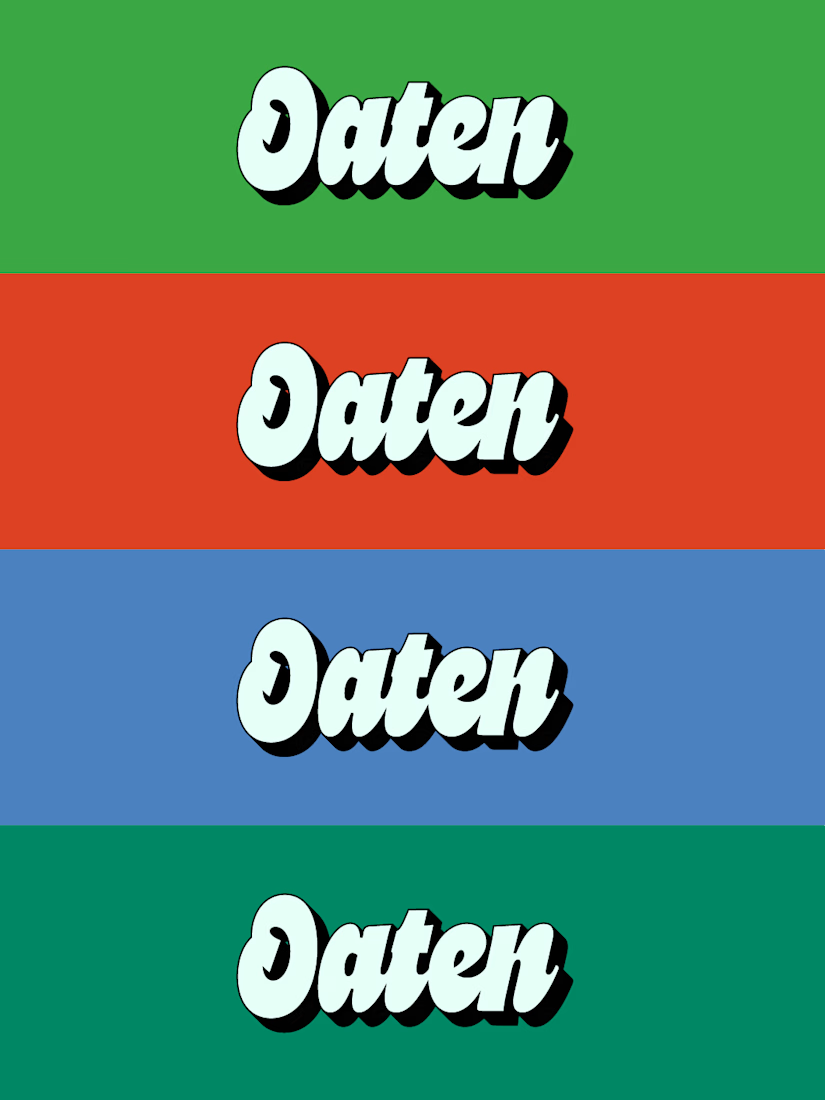
I also chose a secondary font filled with personality to make the packaging more interesting, while still leaving enough negative space so I don’t overwhelm the customer.
The network for creativity
Join 1.25M professional creatives like you
Connect with clients, get discovered, and run your business 100% commission-free
Creatives on Contra have earned over $150M and we are just getting started
Related posts

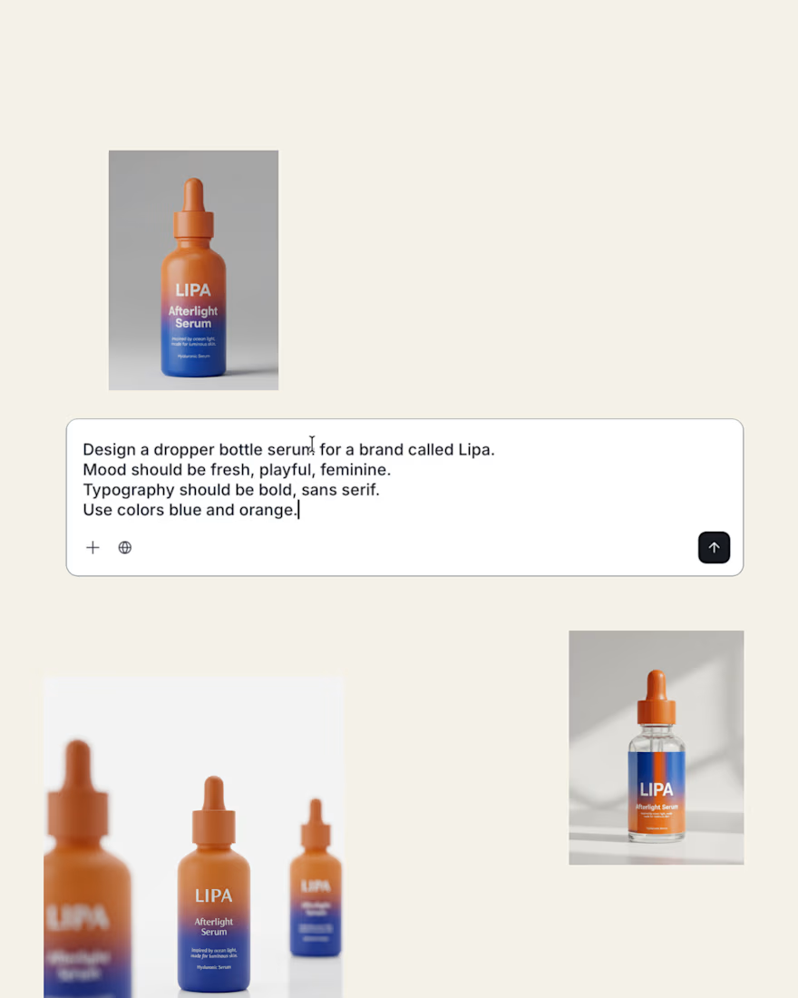
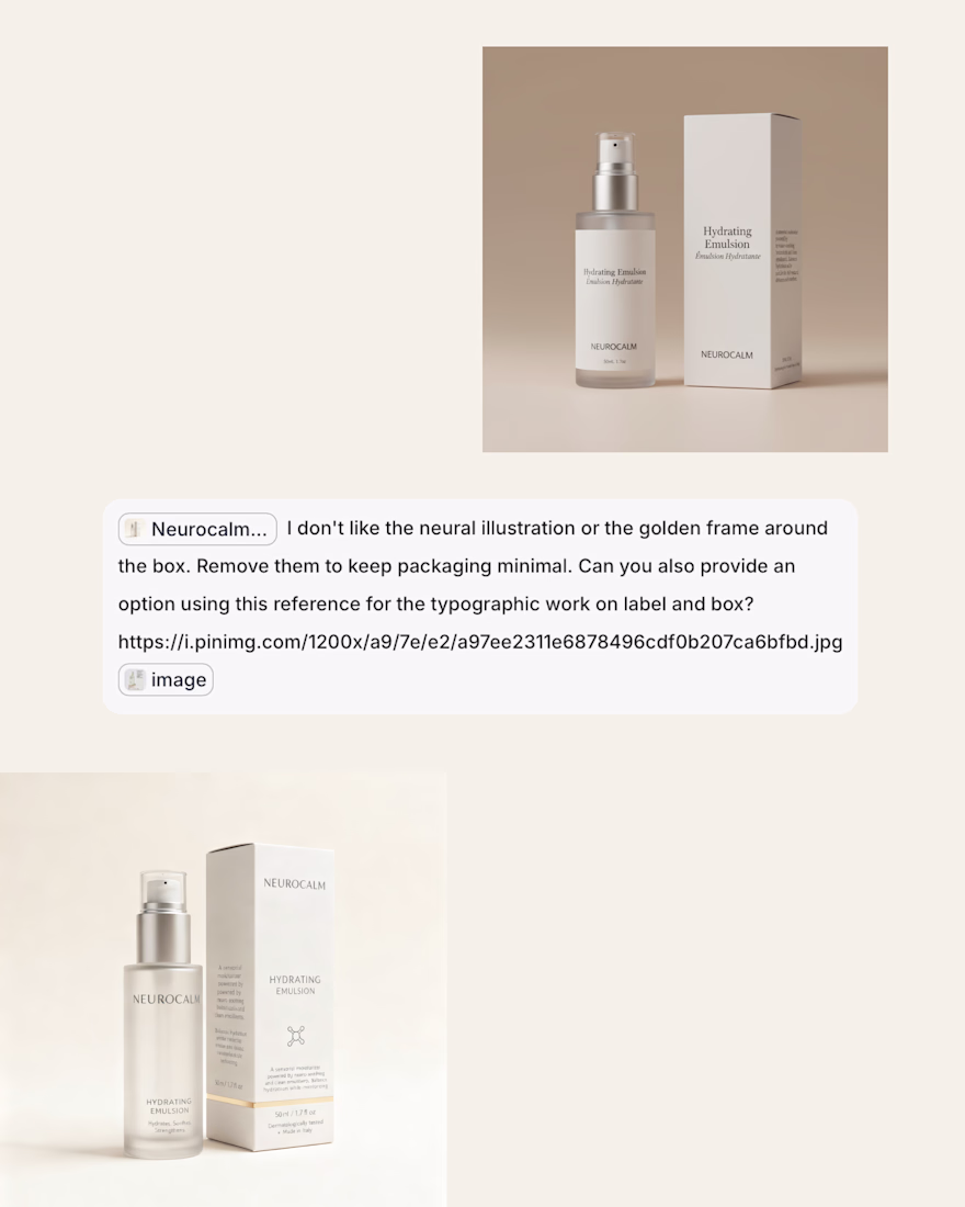
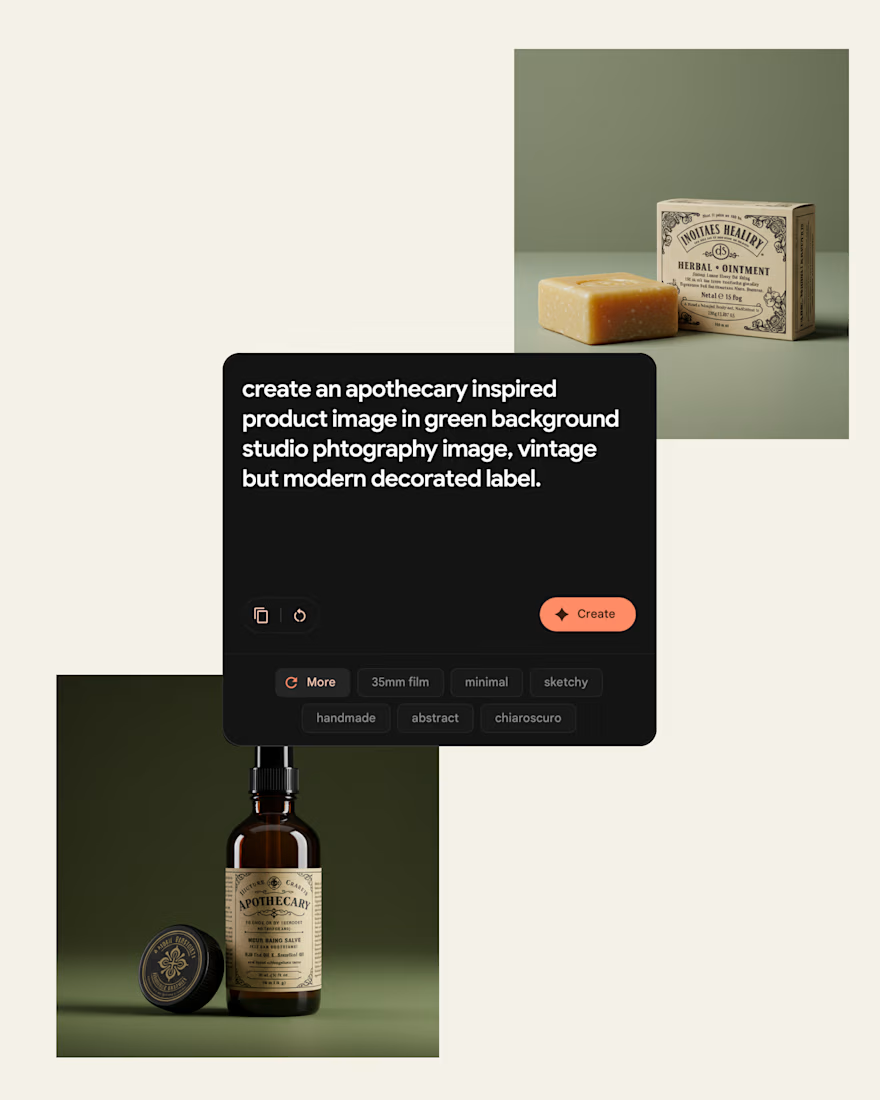
I’ve been testing AI tools to generate packaging concepts.
Here’s my honest take: AI is powerful, but only if you are clear.
If your prompt is vague, the result is generic. If your style direction isn’t defined, it defaults to whatever the model thinks is “good design.” Which usually means safe and trend-driven.
The better results came when I had the opportunity to art direct it or design a draft reference that I could use to guide the results.
And typography? Still hard, nailing intentional type systems is another story.
Are you using AI… or is AI designing for you?

Curious. do you usually sketch a rough type system first before prompting? Typography still feels like the real battleground.


Really nice restraint here. The gradient system feels expressive without overpowering the typography — hard balance to get right.

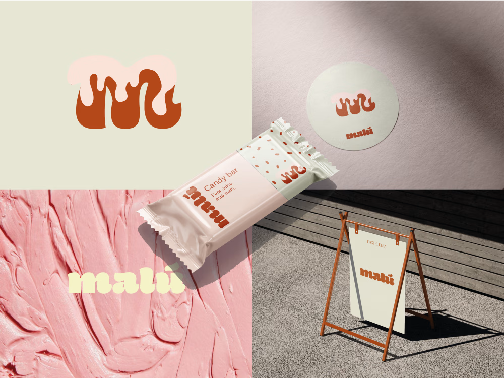
Complete branding for Pastelería Malú, a visual identity project developed to convey the artisanal, warm, and delicious essence of a local bakery in Buenos Aires. The design encompasses the creation of a coherent visual system that includes a logo, color palette, typography, and graphic applications designed to create a recognizable and memorable image.


Nice work!


Trending
maxearnings
The next frontier of payments is live on Contra. How are you maximizing revenue?
micrographics
Micrographics started as utility - barcodes, packaging, instruction labels. How would you use them?
aidesignflow
AI tools are redefining how designer work. What does your workflow look like?
aivideo
AI video tools are moving at warp speed. What tools are you using?
whennotai
As AI accelerates, creative judgment matters more. What part of your work stays human?