The network for creativity
Join 1.25M professional creatives like you
Connect with clients, get discovered, and run your business 100% commission-free
Creatives on Contra have earned over $150M and we are just getting started
Back to feedPost

Multi-market onboarding
One onboarding flow for US, India, Kenya, and Nigeria.
That was the problem.
Each market had different trust signals, literacy levels, and friction points. Treating them the same was costing Branch 43% of new users before they ever took a loan.
I redesigned 4 distinct flows - same component library, completely different experiences. Progressive disclosure, market-specific trust elements, 40% fewer required fields.
Result: 43% drop-off reduction. 25% MRR increase. Time-to-first-loan cut from 8 to 4.5 minutes.
If your product serves multiple markets and uses one flow - you're leaving conversion on the table.


The network for creativity
Join 1.25M professional creatives like you
Connect with clients, get discovered, and run your business 100% commission-free
Creatives on Contra have earned over $150M and we are just getting started



Related posts

Landing page design for Lumo — banking for freelance life
Banks sell control — dashboards, charts, a card floating at fifteen degrees. Freelancers don't want control over their money. They want to stop thinking about it in the gap between sending an invoice and the money landing.
That gap is what the page is built on. The product sits in a meadow instead of on a dark grid, because the promise isn't "manage your finances better" — it's "we handle the part that keeps you up." And the strongest line on the page isn't a feature: no waiting for Monday. Freelancers don't lose weekends to fees. They lose them to timing.
The proof follows the same rule. One freelancer, one number — 4% lost on every international payment. A percentage someone can check against their own account beats any adjective.


great visuals 🙌


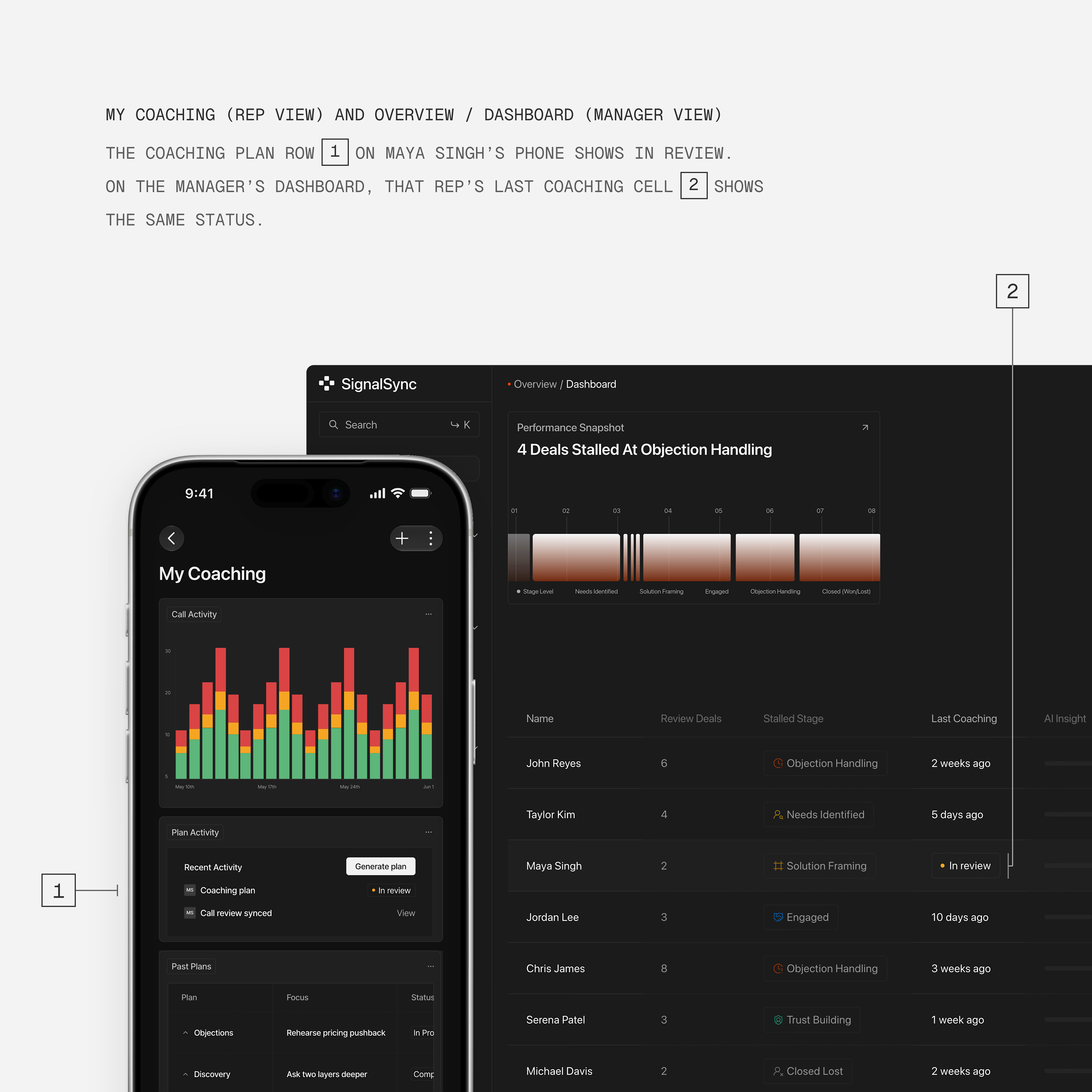
Show a status the same way everywhere it appears. //Micro-case study
In B2B products, one record moves between people and screens. A rep sees it on their phone. A manager sees it on a desktop dashboard. If each screen shows the status differently, each person learns a different product.
In a sales coaching app, a plan in review looks the same on both screens:
→ The same word, "In review"
→ The same orange dot
→ The same pill
I find consistency like this helps users:
Learn the product's words once
Understand what the other role sees
Move faster, because nobody stops to ask
Get to the value sooner