The network for creativity
Join 1.25M professional creatives like you
Connect with clients, get discovered, and run your business 100% commission-free
Creatives on Contra have earned over $150M and we are just getting started
Back to feedPost

Design & Strategy (Figma)
Color Block Architecture: Uses high-contrast transitions (cobalt blue, lime green, powder pink, and cream) to naturally guide the user's eye and separate sections without relying on rigid border lines.
Typography Hierarchy: Strategic use of condensed, heavy sans-serif headers paired with structured body copy to maximize text readability and visual impact.
Responsive Asset Framing: Image containers engineered to scale cleanly, supporting mixed media from editorial studio imagery to clean graphic mockups.
Development Capabilities
While designed pixel-perfect in Figma, this framework is engineered to be fully responsive and optimized for seamless development. I am fully equipped to translate this exact layout into production-ready builds across multiple environments:
Custom Development: Clean, semantic, and accessible HTML/CSS.
No-Code / Low-Code: Fully responsive and animated setups in Webflow or highly customizable, client-friendly architectures in WordPress.


Cool colours!
The network for creativity
Join 1.25M professional creatives like you
Connect with clients, get discovered, and run your business 100% commission-free
Creatives on Contra have earned over $150M and we are just getting started



Related posts

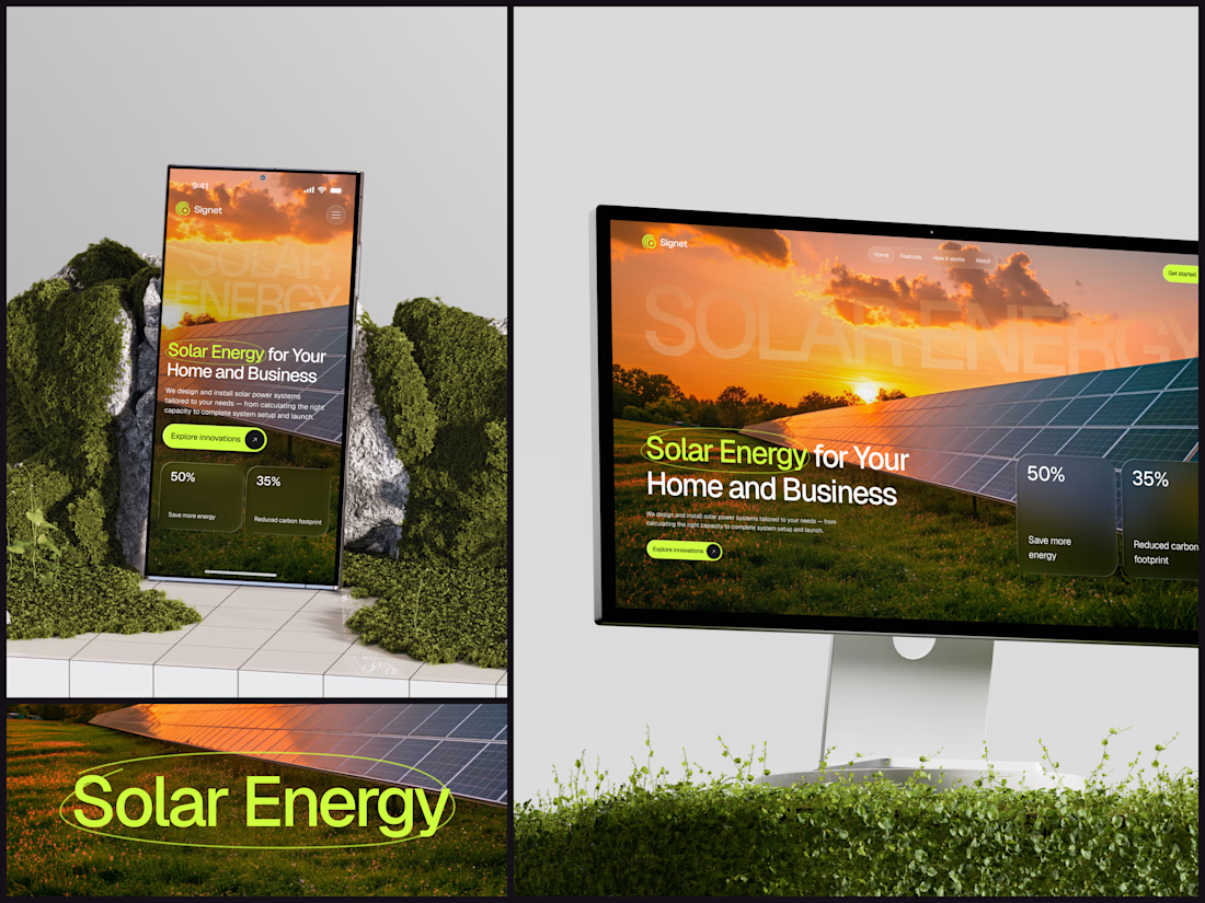
Solar Energy Website
A thin lime circle tells you which two words this page is about.
The headline sits over a sunset photo of a panel field. The "Get started" and "Explore innovations" buttons share the circle's lime, so the eye moves from the circled words straight to the next step.
Large faded capitals repeat those two words across the sky, faint enough to stay inside the photo. On mobile they break onto two lines, and the headline and button stack above two frosted cards.
Only two words of "Solar Energy for Your Home and Business" are lime, and the whole page follows them.
Designed by the Hue & Machine team.
#SolarEnergy #RenewableEnergy #CleanTech #WebDesign #LandingPage #HeroSection #UIDesign #ResponsiveDesign #MobileDesign #FigmaDesign


This is really cool, Nice job Dmytro


Which brand showreel preview design would you choose - Silver & Ropes or Purple Stones? ⚡
Lynksen is cooking something fire...
and we need your expert eyes on this one 🔥😎
Vote and tell why! 👇

12 voted
24%
37 voted
76%
49 votes
Closed

Going with Purple Stones. It feels more distinctive and memorable for a showreel, Silver & Ropes is clean but a bit safer.

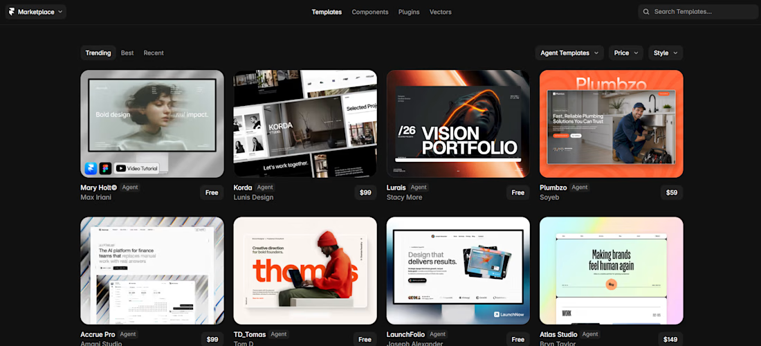
Mary Holt© is currently ranked #1 among Agent Templates on the Framer Marketplace! 🏆
For those who haven't checked out the new Agent Templates yet, they come with dedicated AI skills, a Design System page, and video tutorials to help users customize and extend the template using the Framer Agent.
Mary Holt© currently includes 4 custom skills, making it easier to build new sections, customize existing components, and keep everything consistent with the original design system.
I'm not sure how long it'll stay at #1 as more creators start converting their templates, but it's exciting to see it there!