The network for creativity
Join 1.25M professional creatives like you
Connect with clients, get discovered, and run your business 100% commission-free
Creatives on Contra have earned over $150M and we are just getting started

The network for creativity
Join 1.25M professional creatives like you
Connect with clients, get discovered, and run your business 100% commission-free
Creatives on Contra have earned over $150M and we are just getting started








Related posts


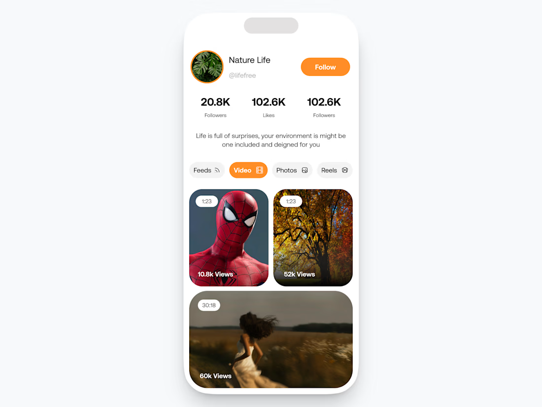

E-Medical Plant App — E-Commerce UI Design
Complete UI design for an e-commerce mobile app selling medicinal/health plants, created for a client. Designed the full shopping journey — including product listing, product detail pages, shopping cart, and checkout flow — focused on a smooth, intuitive user experience for online plant purchasing.


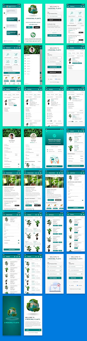

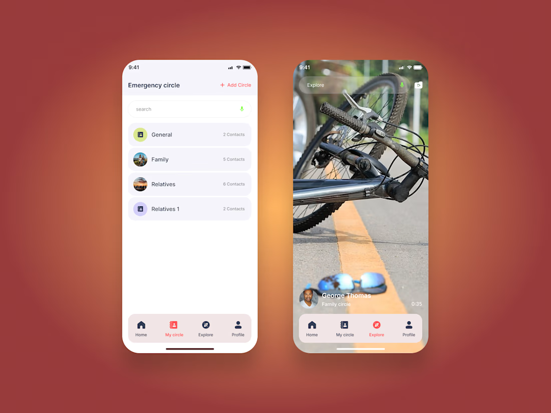
Emergency SOS App | Mobile UI/UX Design
A modern emergency assistance mobile app designed to help users quickly access emergency support and stay connected with their trusted contacts.
The experience includes emergency circles, SOS activation, emergency categories, location-based assistance, live emergency communication, and real-time support flows.
Designed in Figma with a focus on clear navigation, accessibility, and a calm interface for high-pressure situations.
Tool: Figma
Focus: Mobile UI/UX, Emergency App, Safety App, Interaction Design, Product Design

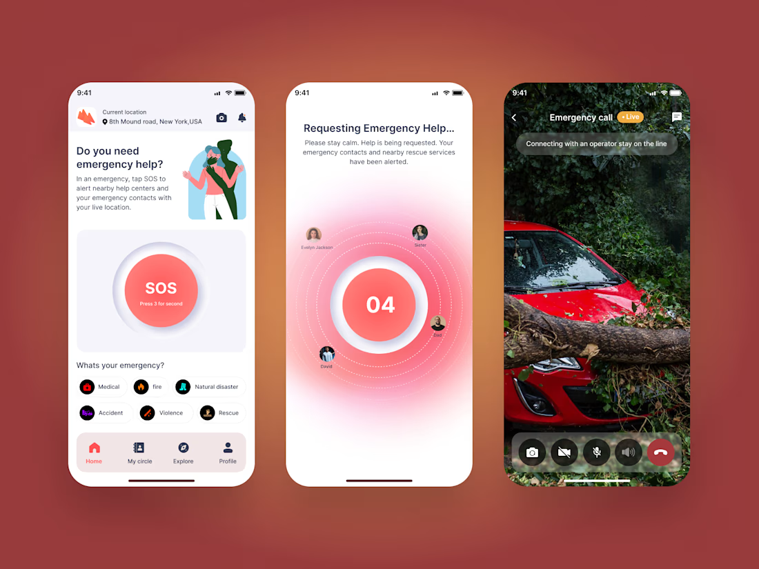

Great UI and UX design 🎉🎉