The network for creativity
Join 1.25M professional creatives like you
Connect with clients, get discovered, and run your business 100% commission-free
Creatives on Contra have earned over $150M and we are just getting started
Back to feedPost

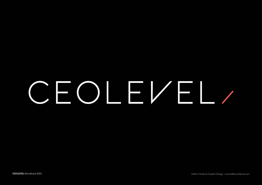
It’s time to introduce the rebranding of CEOLEVEL, a well-known Project Management and Agile School with a long-standing reputation.
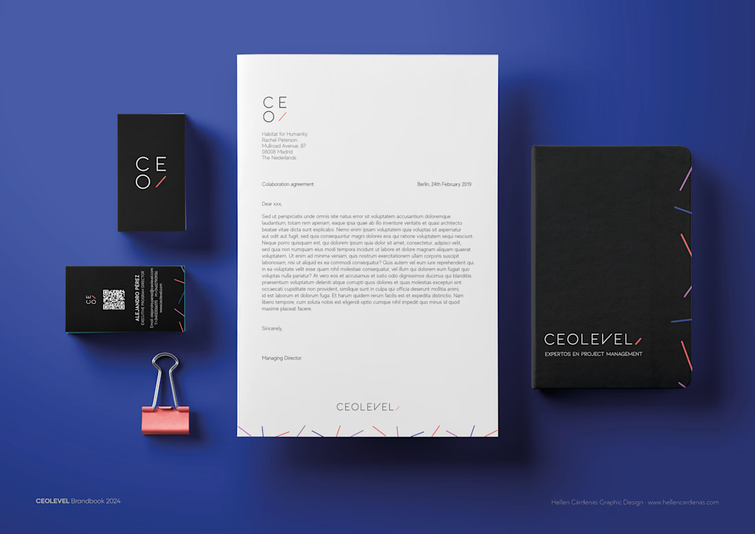
They reached out to me to craft a new visual identity that truly reflects their capabilities, values, and unique personality.
The concept behind this rebrand is all about the balance between chaos and order. In project management, when things aren’t well-organized, chaos takes over—and that’s exactly where CEOLEVEL shines. Their training transforms disorganization into structure, helping businesses achieve clarity and efficiency.
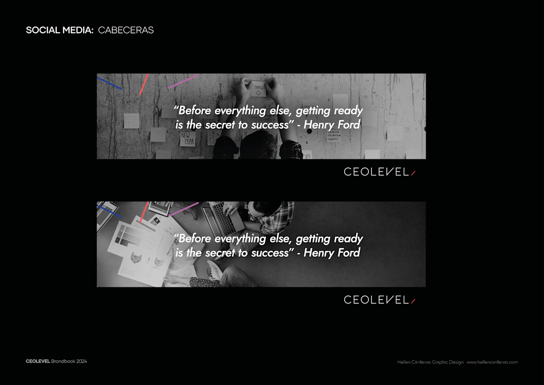
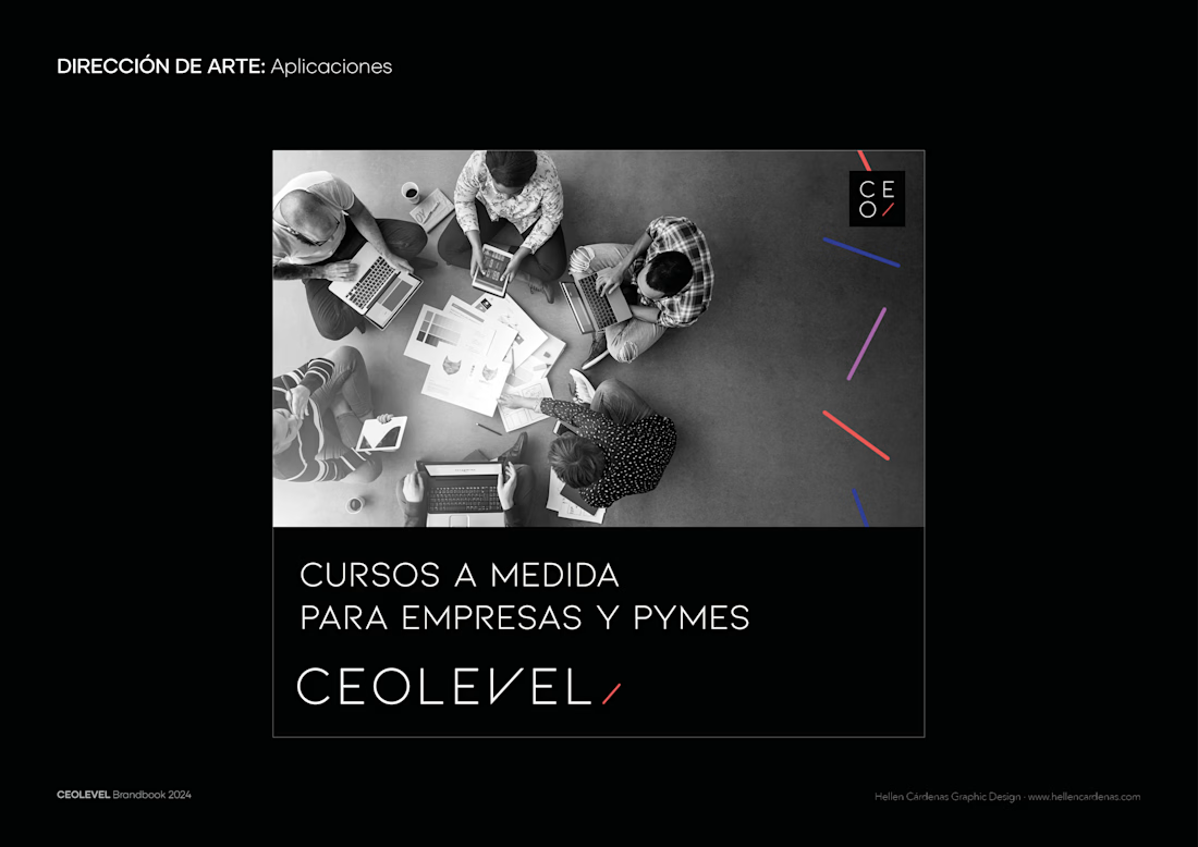
This duality is captured in their new identity: bold, colorful graphics symbolize the challenges and complexities of project management, while a clean, geometric logo embodies professionalism, focus, and structure.
artdirectorbranddesignervisualidentitydesignAdobe PhotoshopBrand DesignVisual DesignArt DirectionAdobe Illustrator


The network for creativity
Join 1.25M professional creatives like you
Connect with clients, get discovered, and run your business 100% commission-free
Creatives on Contra have earned over $150M and we are just getting started





