The network for creativity
Join 1.25M professional creatives like you
Connect with clients, get discovered, and run your business 100% commission-free
Creatives on Contra have earned over $150M and we are just getting started
Back to feedPost

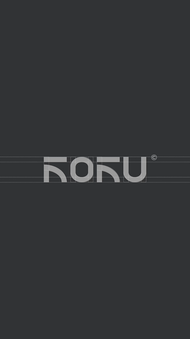
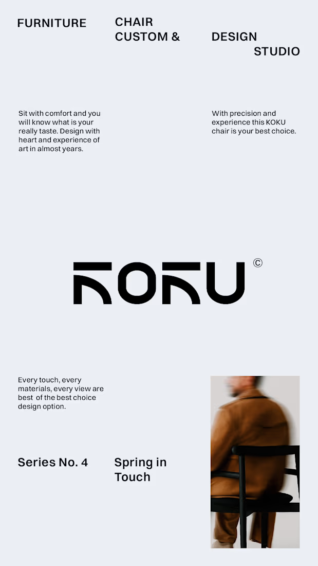
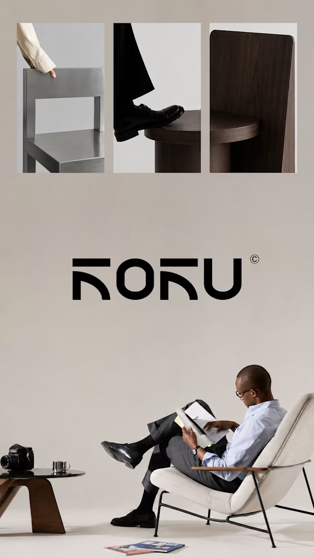
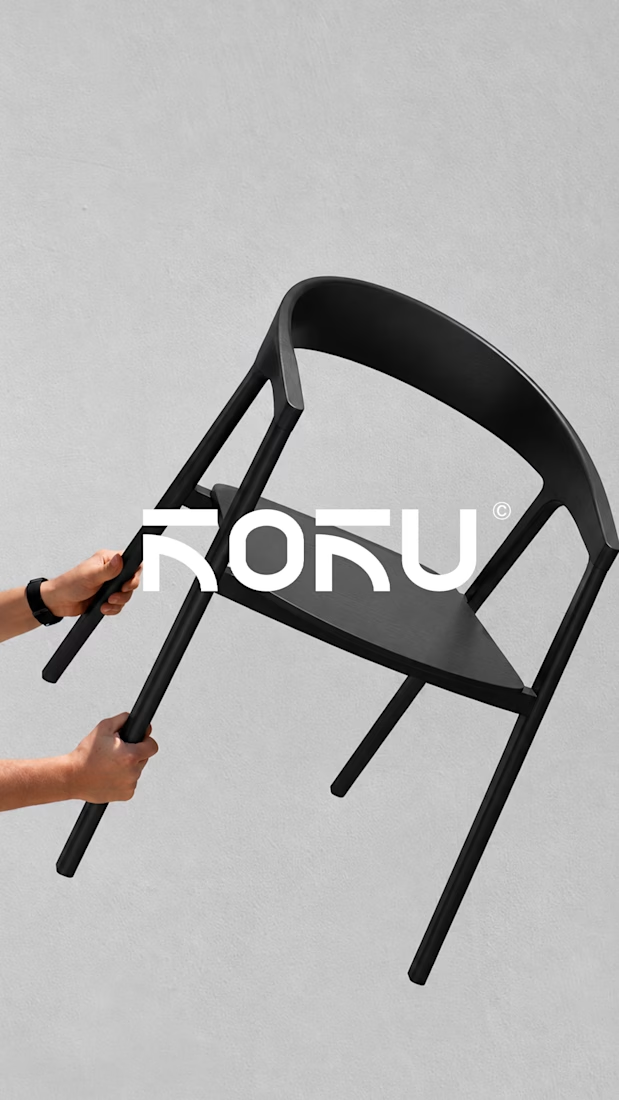
Koku. Premium Custom Furniture Logo Identity and Visual Direction
Koku is a premium custom furniture brand specializing in chairs, created for those who appreciate the relationship between thoughtful design, craftsmanship, and everyday living. In a market where furniture often competes through function or appearance alone, Koku explores a more considered approach, where the design of an object becomes part of the character of a space.
The brand was developed around the idea that a chair can be more than a functional object. Its form, material, proportions, and presence can influence how a space feels. This perspective became the foundation for shaping Koku into a brand that communicates quality through restraint, presenting furniture as an expression of refined taste rather than excess.
The Challenge.
The challenge was to establish a distinctive premium identity without relying on excessive visual decoration or obvious luxury cues. Koku needed to communicate craftsmanship, exclusivity, and quality through a clean and minimal visual language, while remaining recognizable as a brand built around custom furniture.
The Process.
Research and Exploration.
The process began by exploring the visual characteristics commonly associated with premium furniture and contemporary interior design. This involved considering how minimalism, materiality, proportion, and presentation contribute to perceptions of quality. The goal was to identify a visual territory that could communicate sophistication without making the brand feel cold, generic, or overly decorative.
Brand Concept Development.
From this exploration, Koku's direction centered on understated luxury. Rather than using visual complexity to communicate value, the concept emphasized clarity, restraint, and attention to detail. The brand was positioned for an audience that values considered design, lasting appeal, and furniture that complements a space without overwhelming it.
Visual Direction.
The visual direction translated this positioning into a clean and refined aesthetic. Minimal compositions and a restrained visual approach helped establish a sense of balance and sophistication. The intention was to let the furniture remain the focal point, supported by a brand identity that communicates quality without competing with the products themselves.
Identity Development.
The identity development focused on creating a cohesive visual presence that could represent Koku across its brand touchpoints. The design approach emphasized simplicity and consistency, ensuring that the brand's presentation aligned with its premium positioning. Each visual element contributed to a broader impression of refinement, craftsmanship, and thoughtful design.
The Result.
Koku's brand identity brings together minimalism, understated luxury, and contemporary furniture design. The resulting direction establishes a visual foundation for a premium custom furniture brand that values substance over excess and quality over visual noise.
More than simply presenting chairs as products, Koku positions furniture as part of a considered lifestyle, where function and aesthetics work together to create a lasting impression.


The network for creativity
Join 1.25M professional creatives like you
Connect with clients, get discovered, and run your business 100% commission-free
Creatives on Contra have earned over $150M and we are just getting started
Related posts


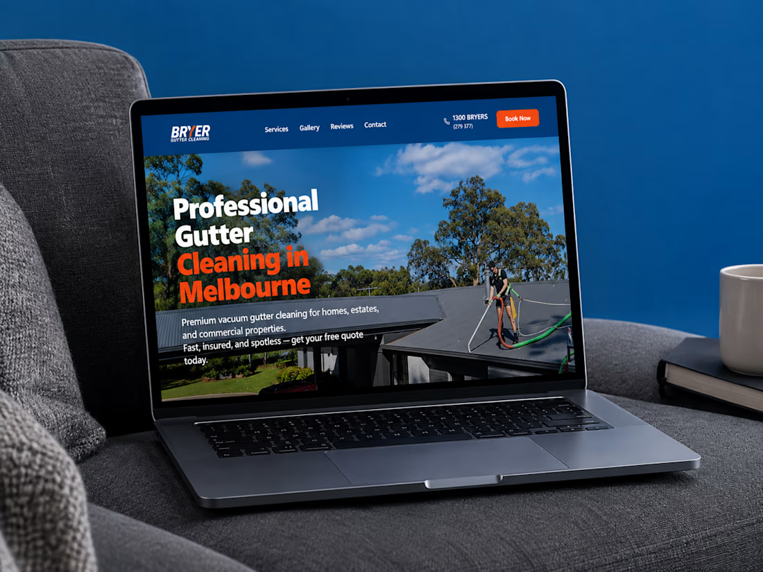
A great website should do more than look good, it should make choosing a business feel easy.
I recently completed a website project for Bryer, a Melbourne-based gutter and solar panel cleaning business.
The goal was to create a clean, professional online presence that communicates their services clearly, builds trust, and makes it easier for potential customers to request a quote.
Now, I’m curious:
When you visit a service-based business website, what matters most to you, the design, the information, or how easy it is to get in touch?
Let’s hear your thoughts! 👇
#WebDesign #Webflow #UXDesign #WebDevelopment #WebsiteDesign #Contra



this is amazing work

A complete brand identity system that brings visual direction, social media, and web design into one clear, consistent brand experience across every touchpoint.


MS Atelier 1913 - Luxury Woven Tag - Real Embroidery Mockup for UK Brand
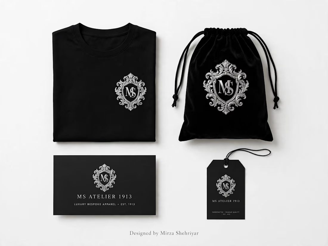

The silver crest on black holds across the tee, drawstring bag, card and hang tag, which is the sign of a mark built to scale. Honest challenge: a baroque shield with MS inside says heritage, and the tag says est. 1913, so who is the buyer? A modern luxury shopper may read that...


