The network for creativity
Join 1.25M professional creatives like you
Connect with clients, get discovered, and run your business 100% commission-free
Creatives on Contra have earned over $150M and we are just getting started
Back to feedPost

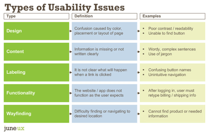
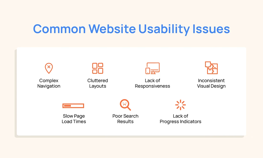
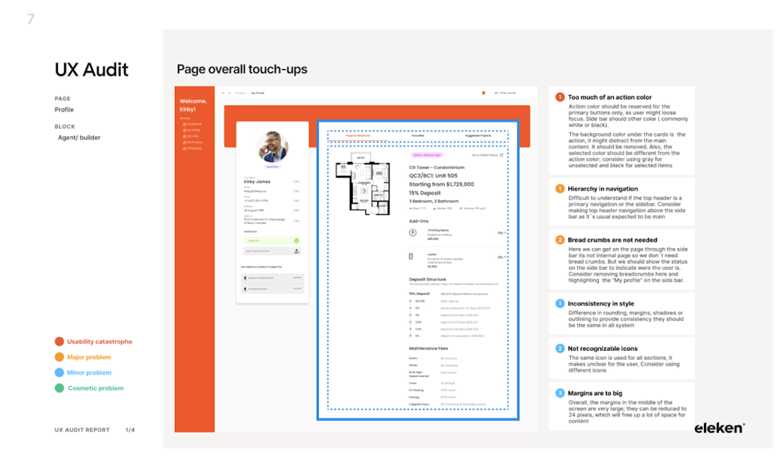
Quick website audit: why visitors don’t click
This is one issue I see on most websites:
🚫 Too many CTAs competing for attention
“Get Started”, “Learn More”, “Contact”, “Book a Call” — all at once.
What works better:
• One primary CTA per section
• Clear action language
• Visual hierarchy that guides the eye
Less confusion = more clicks.
Clarity converts.

The network for creativity
Join 1.25M professional creatives like you
Connect with clients, get discovered, and run your business 100% commission-free
Creatives on Contra have earned over $150M and we are just getting started





Related posts

3 signs your site needs 24/7 chat:
1. Visitors browse well outside business hours
2. Contact-form leads go cold overnight
3. The same questions get typed into search before anyone asks
→ If this sounds familiar, the visitors are already there — just no one to answer them.






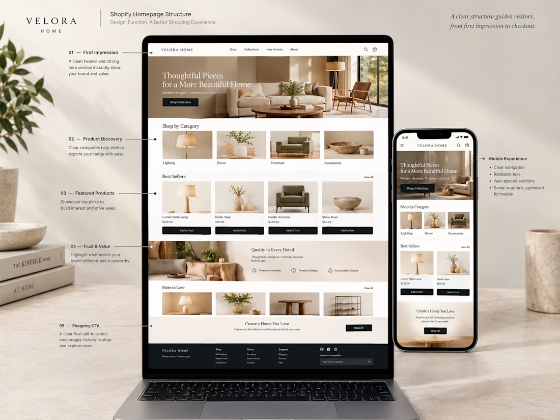
A Shopify homepage isn't just about making the store look good.
The structure matters.
When I approach a homepage, I think about what a visitor needs to see and understand as they move through the store.
A simple structure could be:
→ Strong first impression
→ Clear product categories
→ Featured or best-selling products
→ Reasons to trust the brand
→ More products to explore
→ A clear next step
The goal is to make the journey feel natural instead of throwing everything onto one page.
Good design isn't only about what looks nice.
It's also about what the customer sees, when they see it, and where it takes them next.
What section do you think is most important on a Shopify homepage?


Good structure. The one we see skipped most on this exact layout: the featured-products rail right after the hero still needs enough items per row to feel curated, not half-empty, once it collapses to mobile. A 4-up desktop grid often becomes 2 cramped tiles on a phone with...