The network for creativity
Join 1.25M professional creatives like you
Connect with clients, get discovered, and run your business 100% commission-free
Creatives on Contra have earned over $150M and we are just getting started
Back to feedPost

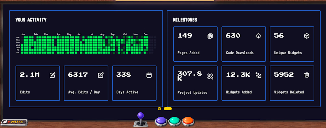
🚀 FlutterFlow Wrapper 2025 — Performance, Visualized
Proud to showcase our FlutterFlow Wrapper 2025, built for scale, speed, and serious productivity.
This dashboard highlights real-time activity, milestones, and growth metrics — all wrapped in a sleek, game-inspired UI.
✨ What stands out:
• High-performance FlutterFlow integration
• Advanced analytics & milestone tracking
• Clean, modern, and interactive dashboard UI
• Built for creators, teams, and scalable products
From widgets to workflows, this wrapper turns data into insight and ideas into impact.
💡 Designed for 2025. Ready for production.
#FlutterFlow #FlutterDev #NoCode #LowCode #AppDevelopment #DashboardUI #ProductDesign #Contra
The network for creativity
Join 1.25M professional creatives like you
Connect with clients, get discovered, and run your business 100% commission-free
Creatives on Contra have earned over $150M and we are just getting started





Related posts

Every guy I know has the same problem on her birthday: he wants to get her flowers, he has no idea which ones, and he doesn't want to ask, because then it's not a surprise.
So he guesses. Sends the florist twenty DMs. Ends up with red roses she politely pretends to love. 🌹
I built Bloom for Her to fix this.
He sets a budget, a date and an address, then gets a link and sends it to her. She opens it and sees only bouquets in his range, with the prices hidden, so she picks what she actually wants, not what feels "affordable". He gets a notification, confirms and pays in one tap. The florist gets a complete order with the bouquet, her wishes ("no lilies please"), delivery slot and card text. No DMs, no guessing.
How I built it
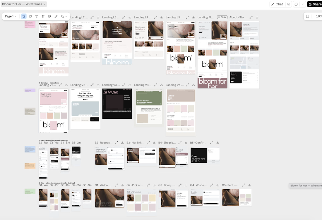
I'm a UX/UI designer who also writes Flutter, so I skipped the usual "design → hope the dev gets it" step:
→ wireframes and high-fi screens for 3 roles: him, her, the florist
→ a design system: Urbanist only, no bold, one dusty-rose accent, borderless inputs
→ built in @Lovable from my screens: React + Supabase, realtime order status, an admin panel for the florist with auth
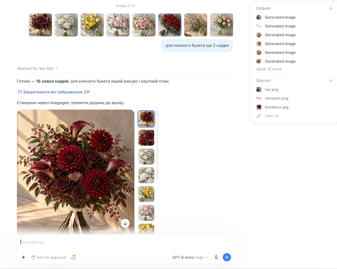
→ AI-generated bouquet photography, so the catalog looks like a real shop
Time: ~10 hours, from "hmm, what about flowers?" to a working product.
What I learned: the hardest part wasn't the code. It was deciding what she shouldn't see. Hiding the price turned out to be the whole product.
Demo below 👇
Concept business — Hackney, London (demo details).
@Lovable


this is lovely

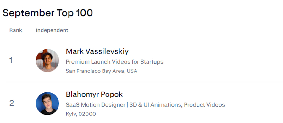
Ranked #2 on Contra's September Top 100.
Thanks to the founders who handed me their product launch this month and let me animate it properly. SaaS dashboards, 3D product shots, UI motion that explains the thing in 30 seconds.
October calendar is open, DMs too🙌


Threadly is a SaaS dashboard for independent sellers who need one clear workspace for products, orders, stores, and sales performance.
We focused on making commerce data feel approachable: key metrics are easy to scan, top products stay visible, recent orders are structured clearly, and product quick views give sellers deeper context without interrupting their workflow.
See the design:
https://dribbble.com/shots/27777724-Dashboard-E-commerce
