The network for creativity
Join 1.25M professional creatives like you
Connect with clients, get discovered, and run your business 100% commission-free
Creatives on Contra have earned over $150M and we are just getting started
Back to feedPost

Built on Wordpress. Ecommerce store using wordpress woocommece.


The network for creativity
Join 1.25M professional creatives like you
Connect with clients, get discovered, and run your business 100% commission-free
Creatives on Contra have earned over $150M and we are just getting started











Related posts


The Clarify, Mobilize, Align framing gives this deck a clear narrative spine, Deep. Practical thinking, measurable progress is a message that will land in any boardroom. A minimalist approach makes the authority of the content stand out.


Happy Friday!
As another working week comes to an end, there's something worth thinking about.
Not every improvement in business comes from doing something new.
Sometimes, it comes from paying attention to what you've already built.
The website you launched.
The services you've been offering.
The conversations you've had with potential clients.
The feedback you've received.
And even the opportunities that didn't turn into actual business.
There's always something to learn.
Maybe someone visited your website but never reached out.
Maybe a potential client asked a question you thought your website had already answered.
Or maybe you've been so focused on attracting new customers that you haven't taken time to review the experience you're giving the ones already interested.
These little things can tell you a lot about where improvements are needed.
Growth isn't always about adding more. Sometimes, it's about making what you already have work better.
So before you close your laptop and settle into the weekend, take a moment to reflect.
What worked well this week?
What could have been better?
And what is one thing you can improve when the new week begins?
You don't have to figure everything out today.
Sometimes, recognizing what needs attention is already a step in the right direction.
Have a restful and productive weekend!
What's one lesson you're taking away from this week?
I am Michael Tewogbade, a WordPress Website Designer and Elementor Expert who helps startups, organizations, and service-based businesses build and strengthen their online presence through website design, redesign, development, and optimization.
I create clear, responsive, and user-friendly websites that communicate what a business does, build credibility, improve the user experience, and guide visitors to take action. My goal is to help businesses turn their websites into valuable tools that support growth.


BEFORE vs AFTER
Which product page would make you more likely to buy?
Same product. Same price. Two different shopping experiences.
A — Before Elixir: A simple product page with a basic layout.
B — After Elixir: A more polished shopping experience with customer reviews, trust signals, product benefits, and quantity discounts.
As a developer interested in e-commerce and UI/UX, I believe great design should do more than look good — it should build trust and make buying easier.
👇 Which one would you choose: Before or After?
What makes the biggest difference to you: product presentation, reviews, trust signals, or discounts?
#Ecommerce #Shopify #UIDesign #ConversionOptimization #Figma #Canva #Framer #Adobe
4 voted
50%
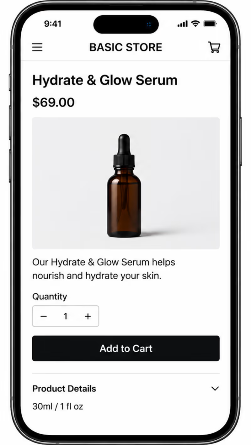
4 voted
50%
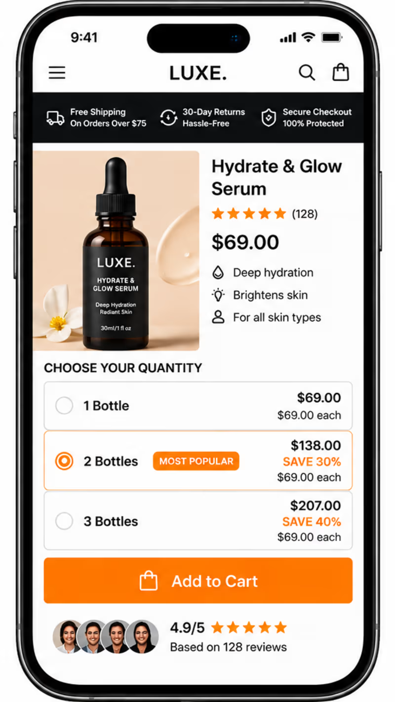
8 votes
Closed

Customer reviews and trust signals make the biggest difference by far. For a $69 skincare bottle people need to see genuine ratings and money back guarantees before they hit buy. But the other elements still matter, better product photos make the brand look legitimate and bundle...