The network for creativity
Join 1.25M professional creatives like you
Connect with clients, get discovered, and run your business 100% commission-free
Creatives on Contra have earned over $150M and we are just getting started
Back to feedPost
I have been using Claude Code for 2 months now, and i'm now at a level where i'm able to produce production ready components from designs.
I couldn't find the right component in Shadecn so I created and tweaked my own side nav bar, and the way of how I wish this experience would feel, you can see on the left my idea of build, and on the right the execution after a couple prompts.
It's like the smallest thing ever, but basically, I hate jumpy dashboard when one minimizes it, in this example you get to see how smoothly it closes.
No layout jumps, or random logo flashes, or jumpy-ness.
If you care about little details like this, you can definitely ship quality-grade products with AI.


My fear is shipping AI-Slop, so I spend a good amount of times (and tokens) until i'm happy with what I see.

This is solid, it feels both clean and engaging. If someone wanted to create something at this level, what would you say matters most in your process?

Feeding my design systemswas the first thing I did when I started working with Claude for writing documentation and with Claude code to build really smooth prototypes. AI or not, it's all about craft :)
Exactly!


The network for creativity
Join 1.25M professional creatives like you
Connect with clients, get discovered, and run your business 100% commission-free
Creatives on Contra have earned over $150M and we are just getting started





Related posts

Solene: skincare e commerce website, built in Framer
Skincare shopping should feel as good as the routine itself. For Solene, I designed and built a full online store with a soft, warm identity: a bold maroon and pink palette, big expressive type and real-skin photography.
What's inside:
A hero that sets the brand tone straight away
A Bestsellers section for quick browsing
Category pages for Cleanse, Hydrate and Protect
A shop page with price slider, filters, sorting and hover image previews
An Our Story page with brand values
A clean, confident footer
Need a website for your beauty or lifestyle brand? Let's talk.


The hover image previews on the shop page caught my eye - they let shoppers sense texture instantly without an extra click.


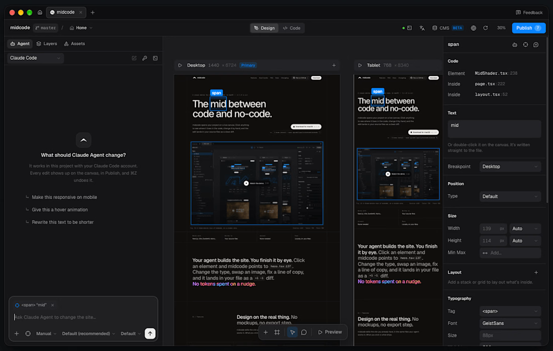
- massively improved the 'builder' part of the app.
-canvas is now functional and you can design directly there (outside of your breakpoints) wip
-your agent in a chat made for midcode
-components and pre-built sections
-much more

Spent a few hours tweaking my police chase game in Unity today.
Reworked all the menus and modals using Claude Design and Opus 5.5 and also made a few small tweaks to the lighting.
I’ve also started on all the tedious stuff like integrating ads, setting up App Store page and all the boring admin stuff.
Luckily asc.cli can handle most of it otherwise I would procrastinate over it for weeks.

where is the link