The network for creativity
Join 1.25M professional creatives like you
Connect with clients, get discovered, and run your business 100% commission-free
Creatives on Contra have earned over $150M and we are just getting started
Back to feedPost

Built a clean and consistent style for the client


The network for creativity
Join 1.25M professional creatives like you
Connect with clients, get discovered, and run your business 100% commission-free
Creatives on Contra have earned over $150M and we are just getting started




Related posts

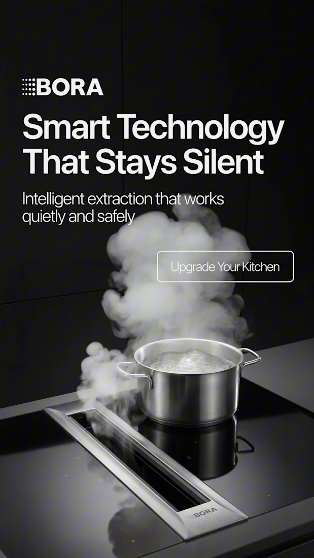
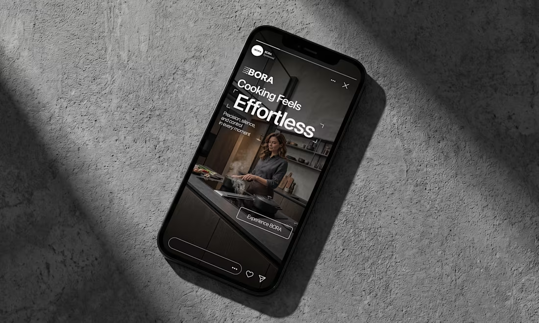
BORA – Ad Creative Concept
Most kitchen appliance ads sell you the warm family dinner. I wanted to try the opposite.
Built this BORA concept as a portfolio piece, treating the product like architecture instead of tech – dark marble, concrete, no hands, no food styling. Just a pot, steam, and silence.
The steam does all the movement in the motion piece. Typography stays out of the way – one line, low CTA, nothing fighting the composition. Turns out when you strip out the lifestyle, the price point sells itself.



Visual Experiment
A compilation of recent visual tests, focusing on atmospheric lighting, fast-paced rhythm, and high-contrast color treatment. Designed to explore the boundaries between cinematic realism and abstract motion.
Everything handled from initial style framing to final color grading and typography integration.
Tools: After Effects, DaVinci Resolve
Created by Johan Vane


The lighting and color treatment create a strong atmosphere.


Motion Graphics for a new product launch.

the freeze protection card is a nice touch. is this for a real app or a concept?