The network for creativity
Join 1.25M professional creatives like you
Connect with clients, get discovered, and run your business 100% commission-free
Creatives on Contra have earned over $150M and we are just getting started
Back to feedPost

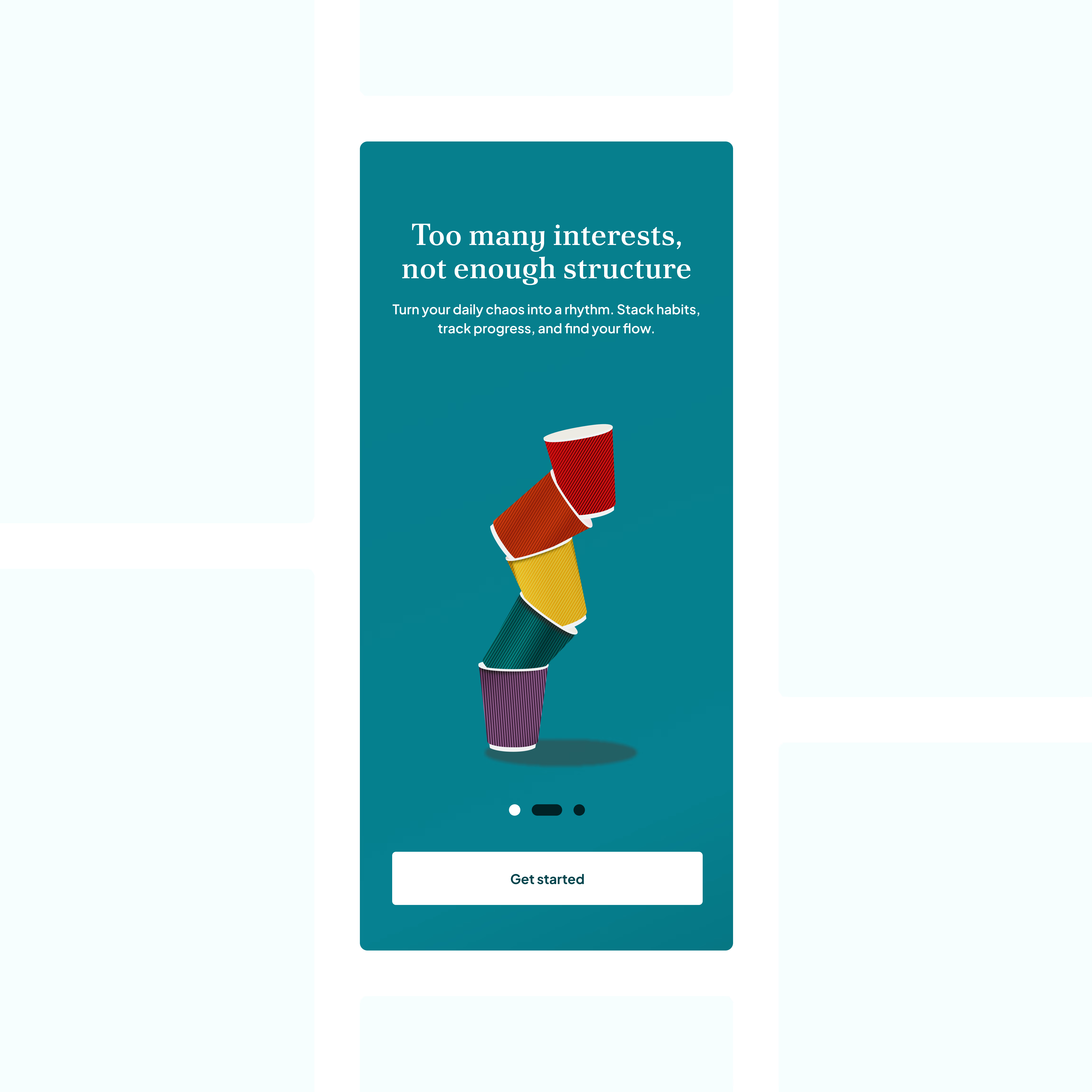
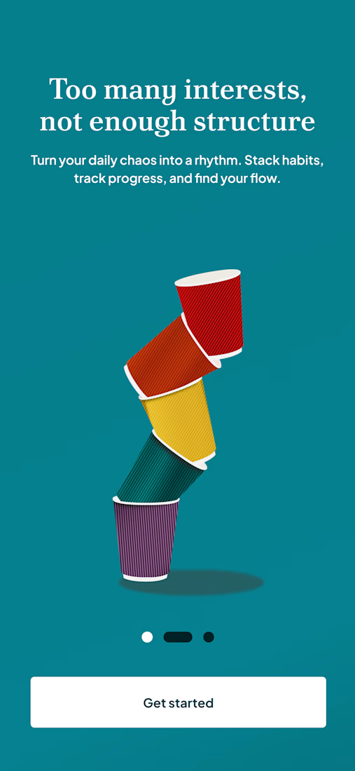
Lately, I’ve been thinking about how "inconsistency" isn’t loud — it’s quiet, repetitive, and unintentional.
This concept translates that idea into a simple onboarding experience.

The network for creativity
Join 1.25M professional creatives like you
Connect with clients, get discovered, and run your business 100% commission-free
Creatives on Contra have earned over $150M and we are just getting started


Related posts

Just wrapped up my fourth UX & Conversion Copywriting concept on Contra! 🎓
Creator platforms often lose new users right after sign-up, not because the product lacks features, but because landing on an empty dashboard triggers instant "blank-canvas paralysis."
For this self-initiated SkillForge concept, I focused on turning curious visitors into published creators:
• Outcome-First Landing Page: Led with speed-to-value ("Turn What You Know Into Income—In One Afternoon") paired with zero-risk microcopy ("Free until you make your first sale").
• Guided Empty-State UX: Replaced dead-end "No products yet" screens with a welcoming 3-step studio prompt and format selector.
• Confidence-Boosting Microcopy: Added an inline pricing tip right inside the publish flow to eliminate second-guessing before launch.
Check out the full case study on my profile and let me know: what’s your favorite example of great empty-state UX copy? 👇

Tackling blank canvas paralysis right at the landing page level is a smart angle, most onboarding fixes only start inside the dashboard. Nice consistency on four concepts already, Dan.


Home A wins, its clarity suits a consultancy.


5 signs your team has outgrown its spreadsheet 👇
Three versions of the same file. “Orders_final_v2” vs “Orders_FINAL_use_this”. Nobody knows which one is right.
Copy-paste between sheets. Every copy is a chance for a #REF! error.
Everyone can edit everything. One wrong click and 70 rows are gone.
It takes forever to open. Your team waits before they can even start working.
Reports are rebuilt by hand. Someone loses hours every week making the same chart.
Quick rule: 1 or 2 of these? Keep the spreadsheet. 3 or more? It’s quietly costing you more than a simple dashboard would.
How many of these does your team have? 👇

Those duplicate files are a clear sign.