The network for creativity
Join 1.25M professional creatives like you
Connect with clients, get discovered, and run your business 100% commission-free
Creatives on Contra have earned over $150M and we are just getting started
Back to feedPost

Modern SaaS & Tech Landing Page
A high-converting landing page designed for a modern SaaS platform. This project focuses on a "Dark Mode" aesthetic with premium glassmorphism elements, ensuring a high-end feel that builds trust with tech-savvy users. The layout is optimized for speed, clarity, and user engagement.
Art Direction: Created a cohesive visual language using deep tones and vibrant accents.
UI Architecture: Designed a modular layout that scales perfectly across all devices (Desktop, Tablet, Mobile).
Interaction Design: Focused on clear call-to-action (CTA) placement to maximize lead generation.
Performance Optimization: Structured the design to ensure lightning-fast loading times.


The network for creativity
Join 1.25M professional creatives like you
Connect with clients, get discovered, and run your business 100% commission-free
Creatives on Contra have earned over $150M and we are just getting started

Challenges
View all


Related posts

SENE car rental Website Projects
A car rental website shouldn't make people think too much. It should help them find the right car, understand the price, trust the service, and book with confidence.
I designed SENE around exactly that principle.
Need a website that turns visitors into customers?
I help businesses create modern, conversion-focused websites that look premium and make the user journey easier.
Available for website design & redesign projects.
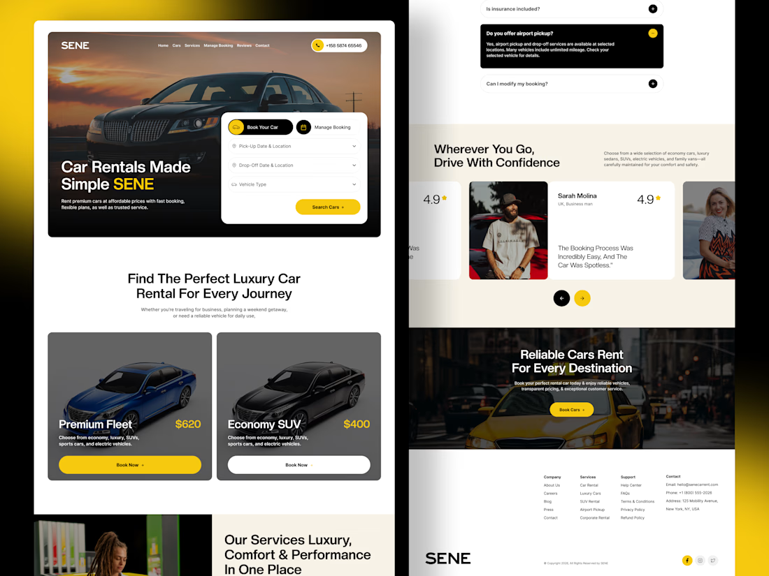

The composition is extremely clean and well organized. It’s impressive how you managed to fit so much information into the layout while keeping everything visually comfortable.


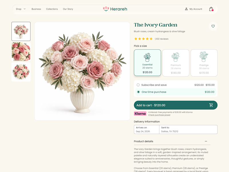
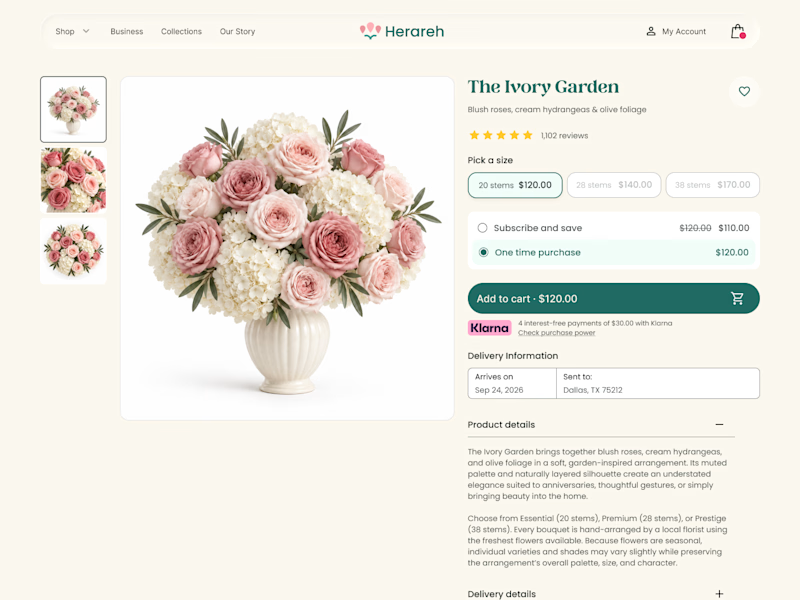

Icon cards for me, bouquets are such a visual purchase that a scannable icon beats reading "small/medium/large" every time. Did the compact chips version convert worse in testing, or are you still gathering data on that?

What if a space brand didn’t just look futuristic — but felt like it was already living in the future?
For XPACE, the goal was to build a visual identity that could turn the idea of space exploration into a complete and immersive brand experience.
The identity combines a bold typographic system, a high-contrast visual language, and electric blue accents against deep black to create a futuristic presence that feels precise, technological, and unmistakably XPACE.
But the identity didn’t stop at the logo.
The system was extended across digital interfaces, web design, favicon and UI icons, access cards, board passes, and branded applications — creating a consistent experience across every touchpoint.
Every detail was designed to make XPACE feel less like a brand inspired by the future, and more like a brand built for it.
XPACE — Visual Identity System.
Looking to build a visual identity that goes beyond a logo?
Let’s create something with a world of its own.


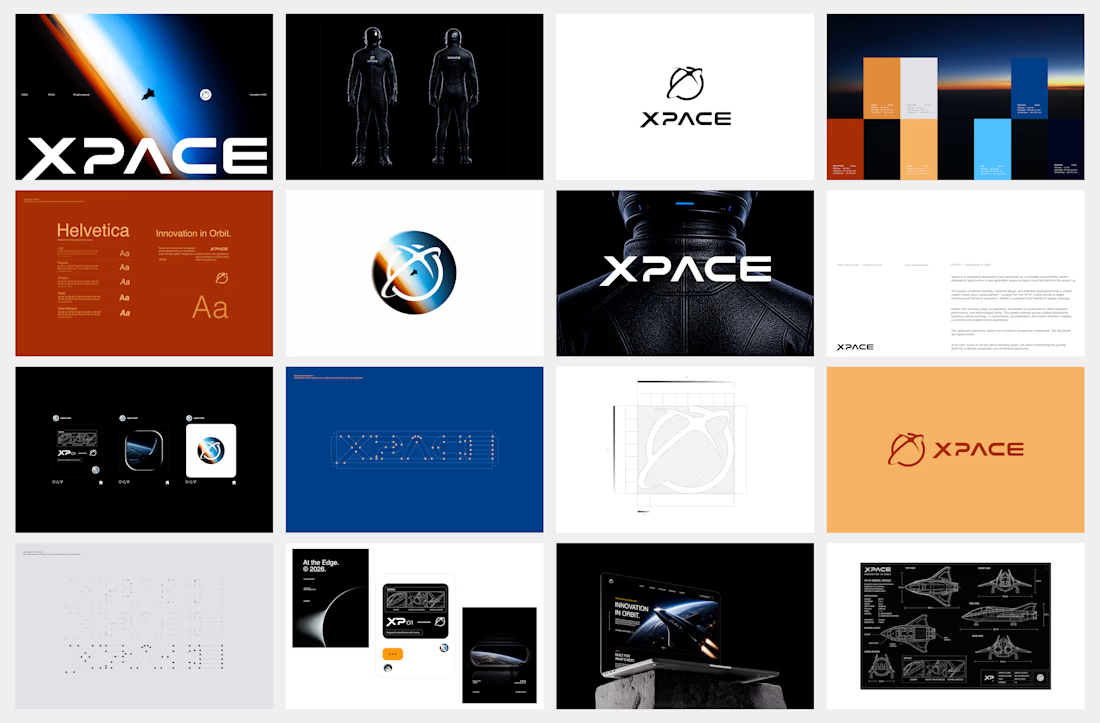

The identity system feels cohesive because the typography, electric blue accents, and image language all push in the same direction. Extending that logic into interfaces and packaging is what makes XPACE feel like a real world, not just a futuristic logo.