The network for creativity
Join 1.25M professional creatives like you
Connect with clients, get discovered, and run your business 100% commission-free
Creatives on Contra have earned over $150M and we are just getting started
Back to feedPost

Flashed Back to my Beginning
I rrembered when i started Grapgics journer, i designed this promotional flyer for a fictional hair brand, Elora Hair Sales, with one goal in mind, Make people stop scrolling in under 3 seconds.
I always have the mindset of "If I saw this while scrolling, would I stop and read it?" Good design isn't just about aesthetics, it's about communicating the message quickly and encouraging people to take action.
I'd love your feedback! What's the first thing your eyes noticed when you saw this design?
The colors? , The typography?, The model?, The overall layout?
Your feedback helps me continue improving my work.
graphicsdesigningbranddesignersocialmediadesignSocial Media ManagementCanva DesignSocial Content DesignAdobe PhotoshopCanvaFigma


The network for creativity
Join 1.25M professional creatives like you
Connect with clients, get discovered, and run your business 100% commission-free
Creatives on Contra have earned over $150M and we are just getting started











Related posts

The team is cooking
Motion design for the logo we are making for Nation e-commerce


Wou


HEATD is a heated Pilates and yoga studio in Mableton, Georgia. The name already said it all, so we made one decision from day one: the heat would be the whole brand 🔥
Amazing project and amazing team.
Collab with @gerbzagency

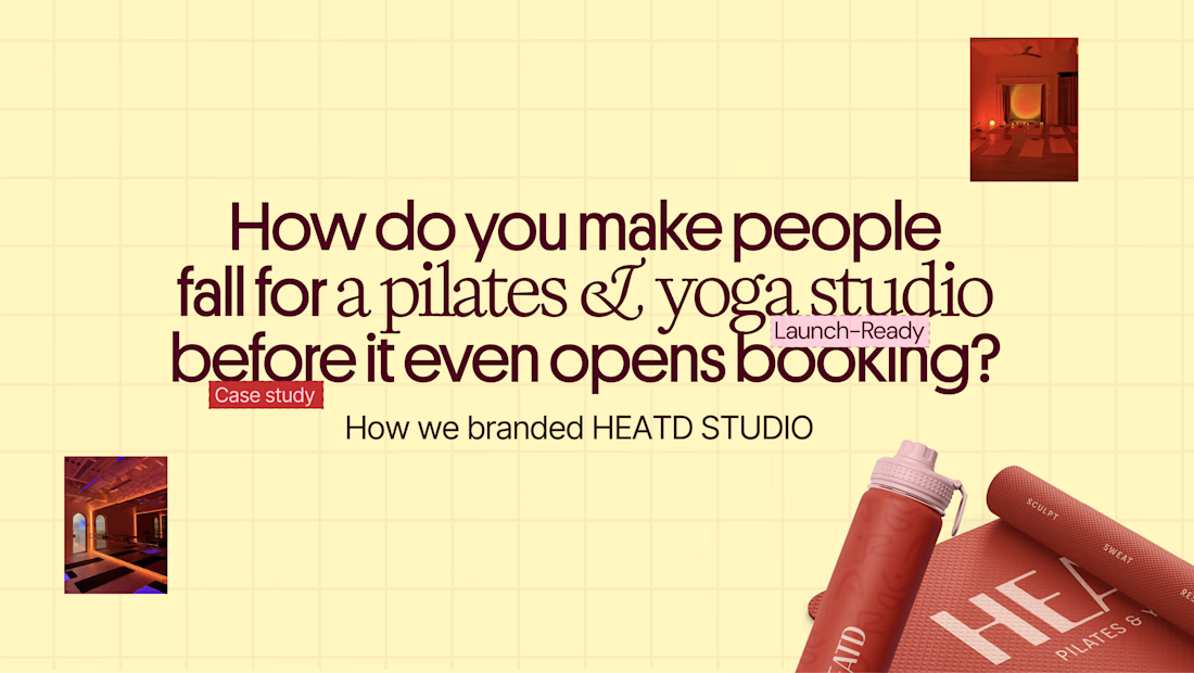
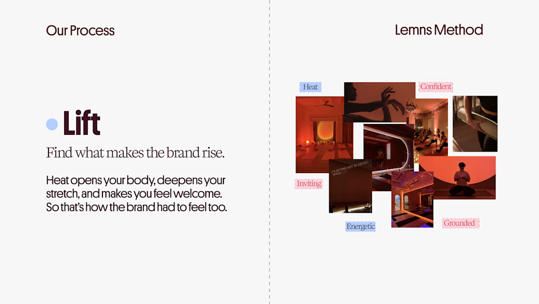
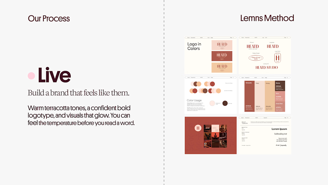
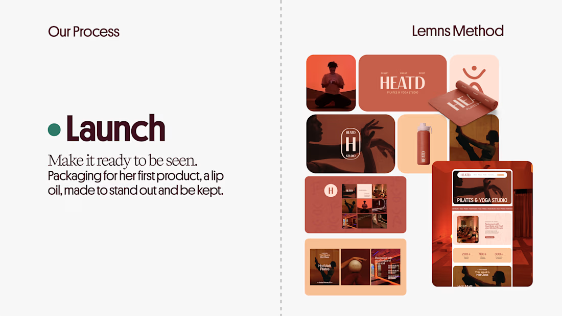

Curious how the terracotta palette got settled here: did the colour come first and the type follow, or the other way round? The heat idea reads as much through the warm tones as through the name itself.

New to Contra, but not new to design🚀
Hi, I’m a designer with 7+ years of experience. As a Top Rated Seller on Fiverr, I’ve completed over 3,500 projects for clients around the world.
Now I’m bringing my experience to Contra!
My team and I create Canva and Figma design systems, social media content, brand identities, and AI images and videos. We help businesses look consistent and make everyday content creation easier.

Wow Vladyslav that's cute❤️❤️