The network for creativity
Join 1.25M professional creatives like you
Connect with clients, get discovered, and run your business 100% commission-free
Creatives on Contra have earned over $150M and we are just getting started
Back to feedPost
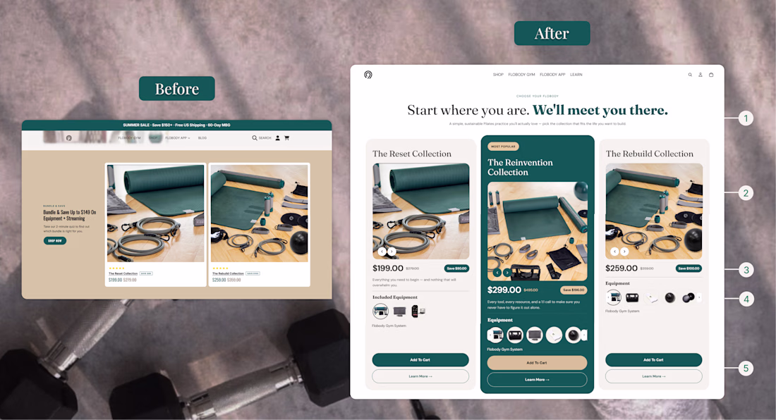
Built a user-friendly Bundle Section for Shopify!
This section clearly showcases what’s included in each bundle, including products, equipment, pricing, and other important details. Users can easily click the CTA buttons to navigate directly to the bundle page or individual product pages for more information.
✅ Desktop: Designed with a clean 3-card layout for easy comparison and browsing.
✅ Mobile: Converted into a smooth slider to reduce excessive scrolling and improve the user experience.
✅ Conversion-Focused: Helps customers quickly understand bundle value and navigate effortlessly.
✅ Responsive & User-Friendly: Optimized for seamless browsing across all devices.
#Shopify #ShopifyDeveloper #ShopifyDesign #ShopifyStore #Ecommerce #ConversionRateOptimization #CRO #ShopifyPlus #WebDesign #UIDesign #UXDesign #Replo #LandingPageDesign #DTCBrand #EcommerceDesign
Really like the 3-card to mobile slider move, that cuts the scroll fatigue that kills bundle conversions. On these I always reserve image height so the cards do not shift while loading, since CLS on a bundle view quietly hurts add-to-cart. Did you build this in Liquid sections or Replo? How did PageSpeed hold up?
The network for creativity
Join 1.25M professional creatives like you
Connect with clients, get discovered, and run your business 100% commission-free
Creatives on Contra have earned over $150M and we are just getting started
Related posts
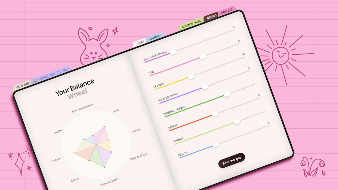
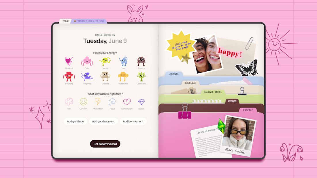
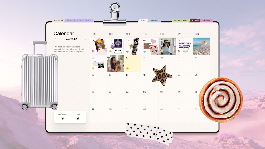
🫧📒 Digital Journal for Self-Reflection ✨
[ PROBLEM ]
In a busy world filled with work, responsibilities, and constant distractions, many people lose touch with their emotions, needs, and personal goals
While journaling can improve self-awareness and well-being, traditional journals are not always practical to use every day
[ SOLUTION ]
I created Digital Journal that makes self-reflection simple and accessible
The app helps users:
💎 Track mood and energy
💎 Reflect on daily experiences
💎 Practice gratitude
💎 Capture thoughts, memories, and dreams
💎 Build greater self-awareness over time
The goal was to combine the convenience of digital tools with the warmth of a scrapbook-style journal
[ TOOLS TESTED ]
During the Makeathon, I explored and tested:
✔️Claude + Figma MCP for generating initial wireframes
✔️Figma AI Agent for early concept exploration and wireframing
✔️Figma for core pages visual design
✔️Figma Make for building and testing the interactive prototype
Project Link: https://aroma-clover-93652527.figma.site
🎥 Watch the demo video to see the full design process, tools used, and how the project was built from idea to interactive prototype
Demo Video (the same as attached): https://drive.google.com/file/d/16Bvwa4M9g3-vPlygg6ljnqOPhMV69cvV/view?usp=sharing
If you enjoyed this project, I would appreciate your support ❤️
———
Wow, feel whisper of childhood. Amazing work.
We're emotional beings. Our tools rarely are.
Emotions can't really be taught. They arrive through lived experience, already packaged with a thousand tiny feelings and nuances we carry without thinking. So what if an interface tapped into that?
Meet Clothesline 🧺, a to-do list with feelings.
Instead of "an urgent, high-priority, do-or-die task," you simply have a bedsheet-sized goal for the year and a sock-sized one for today. One glance and you know exactly how much you're holding.
Create, save, and track your goals right in your browser, the same way you'd hang, dry, and fold your laundry. Close the tab or restart your browser and your line stays exactly how you left it, so nothing ever slips away.
The rope sags under the weight you carry, a little bird drops by with daily inspiration, and finished goals get folded away. It even makes a lovely little second-monitor companion to glance at while you sip your coffee and work.
Built end to end in Figma: Design, Weave, MCP, Make, Sites, and Slides.
🧑🏼🎨 A small experiment in emotional interface design, software that doesn't just track your goals but feels alive alongside them.
It still amazes me how fast an idea can travel from your head to something real, alive, and in your browser.
Notes for reviewers: the overdue state (storm and rain) normally triggers when a goal passes its due date. To preview it without waiting for real time to pass, add a goal and press 'n' for +1 day, 'm' for +1 month, or 'r' to reset. You'll see the sky turn and the line react, so you can fold fast or change the due date.
Links:
--------------------------------------------------------------
Live site
--------------------------------------------------------------
Community file
--------------------------------------------------------------
Process/BTS slides deck (To Learn-Apply-Amplify)
* videos might take some time to load
--------------------------------------------------------------
Linkedin ✦ Instagram
Song playing: "What A Wonderful World" - Louis Armstrong
#emotionalinterfacedesign #goalsetting #todolist #goals #ConfigMakeathon
#Storytelling #Userexperiencedesign @Figma @Contra
Woahhh!!! ✨
A few days ago, I shared a preview of this project. Now it's finally live ✨
While working on this website concept for an interior design studio, I kept asking myself:
How do you make a website feel as cozy as a beautifully designed home?
The answer wasn't in flashy animations or complex layouts. Instead, I focused on atmosphere — elegant typography, rich imagery, thoughtful spacing, and a balance between warmth and luxury.
Curious to hear your thoughts: What’s the first feeling this design gives you? 👀
Trending
Claude
Claude has entered the design space. How are you using Claude Design?
Contra University
Learn from expert creatives how to earn more using next-gen AI tools.
MagicPath
The canvas is infinite, and exploration is becoming the workflow. How are you using MagicPath?
creativeaiflow
Creative AI workflows are evolving. What tools do you use, and what are their strengths and weaknesses?
freelancerlife
Freelancer life is wins, pivots, and everything in between. What’s yours right now?