The network for creativity
Join 1.25M professional creatives like you
Connect with clients, get discovered, and run your business 100% commission-free
Creatives on Contra have earned over $150M and we are just getting started
Back to feedPost


The network for creativity
Join 1.25M professional creatives like you
Connect with clients, get discovered, and run your business 100% commission-free
Creatives on Contra have earned over $150M and we are just getting started
Related posts

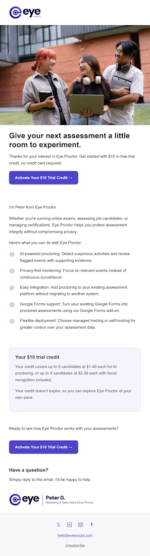
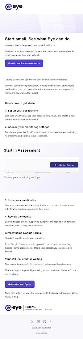
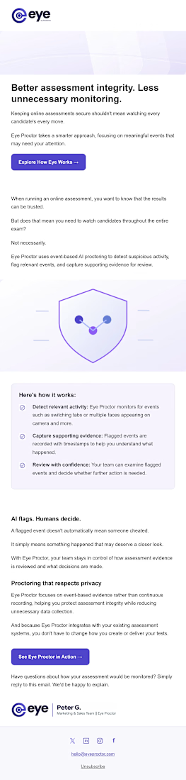
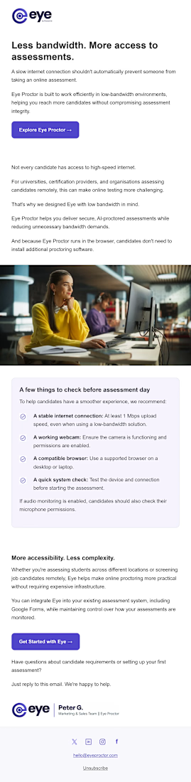
I designed a six-email series for Eye Proctor, an online exam proctoring platform.
The goal was to help new users understand the product, use their trial credit and set up their first assessment.
Each email covers a different topic, including getting started, monitoring settings, privacy and pricing. I used Eye Proctor’s colours, clear headings and simple buttons to make the emails easy to read and follow.
Here are a few designs from the series. I’d love to hear what you think.



"I only have these photos on a white background."
Every email designer has heard this one. It's enough to work with.
Those photos became 4 on-brand emails, and the client came back with the next task.
What do you usually get from clients: studio shots, lifestyle photos, or just white backgrounds?
Need emails for your brand? DM me or tap the link in bio.
#emaildesign #emaildesigner #klaviyo #emailmarketing #ecommercemarketing #dtcbrand #upworkfreelancer

For me it's mostly low-quality supplier photos that I have to clean up first, so a white background shot is honestly a gift. How do you keep 4 emails feeling different when they come from one photo set?

A design should tell a visual story and connect with the consumer