The network for creativity
Join 1.25M professional creatives like you
Connect with clients, get discovered, and run your business 100% commission-free
Creatives on Contra have earned over $150M and we are just getting started
Back to feedPost

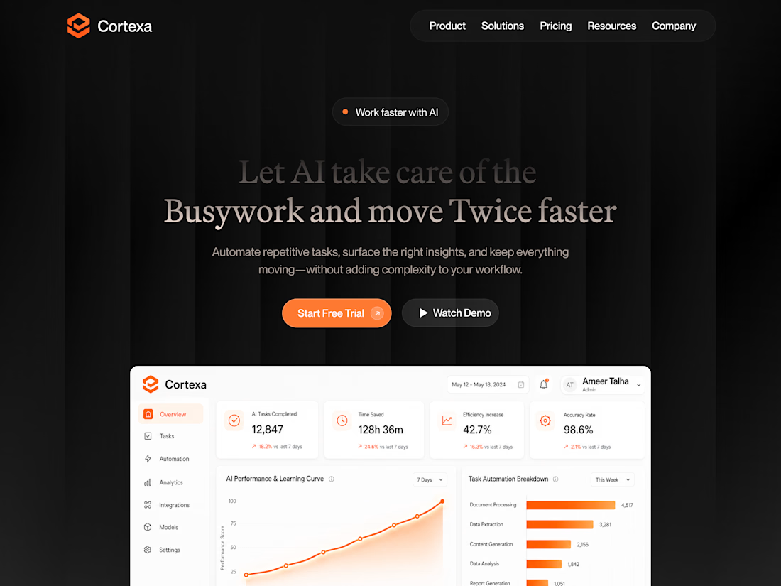

Really loving the direction here!
The network for creativity
Join 1.25M professional creatives like you
Connect with clients, get discovered, and run your business 100% commission-free
Creatives on Contra have earned over $150M and we are just getting started





Related posts


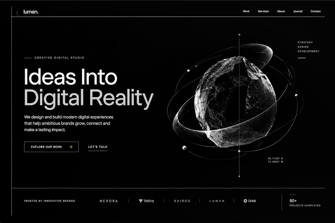

Sleek concept!!

A little slice of the homepage design.
Hero section. More coming soon.

The Glass Morphism is perfectly blended!!

Making a website template for an IT services company. Which hero section do you think is best?
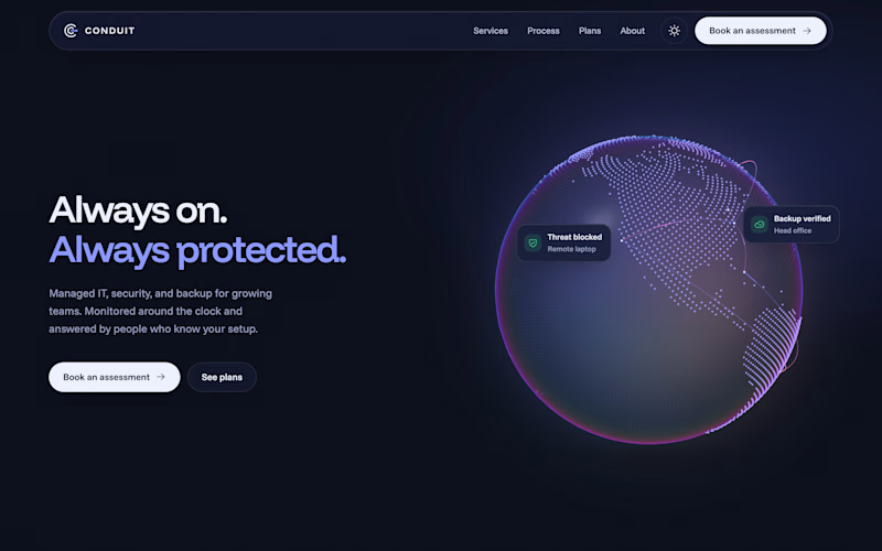
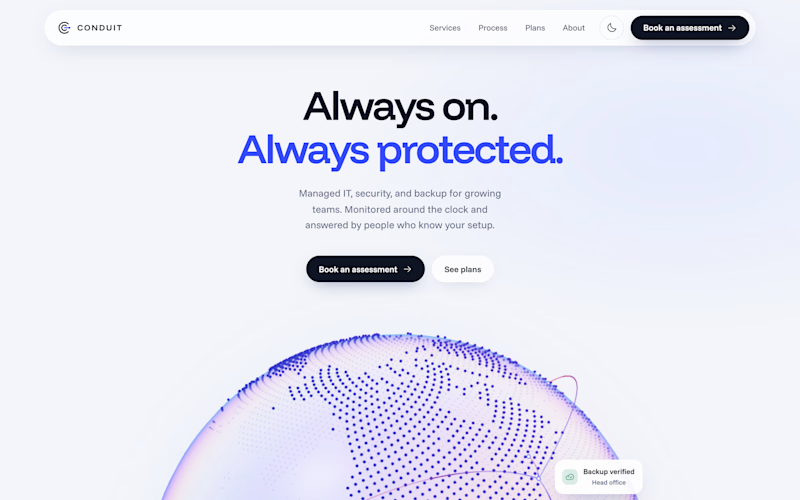
17 votes
Ends in 2h

It's more attractive Centered, light🎉🎉🔥🔥