The network for creativity
Join 1.25M professional creatives like you
Connect with clients, get discovered, and run your business 100% commission-free
Creatives on Contra have earned over $150M and we are just getting started
Back to feedPost
Something I keep coming back to as a designer is how well black and gold work together.
Black gives a design weight and restraint. It doesn't compete for attention, it just sits there with confidence and lets everything else around it breathe. Gold, on the other hand, is one of those colors that immediately signals premium without trying too hard, but only when it's used sparingly.
The combination works because they balance each other out so naturally. black holds the structure and gold becomes the accent that draws the eye exactly where you want it to go, on a button, a highlight, a small detail that makes the whole thing feel intentional rather than loud.
When it's balanced right, it's one of the most luxurious feeling combinations you can design with.
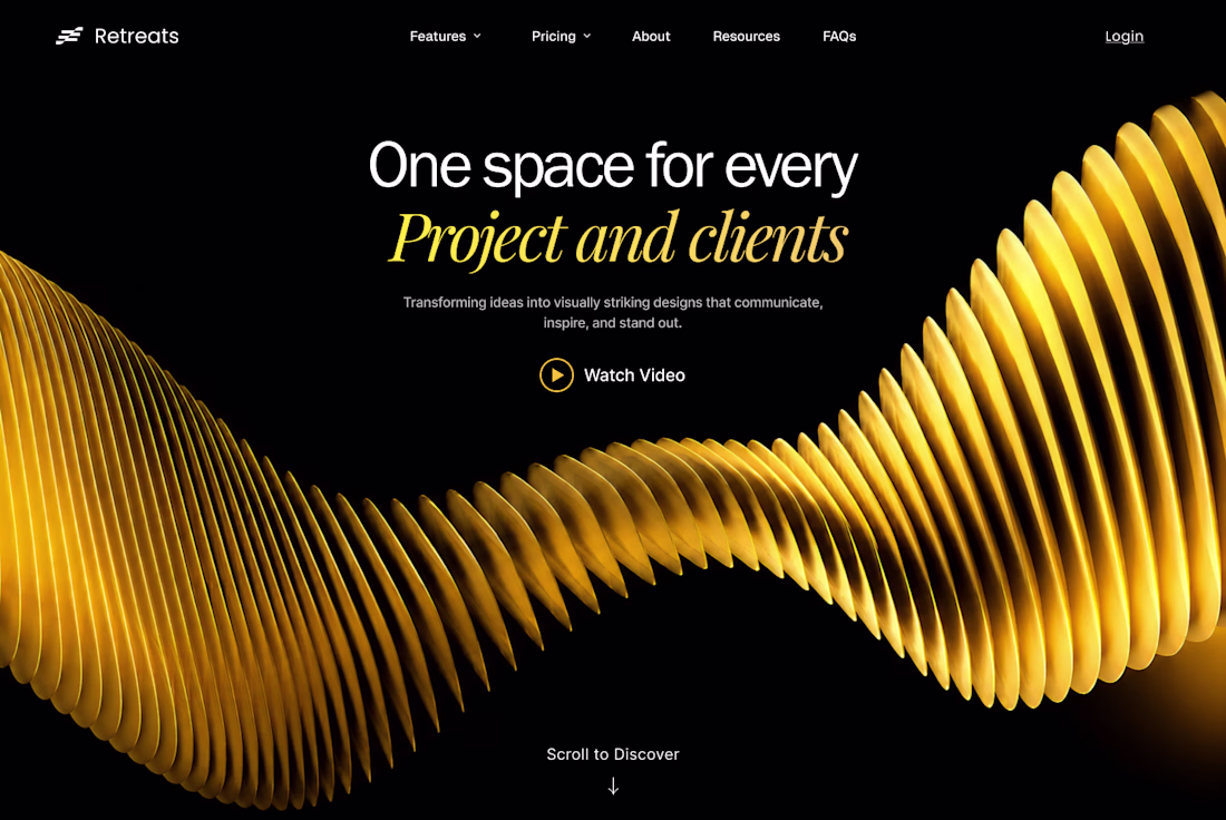
The point about gold only working when used sparingly is the part most people miss. It's easy to go overboard and end up with something that looks expensive-adjacent rather than actually premium. The Retreats site gets it right, the wave becomes the focal point and everything else steps back.
Nice work as usual
thanks Boluwatife.
A premium design outlook.
Glad you liked it
Nice work
Thanks Sujon
FIgma + framer absolute legend combo
Clean, professional, and easy to navigate.
The network for creativity
Join 1.25M professional creatives like you
Connect with clients, get discovered, and run your business 100% commission-free
Creatives on Contra have earned over $150M and we are just getting started
Related posts
Hey Contra 👋
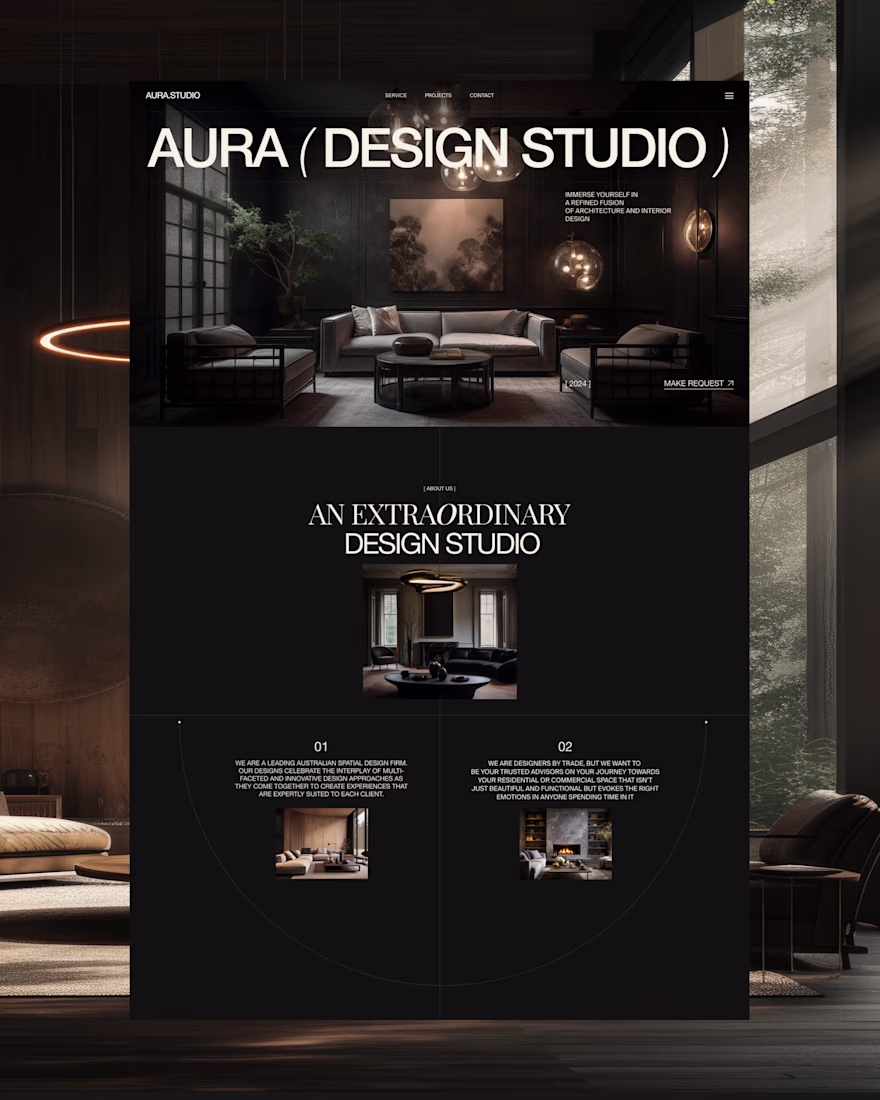
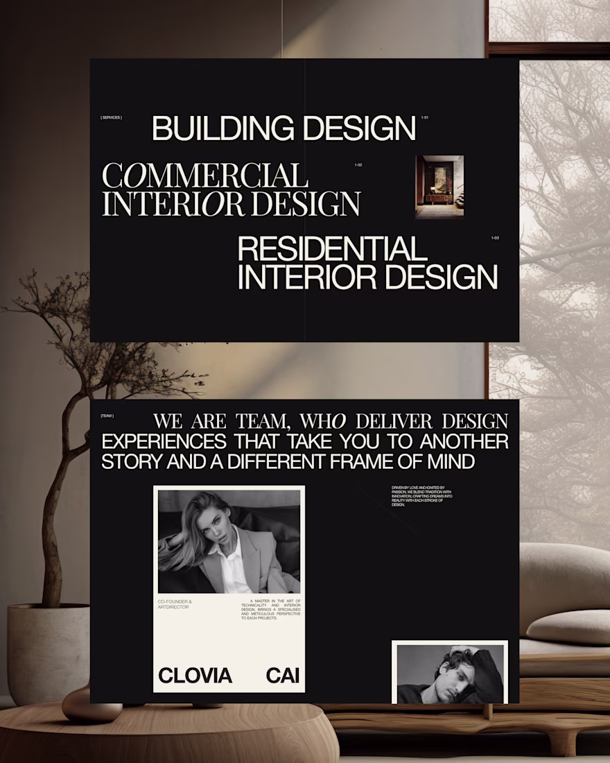
I'm Natali, a Web and UX/UI Designer from Ukraine.
I'm new here, so I thought I'd introduce myself and start exploring how everything works on Contra ✨
For my first post, I'd like to share a website concept I recently designed for an interior design studio. My goal was to create a sense of elegance, atmosphere, and space through typography, contrast, and carefully crafted visual details.
I'd love to hear your thoughts on the project 🤍
Also, I'm curious - what do you enjoy most about Contra, and what advice would you give to someone who's just getting started?
рада тебе тут бачити 😍
every AI startup landing page in 2026:
→ black background
→ purple gradient
→ a glowing orb floating in the void
→ "Intelligence, redefined"
so i built the opposite. warm, light, actually looks like a product.
free Framer template, link below ↓
nice color combination!
What if digital creation felt as natural as working with real clay?
Mitti is a gesture-controlled pottery experience that lets anyone sculpt virtual clay using hand movements. Instead of learning complex tools, users simply shape, narrow, widen, and refine pottery through natural interaction.
Start with different pottery styles, adjust wheel speed, and save finished creations to your personal collection.
Mitti explores how creative software can become more intuitive by replacing menus and controls with direct physical interaction.
Built using the Figma ecosystem for the Config Makeathon.
Links
Trending
Claude
Claude has entered the design space. How are you using Claude Design?
Contra University
Learn from expert creatives how to earn more using next-gen AI tools.
MagicPath
The canvas is infinite, and exploration is becoming the workflow. How are you using MagicPath?
creativeaiflow
Creative AI workflows are evolving. What tools do you use, and what are their strengths and weaknesses?
freelancerlife
Freelancer life is wins, pivots, and everything in between. What’s yours right now?