The network for creativity
Join 1.25M professional creatives like you
Connect with clients, get discovered, and run your business 100% commission-free
Creatives on Contra have earned over $150M and we are just getting started
Back to feedPost

I'm going to say something the entire marketplace development industry doesn't want you to hear.
The biggest risk in building a marketplace isn't the technology.
It's the questions nobody asks before the technology starts.
Who moves first — buyers or sellers?
How does a transaction actually happen, step by step?
Where does your cut come from?
How will you handle trust between two strangers?
What is the minimum flow that creates real value?
These questions sound simple.
They're not.
And the teams that skip them
always end up answering them later —
at a much higher cost.
At U1CORE we've worked on marketplace products across different industries.
The pattern is consistent:
the projects that go smoothly are the ones where these conversations happened first.
The ones that struggle are the ones where they didn't.
No sprint will save you from a wrong assumption.
No UI kit will solve a chicken-and-egg problem you haven't acknowledged.
The most valuable work in marketplace building
happens before anyone opens Figma.
If you're planning to build one —
start there.
The network for creativity
Join 1.25M professional creatives like you
Connect with clients, get discovered, and run your business 100% commission-free
Creatives on Contra have earned over $150M and we are just getting started

Challenges
View all


Related posts

A marketplace should feel as exciting as the thing you collect.
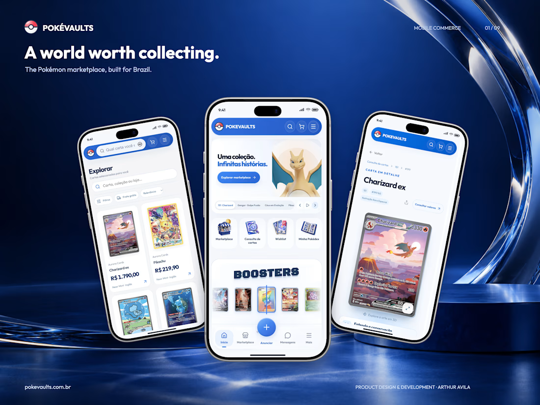
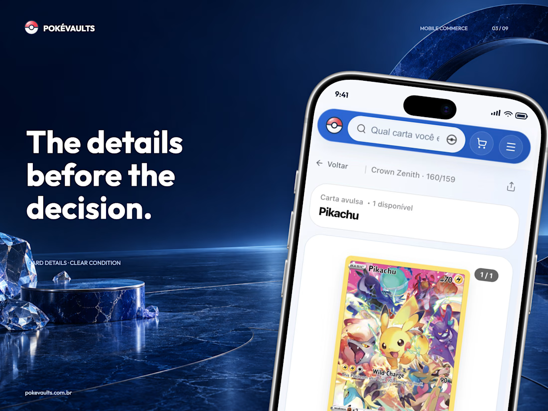
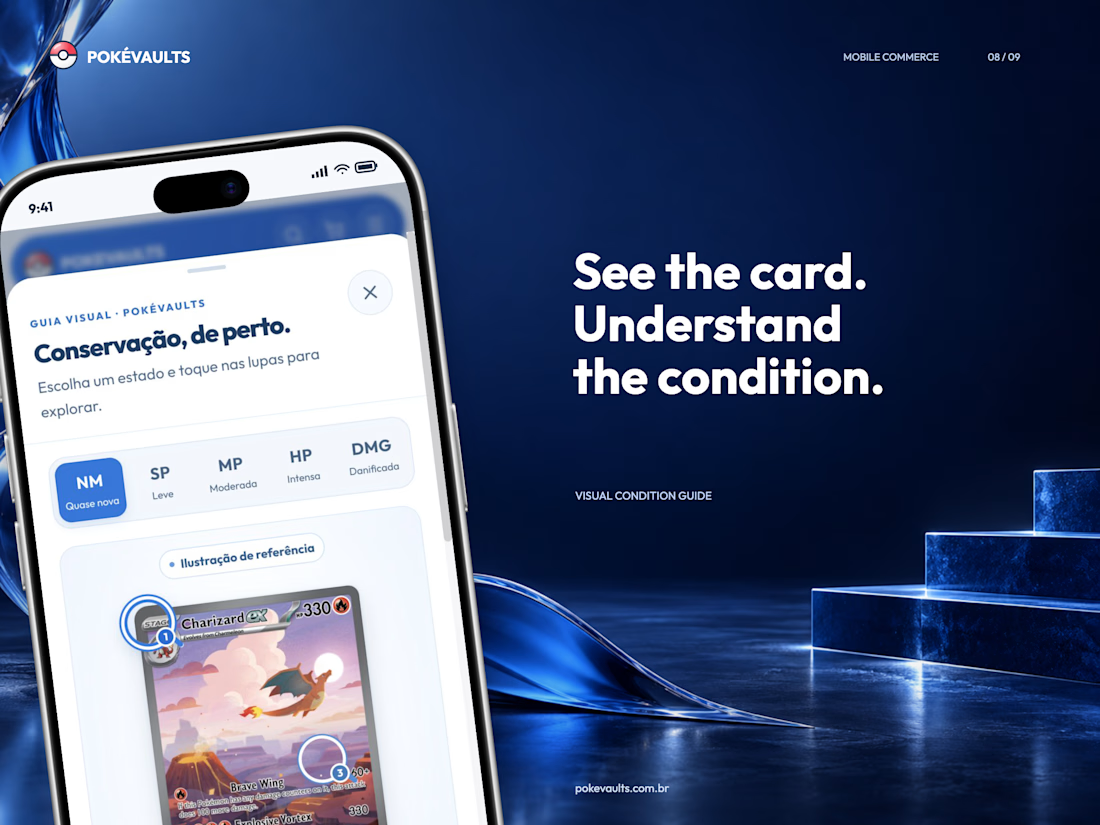
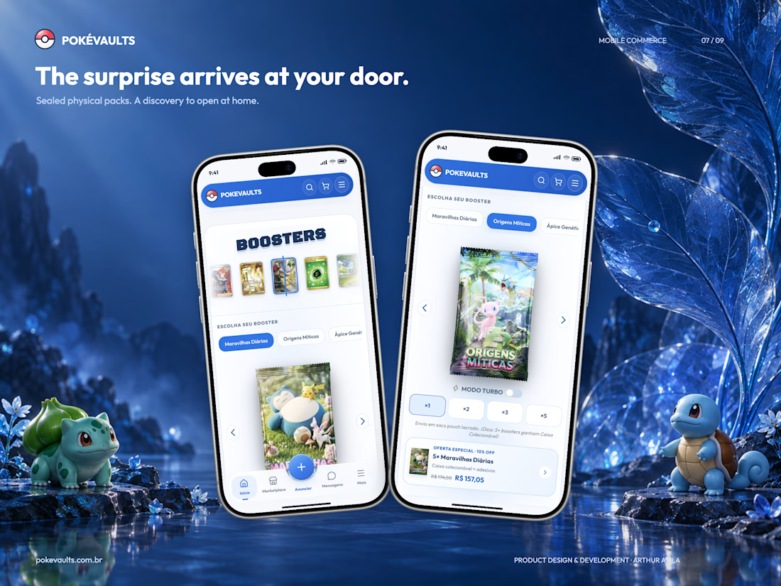
PokéVaults is a live Pokémon TCG platform I designed and developed for the Brazilian market, bringing card discovery, collecting and commerce into one connected mobile experience.
• Search cards, organize collections and share wishlists.
• Buy, sell and negotiate through marketplace listings and messages.
• Receive sealed physical mystery packs at home.
• Manage checkout, shipping and seller operations in the same product.
My work spans product design, UX/UI, full-stack development and Mercado Pago + Melhor Envio integrations. The challenge was keeping a specialist product intuitive without losing the detail collectors care about.
Explore the full case:
https://contra.com/p/ZgegsboN-pokevaults-pokemon-collecting-and-commerce-built-for-brazil
Live platform: https://pokevaults.com.br
Building a marketplace or a product with complex workflows? I’m available for design and development projects.
Showcase uses selected demo listings; the platform is built for Brazil and its interface is in Portuguese.


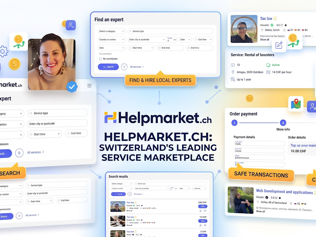
Helpmarket is a Swiss service marketplace that connects customers with trusted local specialists across multiple industries. Our team designed and developed advanced discovery tools with filtering by canton, city, postal code, search radius, hourly rate, language, and verified reviews. Specialists can publish service listings, manage education and portfolio details, select Regular or Business subscriptions, purchase promotional boosts, monitor an integrated CHF wallet, and share profiles through custom QR codes. The platform also includes client task placement, rating workflows, multilingual content, subscription monetization, and a Swiss-law-aligned knowledge base. Technology stack: .NET Core, C#, REST API, Next.js, TypeScript, Redux Toolkit, SCSS, Entity Framework Core, PostgreSQL, and Docker.



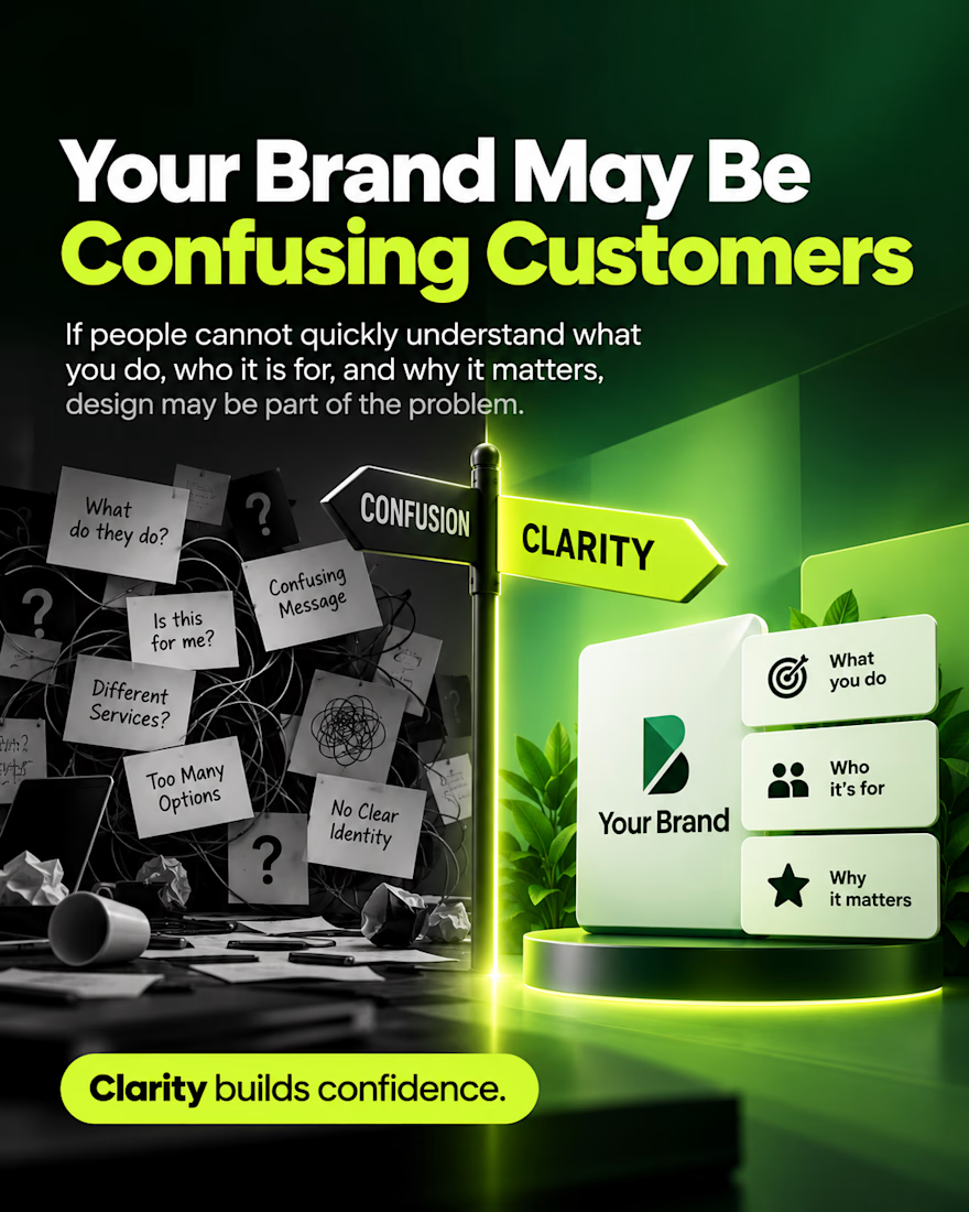
If visitors cannot figure out what you do within a few seconds, design is usually part of the problem.
When messaging is scattered, options are overwhelming, or visual identity lacks focus, prospects hesitate and move on to a competitor.
A high performing brand strips away the noise and answers three questions instantly:
• What You Do: Explaining your core offer in simple terms with zero guesswork.
• Who It Is For: Making your target customer feel like they are in the exact right place.
• Why It Matters: Highlighting clear value that sets you apart from the rest of the market.
Confusion creates doubt. Clarity builds confidence.