The network for creativity
Join 1.25M professional creatives like you
Connect with clients, get discovered, and run your business 100% commission-free
Creatives on Contra have earned over $150M and we are just getting started
Back to feedPost

Built this chat interface with Expo, Reanimated, and NativeWind, including a smooth slide-out sidebar inspired by modern messaging apps.
Focused on creating fluid interactions and a polished mobile experience.
Mobile DevelopmentExpoMobile DesignReact NativeTailwind CSSmobileappdesignmobiledevelopmentopentoworkfreelance


Smooth 👏
The network for creativity
Join 1.25M professional creatives like you
Connect with clients, get discovered, and run your business 100% commission-free
Creatives on Contra have earned over $150M and we are just getting started

Challenges
View all


Related posts

Friday app: Loopin
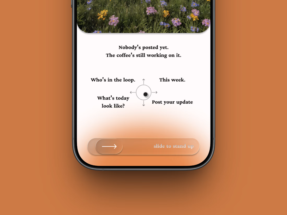
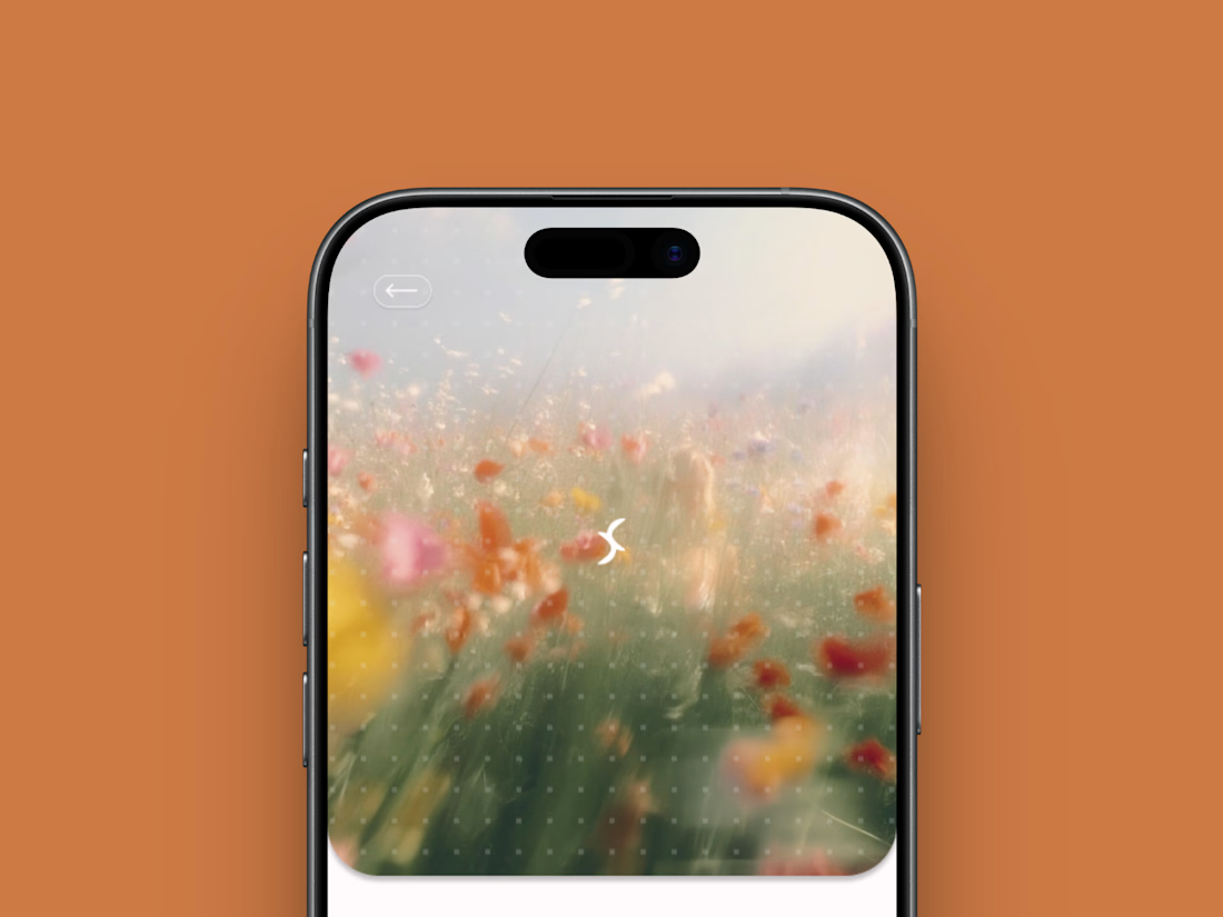
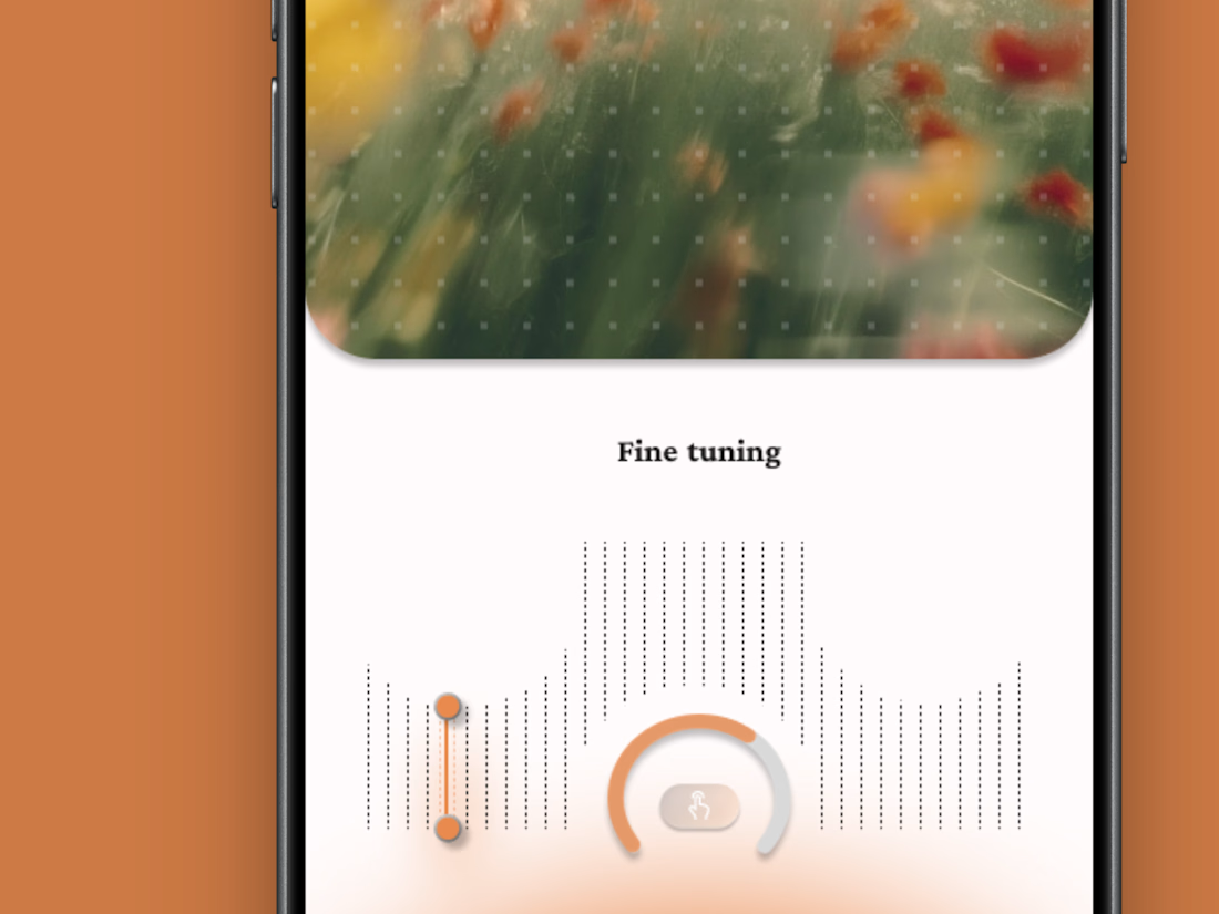
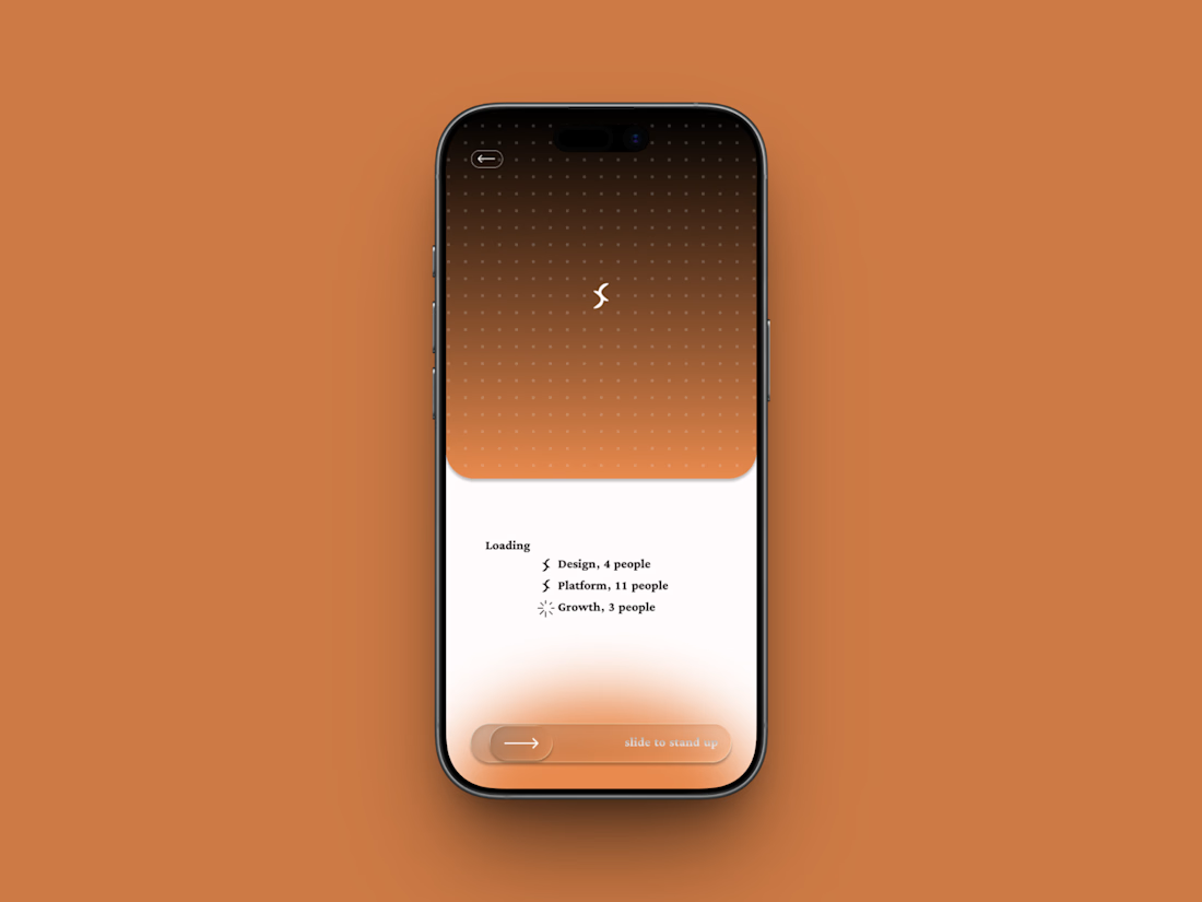
A fictional async standup app where the meeting is one gesture: slide to stand up.
Film-photo window up top, a four-way compass below, and a loading state that resolves your team one row at a time.
Concept project.


Amazing design

A Shopify store might look great on a computer but feel completely different on a phone.
That's why mobile optimization matters.
When reviewing a store's mobile experience, I pay attention to things like:
→ Easy to use navigation
→ Readable product descriptions
→ Clear product images
→ Buttons that are easy to tap
→ Proper spacing between sections
→ Product pages that fit the screen
→ A smooth path from browsing to checkout
The goal isn't just to make the desktop design smaller.
It's to make the store comfortable and easy to use on a mobile device.
Because customers should be able to browse products, understand what they're buying, and take the next step without unnecessary frustration.
A good mobile experience is an important part of good Shopify design.
Have you ever left an online store because it was difficult to use on your phone?



Absolutely. A smooth mobile experience can make the difference between a customer buying and leaving.