The network for creativity
Join 1.25M professional creatives like you
Connect with clients, get discovered, and run your business 100% commission-free
Creatives on Contra have earned over $150M and we are just getting started
Back to feedPost


Really grateful for this feedback from Roadmap Delivery Advisors 🙏
It was a fun project to work on, and I enjoyed helping turn Ian's ideas and Storydoc into a clean, focused website that reflects the business clearly.
Always appreciate working with great clients and building long-term relationships.

RECOMMENDED
“Henry was responsive, professional and terrific to work with. I wouldn't hesitate to recommend him going forward.”


Ian Brodie
Roadmap Delivery AdvisorsThe network for creativity
Join 1.25M professional creatives like you
Connect with clients, get discovered, and run your business 100% commission-free
Creatives on Contra have earned over $150M and we are just getting started







Related posts

Thinking of moving from Upwork to Contra? 👀
Freelancers, what’s your experience with Contra so far?
Are you getting quality leads, landing clients, and finding long-term projects?
Would love to hear your honest feedback! 🚀
#Contra #Upwork #Freelancing #FreelanceDeveloper::

I’ve been exploring Contra alongside other freelance platforms, and I like its community and portfolio-focused approach. I’m still building momentum, but it’s a promising platform for connecting with clients and finding new opportunities. 🚀


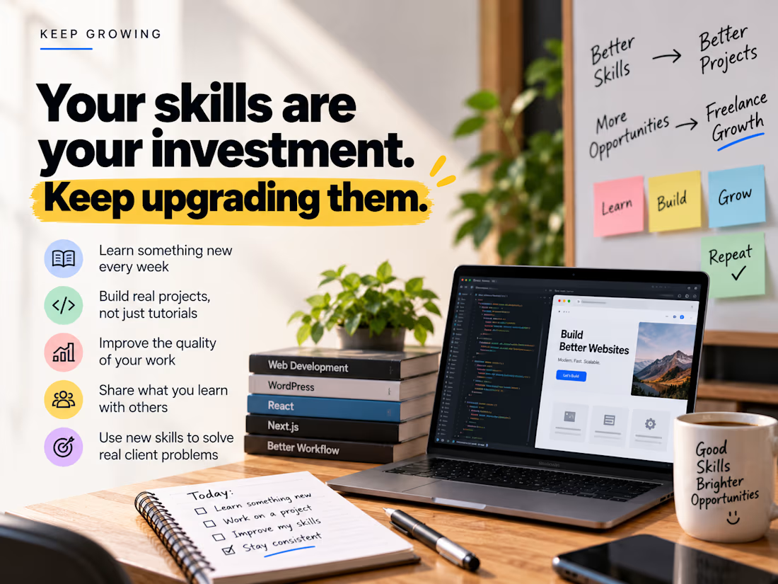
Your skills are your investment. Keep upgrading them. 💡
The web development world keeps changing.
New tools emerge.
Better workflows become possible.
Client expectations evolve.
As freelancers, we can't stop learning.
Here's what I'm reminding myself:
→ Learn something new every week
→ Build real projects, not just tutorials
→ Improve the quality of your work
→ Share what you learn with others
→ Use new skills to solve real client problems
You don't have to learn everything.
Just make sure you're better today than you were yesterday.
Keep learning. Keep building. Keep growing. 🚀
Wishing everyone in the Contra community a productive day and exciting new opportunities!
#contra #webdevelopment #wordpress #freelancing #continuouslearning
Absolutely! 🚀 Continuous learning is what helps us stay competitive as freelancers and deliver better solutions to clients. Keep growing and keep building! 💡