The network for creativity
Join 1.25M professional creatives like you
Connect with clients, get discovered, and run your business 100% commission-free
Creatives on Contra have earned over $150M and we are just getting started
Back to feedPost
Taste Test
Designed a "How it works" section for an invoice generation landing page. Which works better? without color or with color.
4 voted
80%

1 voted
20%

5 votes
Closed

The dark shade is more exciting

Thank you

I'll like it without color
The network for creativity
Join 1.25M professional creatives like you
Connect with clients, get discovered, and run your business 100% commission-free
Creatives on Contra have earned over $150M and we are just getting started











Related posts


Same brand. Same palette. Two completely different proposals for a real estate developer.
A: An isotype built from blocks. Geometric, precise, the language of construction. It says we build.
B: Custom lettering with movement. Warmer, more editorial. It says we build places you’d want to live in.
36 voted
51%

35 voted
49%

71 votes
Closed

My vote is B, Milagros. Custom lettering with movement has real editorial warmth, which suits a developer selling places people actually want to live in.

A few colour explorations from ARDA®.
I spent a bit of time experimenting with different colour combinations to see how they would change the overall feel of the site.
There were a few I really liked and considered taking further, but in the end I kept coming back to black and white. I felt it worked best with the imagery and typography, and ultimately suited the direction I wanted to take the project.

There is something satisfying about watching the same site change personality with each colour combination. The ARDA explorations look like a great exercise in that.

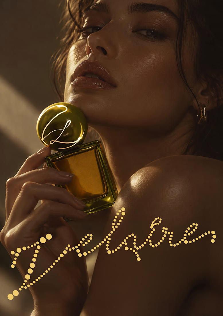
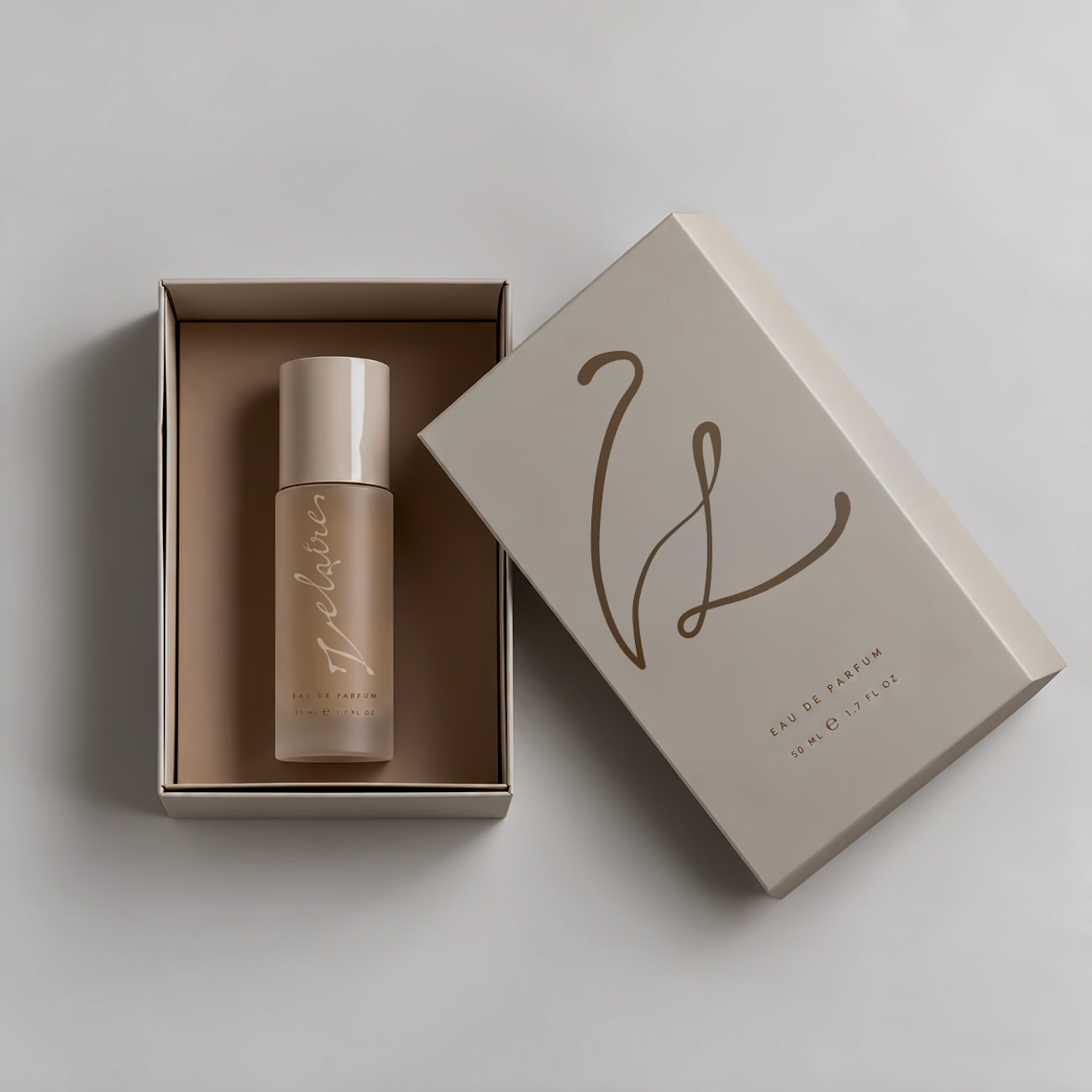
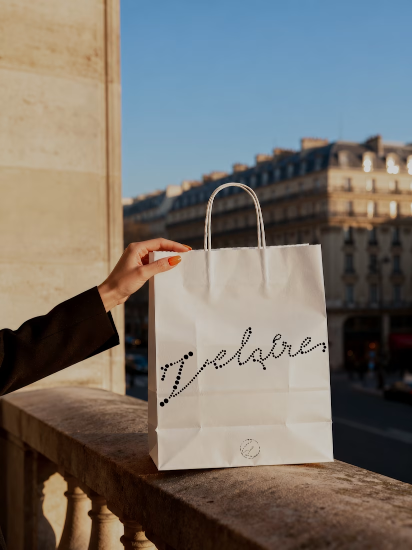
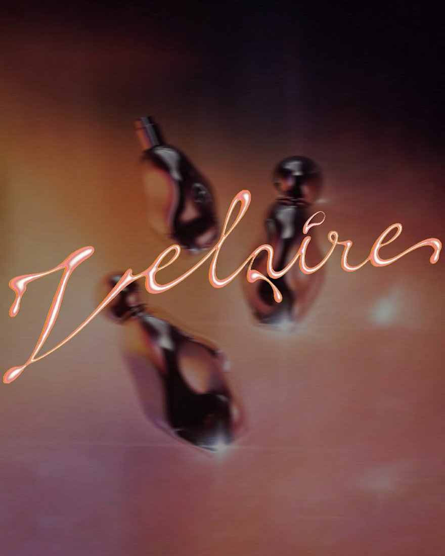
VELAIRE — Beauty & Fragrance Visual Identity
A self-initiated identity exploring custom lettering, sensual art direction and a refined visual system across packaging, editorial and digital applications.
Currently open to freelance and remote collaborations in branding, music, fashion and culture.
Visual Identity · Art Direction · Logo Design · Campaign Design
#VisualIdentity #ArtDirection #BrandDesign #LogoDesign #GraphicDesign



Great brand identity Yaren that's really luxury 🔥🔥