The network for creativity
Join 1.25M professional creatives like you
Connect with clients, get discovered, and run your business 100% commission-free
Creatives on Contra have earned over $150M and we are just getting started
Back to feedPost

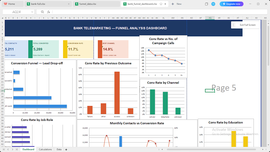
An excel dashboard to tell the realtime state of rates

The network for creativity
Join 1.25M professional creatives like you
Connect with clients, get discovered, and run your business 100% commission-free
Creatives on Contra have earned over $150M and we are just getting started





Related posts

Awesome


OCR extracts business names, formation dates, and addresses from uploaded documents automatically. But users still need to trust what the system found before anything gets submitted.
We designed the confirmation flow around editable fields that surface extracted data clearly....


Project Title:
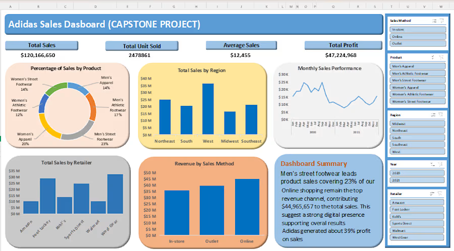
Adidas Sales Performance & Profitability Analysis (Capstone Project)
Overview:
A comprehensive interactive Excel analytics dashboard developed as a Capstone Project to analyze Adidas' overall sales revenue, unit distribution, regional performance, and profit margins. This dashboard transforms raw retail data into executive-ready visuals that highlight top-performing channels, regional growth opportunities, and product category trends.


"We can't afford a data analyst."
I've heard this from 3 different startups this year.
So I built one.
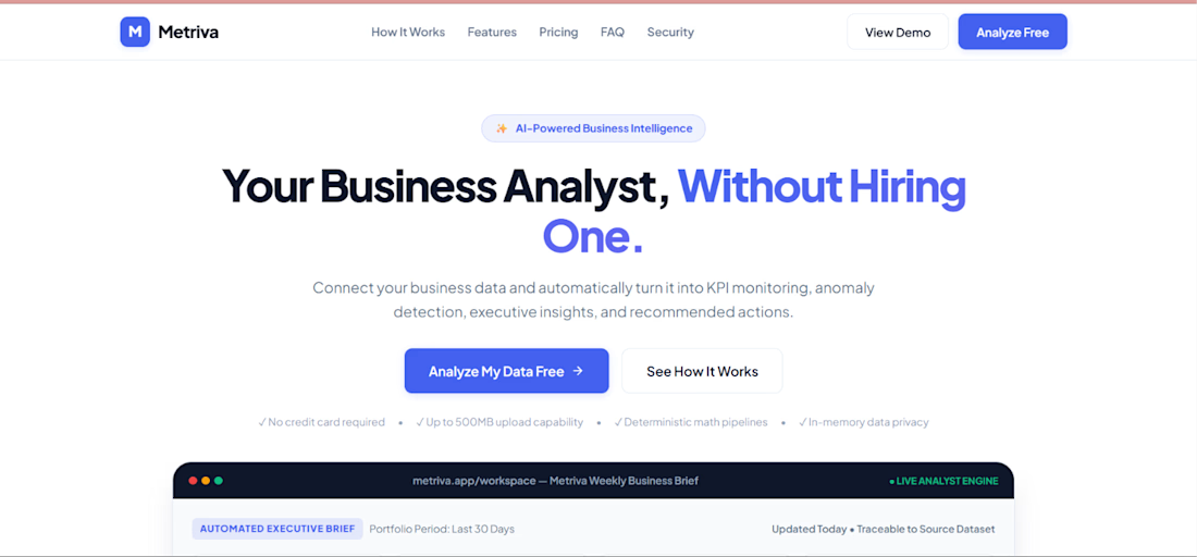
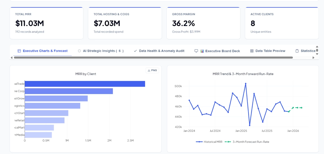
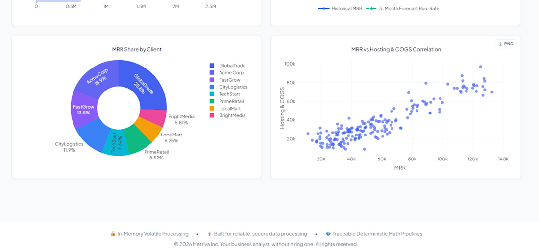
Metriva is an AI-powered business analyst that:
📊 Turns messy spreadsheets into executive dashboards
🧠 Writes C-level business briefs automatically
📈 Forecasts trends + detects anomalies
💬 Answers questions about your data in plain English
🎯 Finds your Pareto 80/20 — who drives 80% of your revenue?
No SQL. No Python. No data team.
Just upload your file and get answers.
Built with Flask, vanilla JS, and a lot of late nights.
🔗 Try it: metriva.ai1.vercel.app
#AI #BusinessIntelligence #Founder #IndieHacker #DataScience

The brief-writing piece is interesting — curious how you handle the validation step. AI-generated language tends to sound confident even when the underlying data is sparse or the trend is ambiguous. One pattern that helps: have the model output a confidence signal alongside the...